
Design is at its best when an idea carries through every part of the experience.
Every month, DesignRush spotlights standout creative work through its Design Awards program.
October's winners come from six categories: website, logo, print, app, packaging, and video design.
Each team picked one symbol or one rule and let it set the terms for everything else.
Together, they show how a strong idea can give a design system its own unique character.
Best Website Design: Ravi Klaassens
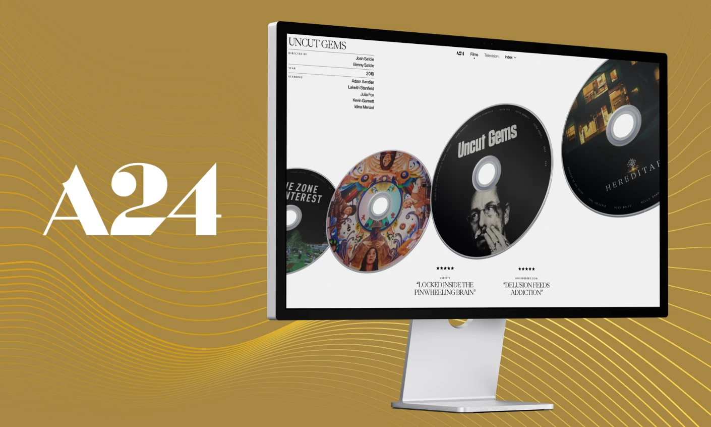
Ravi Klaassens won for A24 Films, presenting the studio’s catalog as a row of physical discs on a clean off-white stage.
Every title gets its own printed CD art, and the horizontal scroll pulls them past like flipping through a record crate.
A loose ink circle scribbled around the active disc breaks the polish, a small web design choice that makes the selected film read as hand-picked.
Serif typography handles titles, credits, and star-rated critic quotes, giving the catalog the feel of a printed film journal.
Clicking a title fills the screen with a full-bleed still and staggered type, and the disc idea still holds the page together.
Best Logo Design: Zamora Design
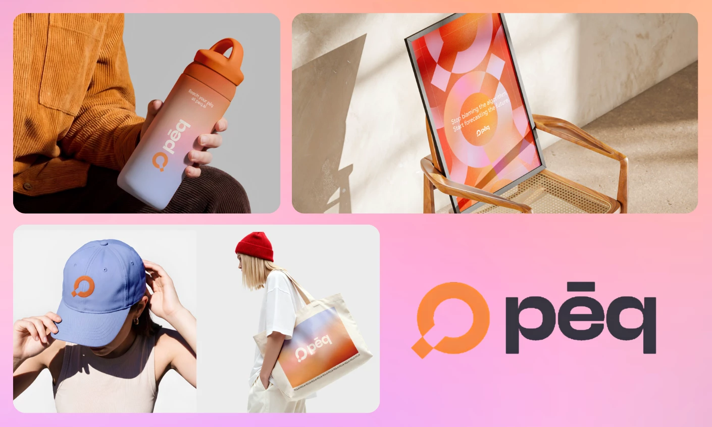
Zamora Design took the logo category for pēq, building the identity out of the magnifying-glass symbol that the company already had.
Frosted panels and layered translucency pull straight from the lens, letting a measurement business look like the transparency it sells.
Orange stays the brand color across every application and pulls pēq clear of a category washed in blue and purple, with cool neutrals holding the rest steady.
One set of rules keeps the mark legible at favicon size and commanding on a transit wall.
Zamora chose Trebuchet, a system font the British Dyslexia Association recommends for its open letterforms and spacing.
Partners and agencies reproduce the lockup with no license to buy, so the wordmark renders the same everywhere.
Best Print Design: Counterprint
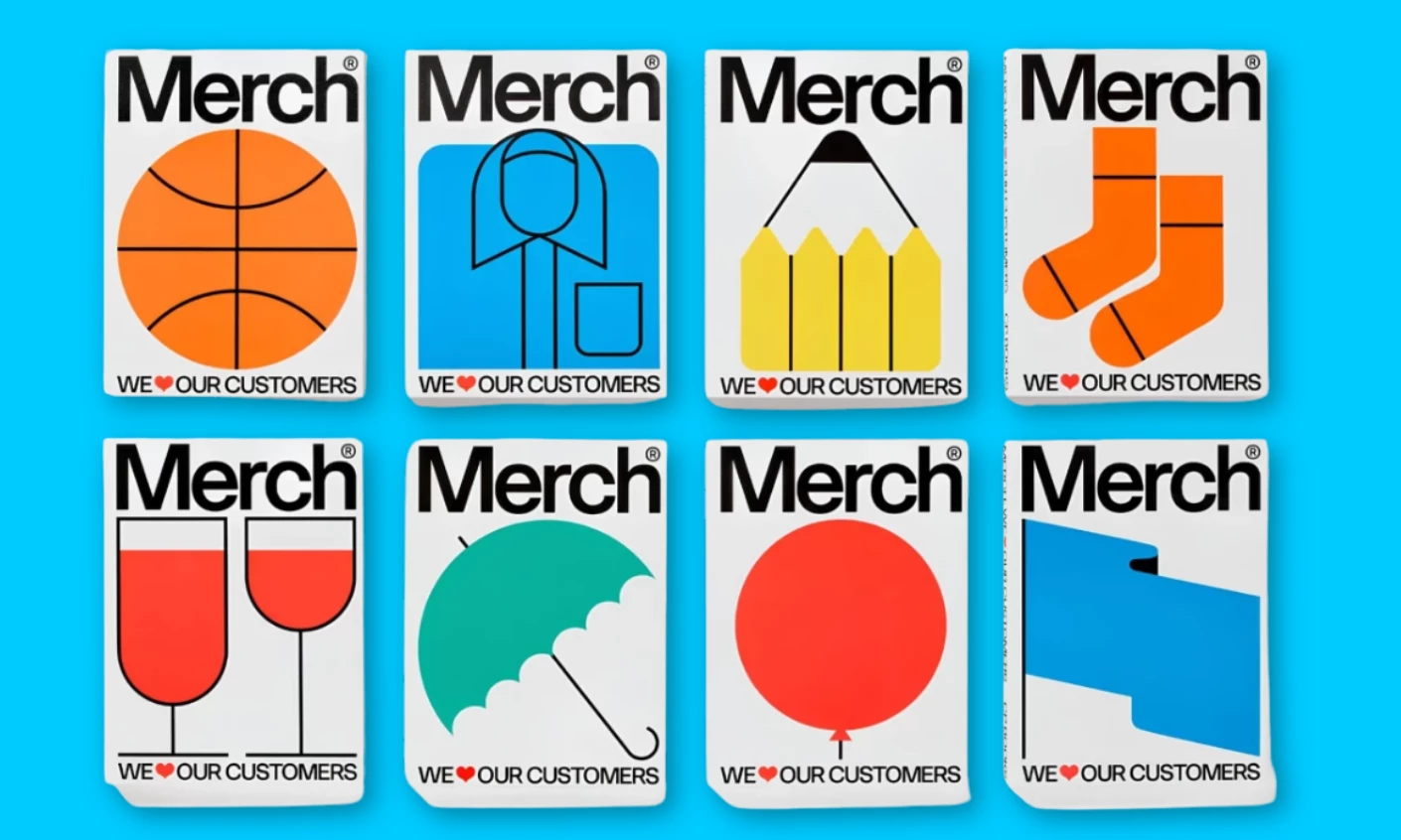
Counterprint won for "Merch," a book cover system that presents merchandise as a branding tool.
The lockup stays fixed, with "Merch" in heavy black type at the top and "WE ♥ OUR CUSTOMERS" at the foot.
Between them, flat pictograms swap from cover to cover, including a basketball, socks, an umbrella, and two glasses of wine.
Solid orange, cyan, and green fields with clean black keylines pull from mid-century trade-catalog pictograms, so each cover scans at thumbnail size.
Inside, the system relaxes into case-study spreads that pair full-bleed product photography with tight justified columns and playful lettering.
The "I'M IN WITH CP BOOKS" promo pins prove the same visual language holds once it leaves the page.
Best App Design: Fuselab Creative
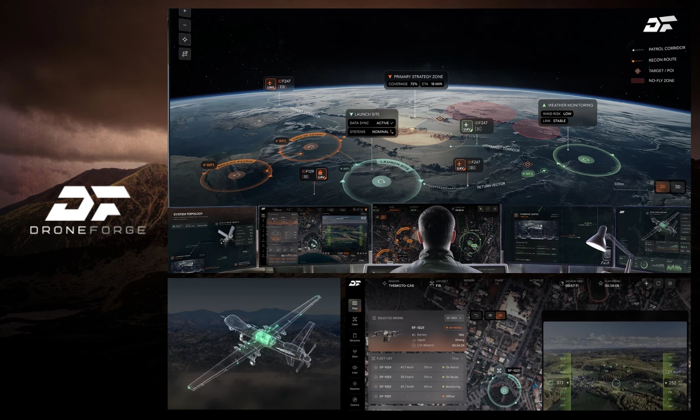
Fuselab Creative earned the award for Drone Forge’s UAV Mission Control Platform, which pulls five mission systems into one screen.
The agency built the user interface on a single rule where telemetry surfaces only when a decision is due.
The Meteo Ground Station turns wind, visibility, and humidity into one flight-readiness figure and a go or hold call.
Once the drone is airborne, a live schematic of the aircraft sits at the center, ringed by endurance, propulsion efficiency, and payload data.
The fleet map places every active drone over live terrain, and operators can take manual control of any unit in seconds.
A separate diagram links the drone, the relay satellite, the command center, and the ground station across primary and fallback routes.
Best Packaging Design: Bulletproof
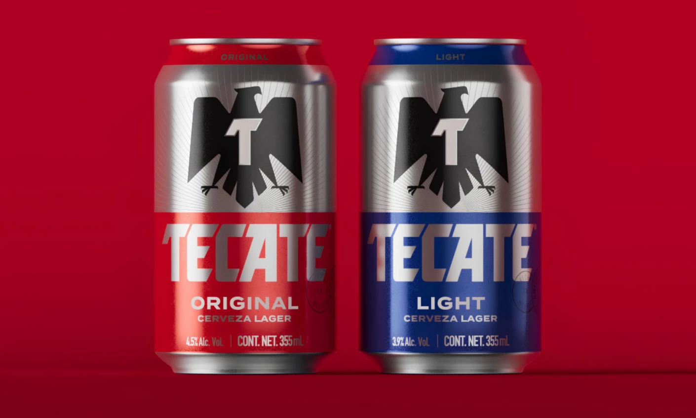
Bulletproof dominated the packaging category for Tecate, hanging the Mexican lager’s brand refresh on one redrawn eagle with a "T" cut into its chest.
The eagle is bolder and more upright now, with sharp talons and clean negative space.
The "T" comes from the ingot Bulletproof pulled out of the Tecate archive, a brand symbol that now reads as monogram and badge at once.
A silver top half bands over a base that flips red for Original and blue for Light.
Sunburst rays behind the eagle push the eye to the center, and a tight grid keeps the bird symmetrical and the wordmark’s angled cuts sharp.
Best Video Design: Innocean
Innocean took the award for Hyundai’s "The Mark of a Warrior," an automotive film that doesn't show a single car.
The story stages a young cancer patient as a lone gladiator in a Roman arena, armed with a small spear against a much larger opponent.
Her fear and resolve in the sand stand in for her fight against the illness.
The arena then cuts to a hospital hallway where doctors, nurses, and parents applaud the same girl, recasting the combat as treatment and recovery.
Scarlett Johansson narrates in her first outing as Hyundai’s brand voice, and the logo stays off-screen until the final frames.
The campaign recasts the Hope on Wheels handprint, the nonprofit’s symbol for decades, as a warrior’s mark.
Design decides what a company gets remembered for, and most brands pick too many things to be remembered for at once.
Every October winner answered this question by letting one element answer for the whole system, including a disc, a lens, an eagle, a pictogram, and a handprint.
DesignRush judges favored work that stays uniquely recognizable even after it leaves the screen it was made for.
The next set of winners arrives in November. Submit your work now before the panel meets.