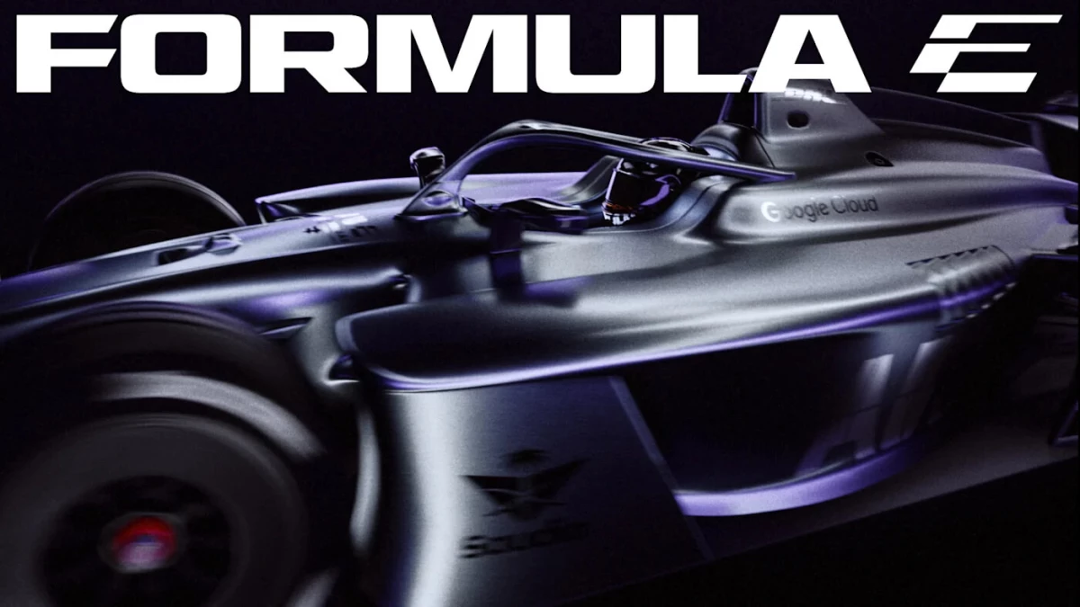

Formula E is changing its look just as the championship prepares to change how it races.
The ABB FIA Formula E World Championship has unveiled a new brand identity ahead of the 2026/27 season.
It's timed with the arrival of its GEN4 race car, its biggest global calendar yet, a new Disney+ streaming partnership, and the launch of E-PrixUnleashed.
The refresh was developed by global creative practice MOX, with All Purpose Studio creating a bespoke typeface family.
The new system covers Formula E's logo, wordmark, icon, typography, color palette, motion graphics, and broadcast package.
At the center is the idea of "making progress thrilling," giving the championship a clearer platform as it expands beyond the traditional race-day environment.
"Formula E asked MOX to blow up the existing identity and start again," Matt Bolton, creative director and co-founder at MOX, said.
"We didn’t want to make Formula E simply look more modern. We wanted to give it a visual language that feels alive."
For Formula E CMO Ellie Norman, the refresh is a reflection of the championship's growth across racing, audiences, manufacturers, and commercial partnerships.
"Our previous identity represented an earlier chapter; this brand refresh reflects exactly where we are going next," he explained.
Designing for the Next Race
The new visual identity is designed to behave differently across Formula E's live events, broadcast coverage, streaming, social media, gaming, merchandise, and partner activations.
The new Formula E icon uses a 30-degree angle to create a sense of forward movement, with the "E" appearing first and the "F" revealed in it on closer inspection.
Typography also gets a performance-oriented system.
Turbo Mode is a condensed italic typeface that signals speed, while Micro Mono handles timestamps, reference codes, and technical information.
Meanwhile, Inter is used for longer-form copy.
This flexibility is crucial as Formula E enters a season spanning 21 rounds across 13 events, with races coming to cities including Jeddah, Austin, Miami, Monaco, Mexico City, and Tokyo.
The championship enters the season with a 422 million global fanbase, according to Formula E's Season 11 figures, while 58% of its fans were classified as highly engaged.
Formula E global cumulative TV audience increase 14% to 561m in 2024/25 season
by u/barmolen in FormulaE
The new identity will roll out across championship touchpoints ahead of the 2026/27 season.
All in all, it gives Formula E a common visual system as its audience encounters the sport across more channels.
The Strategy Behind the Refresh
Formula E's rebrand arrives as the product itself is changing substantially.
GEN4 will deliver up to 600kW of power, exceed 335kph, and reach 100kph in approximately 1.8 seconds.
Meanwhile, the E-PrixUnleashed introduces a 30-minute sprint format for higher-speed racing.
The branding challenge Formula E faces now is how to make its identity communicate and honor these features.
Three lessons stand out for marketers:
- Make the identity respond to the product: Formula E's motion system gives its visual branding a direct connection to the speed and energy of the racing itself.
- Design for the spaces your audience occupies: The same system is intended for broadcast, streaming, social, gaming, live events, and partner environments, reducing the gap between channels.
- Refresh when the business has changed: Formula E is pairing the identity update with a new car, race format, calendar, and distribution partnership, giving the rebrand a concrete reason to exist.
Formula E is also entering the season with Disney+ as its global streaming home across 144 territories.
This potentially puts the championship in front of households that may encounter it outside traditional motorsport viewing habits.
Our Take: Can a Visual System Keep Up With the Sport?
This is where the rebrand gets interesting.
We often talk about sports identities as badges, but Formula E is treating identity more like equipment.
The logo, type, motion, and broadcast graphics have to literally perform every time the championship moves from a street circuit to a phone screen to a sponsor's activation.
We think that makes the system's flexibility more commercially important than just any individual logo tweak.
When a sport is selling access across multiple sectors, the visual identity has to give all those businesses a common language.
The strongest refreshes usually start with something people already feel when they use the product.
Explore these top branding agencies in our directory.