
A logo can change overnight. The perception attached to a company can't.
That perception comes from every visual and verbal signal a customer encounters, from the typeface and color palette to the packaging, website, and product itself.
A business moving upmarket needs those details to signal the same level of quality from the first impression onward.
Why a Logo Can’t Carry a Premium Position
Doodle N Dash saw that problem in a peptide company that came in asking for a website.
The client wanted to be “the Mercedes of the peptide industry.”
Its products were sourced from California and manufactured and tested in the US, while the wider peptide market was crowded with low-cost products shipped from China.
The only problem was that nothing about their brand was telling it.
The company had a logo made in ChatGPT, using Arial with blue and green. It had already been registered and printed on vials in a warehouse.
As far as they were concerned, that part was finished. They liked it. Conversation closed...
Except it wasn't finished, especially since ‘Mercedes of the industry’ was the actual goal.
View this post on Instagram
That disagreement is where a rebrand can become more than a visual swap.
The team first had to explain “why a generic mark can't carry a premium claim” and why the logo, colors, and typography needed to work as one system.
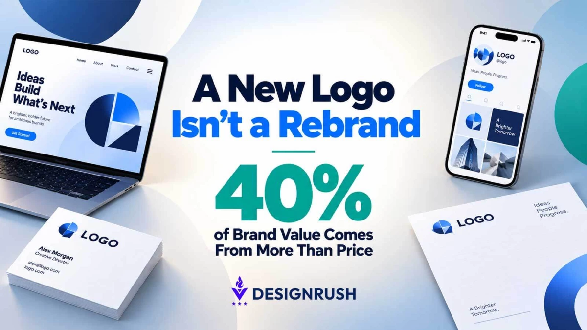
As much as 40% of perceived brand value can come from factors other than price, according to Deloitte’s 2026 Global Retail Industry Outlook.
Those factors include quality, service, checkout ease, loyalty, and employee interactions
A logo sits inside that wider experience. It can signal a promise, but it can't supply the product quality or service behind it.
What a Rebrand Has to Change Beyond the Logo
My team didn't start by producing isolated logo concepts.
We created complete directions showing the mark with the color system and typography across customer touchpoints, including packaging, the homepage, and the vial itself.
We also built out full directions: logo plus the color system and type it would actually live inside, so they could see it on packaging, on a homepage, on the vial itself.
After several rounds, the client chose the direction Doodle N Dash had been recommending from the start and moved away from the existing mark, despite having already paid for it and printed it.
The site is now live on the new system.
On average, brand strength accounts for 30% of revenue across categories, according to NIQ’s 2026 brand equity research, which draws on NIQ GfK retail panel data.
The research doesn't attribute revenue to a new logo.
It does, however, link brand strength to commercial performance, with the logo forming one part of the wider brand system.
View this post on Instagram
Eighty-one percent of retail executives surveyed by Deloitte said they expect generative AI to weaken brand loyalty by 2027, as AI-mediated shopping puts greater weight on factors such as value and fit.
In that environment, visual recognition still has a role, but it has to connect to a credible product and customer experience.
For the peptide client, the premium position had to show up consistently before anyone reached the copy.
A prospect forms an opinion about you before they read a single word about your product. The logo is already doing that job, whether you meant it to or not.
What Rebrand Decisions Need to Prove
A rebrand comes down to one question: “Does the new identity make the intended position easier to understand?”
That changes how decisions get made.
A logo can be judged in isolation, but an identity needs to survive contact with the business.
It has to work on packaging, digital interfaces, sales materials, and other customer touchpoints without losing the same signal each time.
The Doodle N Dash case points to three checks.
First, the visual system had to support the premium claim.
Second, the team showed the client the work in context instead of asking for a verdict on a mark floating on a white page.
Third, the client had to be willing to reconsider an asset it had already approved.
A rebrand can go off course when decisions come down to personal taste instead of what the identity needs to communicate.
View this post on Instagram
Color preference, font preference, and logo preference are real reactions, but they don't answer the commercial question.
The identity still has to communicate what the company is, what it promises, and the level of experience customers should expect.
If you’re considering a rebrand, the stronger question is what has to change for the visual identity to match the position the company is claiming.
If the answer is only the logo, the project may be a logo redesign.
If the answer extends to how the company presents its product, service, and customer experience, the work is addressing the brand itself.