
Coca-Cola has refreshed its global visual identity while keeping its logo, color palette, and mascot unchanged.
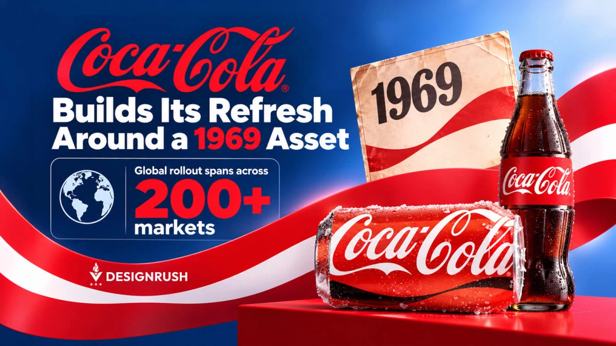
The update set clearer rules for how its existing visual assets appear across packaging, retail environments, equipment, and digital experiences in more than 200 markets.
The Dynamic Ribbon, a brand device first introduced in 1969, takes greater prominence alongside Coca-Cola’s familiar red-and-white palette, Arden Square, and Spencerian script.
The update gave Coca-Cola’s existing visual assets a more coordinated role across the brand.
The rollout also included a new Brand Center and Design Intelligence tools for Coca-Cola’s internal teams and agency partners, adding a layer of governance and technology alongside its visual rules.
For Oleg Turbaba, Brand Design Director at Clay, that systems-level view is familiar territory.
His work spans brand identity, digital experiences, and design systems, all of which come into play when a global brand must keep its visual identity consistent across markets and formats.
Why Is Coca-Cola Focusing on Brand Consistency Instead of a New Logo?
Coca-Cola’s approach runs against the assumption that a major brand refresh needs a dramatic visual reveal.
There is plenty here to look at.
“The ribbon brings movement, energy, and versatility across a wide range of touchpoints,” Turbaba says.
“Its strength lies in its ability to work independently, as a standalone graphic, while the brand remains distinctive and recognizable on small screens where full logos fail.”
Still, the most consequential part may be what Coca-Cola has left alone.
A logo can identify a brand in a fraction of a second, but a global identity has to do more work once that logo leaves the presentation deck.
“Stripping away visual clutter rather than reinventing core elements shows that true brand power comes from strengthening iconic assets and evolving with the times,” Turbaba adds.
In fact, 38% of brands improved their Brand Experience Index scores year-over-year in Forrester’s 2026 research.
The study evaluated 375 brands across 13 countries as part of its Total Experience rankings.
A brand can therefore change how it is experienced across hundreds of touchpoints without changing the asset people recognize first.
Turbaba has previously described his interest in “how to process large amounts of data while maintaining a specific style and message.”
“That principle applies to a brand operating across hundreds of markets, where the challenge is less about inventing another asset and more about keeping many executions recognizably related.”
Coca-Cola is not handing one designer a logo and asking for a poster; it’s setting rules for a vast number of people, formats, and commercial situations.
Those rules must work across packaging, retail environments, equipment, digital interfaces, and local market executions.
What Does Coca-Cola’s Identity Refresh Say About Modern Branding?
Coca-Cola’s timing reflects the broader marketing problem of maintaining consistency across more channels and more people producing brand work.
Kantar reports that coherent, cross-channel ideas are 2.5 times more important to campaign success than they were a decade ago.
The research found that just 27% of creator content has a strong connection to the brand.
“Modern branding is about maximizing iconic assets through clear definition, digital flexibility, and distinctive ownership,” Turbaba says.
“Major brands future-proof their visual systems by knowing which assets to evolve and which to reinforce. Flexible elements like the Dynamic Ribbon can adapt and stay fresh over time, while distinctive shapes like the red square become more firmly associated with the brand.”
That starts with familiar assets.
The company says its red and white palette, Dynamic Ribbon, Arden Square, and Spencerian script will carry more weight across the system, giving consumers more familiar cues to recognize the brand.
Recognition and novelty serve different purposes in a brand identity.
A dramatic redesign can attract attention by giving people something new to notice.
An identity system works differently, relying on familiar elements that remain recognizable across different contexts.
“Its success depends partly on repeated exposure, where typography, color, composition, and graphic devices begin to work as a recognizable set,” Turbaba says.
The impact is easier to see across hundreds of real-world applications, where Coca-Cola’s rules have to work consistently across internal teams and agency partners.
That detail may end up being more significant than the visual refresh itself.
A global identity doesn’t live inside a PDF. It lives in the hands of everyone producing work for the brand.
And that’s where Coca-Cola’s approach gets interesting for other large organizations.
A brand can have an excellent logo and still look strangely different from one interaction to the next.
“The harder task is making the identity usable enough that teams can reproduce it accurately without sanding away all the character,” Turbaba says.
Coca-Cola’s answer is to give its existing assets a tighter operating system.
There’s nothing flashy about that.
Then again, when the brand is already one of the most recognizable in the world, making the logo louder would be an unnecessary change.