F&B Web Design Takeaways:
F&B websites featuring high-quality food photography generate up to 5x more digital orders.
The most effective sites stimulate appetite, build emotional trust, and simplify the purchasing path, all within the first few seconds.
Prioritize visual appeal and conversion in equal measure. The best F&B websites strike a balance between appetizing design and clear paths to action.
Your website is often the first taste customers get of your brand. And in the food and beverage industry, that taste must be unforgettable.
In fact, restaurants with high-quality food photos generate five times more digital orders — about $31,500 a month vs $4,900 for sites without them, the St. Louis magazine reported.
That means every image on your site should do more than look good. It should evoke hunger, excitement, and trust from the very first glance.
Editor’s Note: This is a sponsored article created in partnership with eDesign Interactive.
On top of that, users form an opinion about your website in just 50 milliseconds, faster than a blink, which means you’re being judged before a single word is even read.
So, how do you make that first split second count?
The best F&B websites do three things:
- make you hungry,
- make you care, and
- make it easy to act.
Quick listen: 5 web design tactics that turn cravings into conversions, in under 2 minutes.
Web design agencies like eDesign Interactive have unpacked what truly works when designing a site that drives appetite, connection, and conversions:
- Use irresistible visuals to spark cravings instantly
- Build emotional trust with a brand story that resonates
- Deliver a clean, intuitive user experience without losing flavor
- Guide users to act with conversion-first design
- Tap into emotion to create a lasting brand connection
1. Make Visitors Hungry with Visuals That Sell
Unlike a storefront or a tasting booth, your website can’t rely on smell or taste to draw people in. It has to simulate those senses visually.
That’s why for food and beverage brands, imagery isn’t just decoration; it’s also your primary sales tool.
“Your visuals are your first line of persuasion. If your images don’t make visitors crave your product within seconds, you’ve already lost them,” said Vincent Mazza, Partner at eDesign Interactive.
Great websites don’t rely on plain product shots. They utilize rich, strategic imagery designed to ignite cravings and draw visitors in.
Here’s 4 things to focus on first:
- High-resolution, professionally styled food photography that uses lighting and color to create warmth, richness, and freshness
- Close-up shots that highlight textures — think gooey cheese pulls, crispy crusts, glistening glazes, or fizzy bubbles rising in a glass
- Motion elements, like short looped videos of pouring sauces or rising steam, can trigger a visceral response and bring the food to life
- Consistent editing and color grading that reflects your brand personality, i.e., bold and vibrant for a street food brand, soft and organic for a farm-to-table concept
Even small touches like hover animations, parallax scrolling, or micro-interactions (like a product image shifting slightly on scroll) can deepen the sense of immersion and keep visitors on the page longer.
A huge thank you to BELLA for trusting us with their digital storefront.
— eDesign Interactive (@We_Are_eDesign) April 29, 2025
🎨 Beautiful design
📱 Mobile-first and user-friendly
🧁 A treat for the eyes and the appetite!#WebDesign#UXUI#DigitalLaunch#BellaBakery#FrozenPastries#CreativeAgency#WebDevelopment#MadeWithLovepic.twitter.com/2Kv0yKs19M
And don’t underestimate the importance of image placement.
Hero banners should feature your signature product or most visually arresting dishes, while grid layouts can showcase product diversity or pairings.
On mobile, imagery should load quickly but retain enough detail to be enticing on a smaller screen.
The goal? To make someone’s mouth water, and their finger click "Order Now."
2. Tell a Story That Builds Trust
In 2025, consumers want to know:
- who you are,
- what you stand for, and
- why your product matters.
A compelling brand story turns passive browsers into emotionally invested buyers.
“We always tell clients: your story isn’t just content; it’s conversion fuel. When users connect emotionally, they’re far more likely to remember, recommend, and reorder,” said B.C. Wallin, creative brand strategist at eDesign Interactive.
Your website is the perfect place to weave that narrative, but it has to be done with clarity and purpose.
To bring it to life, you can do these 4 things:
- Start with your origin story, whether it's a family recipe, a cultural tradition, or a problem your product solves (like healthier snacks or sustainable farming)
- Use scroll-based storytelling to guide users through key chapters: the “why” behind the brand, your values, your process, and your passion
- Support text with strong visuals: archival photos, behind-the-scenes shots, ingredient sourcing, team profiles
- Break long content into digestible, visual-first modules so users can skim and still get the core message
Your story doesn’t need to be told in one long paragraph.
It can, and should, be embedded into the entire user experience, from homepage headlines to product copy to microinteractions like tooltip messages and loading animations.
Think about what you want people to remember when they leave your site:
- Do they feel connected to your mission?
- Do they understand what makes your offering different?
- Are they proud to support your brand?

That storytelling creates an emotional foundation; one that builds trust, encourages brand loyalty, and increases repeat purchases.
A strong narrative doesn’t just differentiate you; it makes your product matter.
3. Keep It Simple (But Not Boring)
Food and beverage websites often fall into one of two traps: they’re either so design-heavy that users get lost, or so stripped down that they feel generic and forgettable.
The sweet spot? A clean, intuitive experience that still delivers personality.
After all, the most effective sites guide the user, not overwhelm them.
Here’s what that looks like in practice:
- Streamlined navigation: Limit menu items and make it easy to access key pages like Menu, Shop, About, and Locations.
- Clear hierarchy: Use bold headlines, short paragraphs, and visual breaks to help users scan.
- Fast, mobile-first design: Prioritize speed and ensure all buttons, forms, and CTAs are easy to tap on smaller screens.
- Strong CTAs: Make action buttons visible, compelling, and consistent (“Order Now,” “Find Near Me,” “Get the Recipe”).
- Consistent flow: Guide users naturally from discovery to action, from craving to conversion.
Clean design doesn't have to mean boring. Use playful microcopy, smart animations, or bold colors to add flavor, as long as they don’t get in the way of the user’s next step.
Every detail should help someone understand, connect, or act.
4. Build for Conversions, Not Just Clicks
A beautiful website won’t help your business if it doesn’t prompt visitors to take action. For food and beverage brands, that action could be placing an order, subscribing to emails, or finding a store.
“Every element of your site should have a purpose. We design with one mantra: make the next step obvious, effortless, and rewarding,” said Jeff Nordstedt, Director of UX at eDesign Interactive.
To make that happen, design each page with a clear goal in mind and remove as much friction as possible.
To achieve this:
- Enable eCommerce: Make it easy to browse, add items to the cart, and check out, especially on mobile devices.
- Add a store locator: Help users quickly find where to buy in person or order via delivery apps.
- Use purposeful pop-ups: Offer a discount or loyalty reward to capture emails without disrupting the experience.
- Build campaign-specific pages: Promote new products, flavors, or limited-time offers with focused, high-converting landing pages.
- Simplify user flows: Fewer clicks spent navigating means more conversions. Guide users directly from the homepage to the action.
The key is to design for decision-making, not just browsing.
Ask yourself: What’s the next step for this visitor? Then make it fast, clear, and compelling.
5. Use Emotion as the Secret Sauce
Food is deeply emotional. It’s tied to memory, culture, comfort, and celebration. That’s why the most effective F&B websites go beyond product promotion and create a feeling.
Whether it’s the cozy nostalgia of a heritage bakery or the energy of a youth-focused beverage brand, emotional design builds brand affinity and drives repeat engagement.
Here’s how to tap into it:
- Tell stories, not just features: Don’t just say it’s organic. Show the farm. Introduce the farmers. Describe the aroma.
- Use mood-setting visuals: Lifestyle photography of people enjoying your product in context can be more powerful than product shots alone.
- Design for the senses: Use warm colors, textured backgrounds, ambient video, or soft animation to evoke flavor, freshness, and vibe.
- Speak with voice: Copy tone matters. Whether it’s witty, warm, or luxurious, your text should sound like your brand and like someone your audience would want to talk to.
Done right, emotional design makes users feel connected, even proud to support your brand.
That’s the difference between a one-time visitor and a lifelong fan.
What Great F&B Web Design Looks Like in Action
These real-world examples show how strategic design choices can turn food brands into digital standouts.
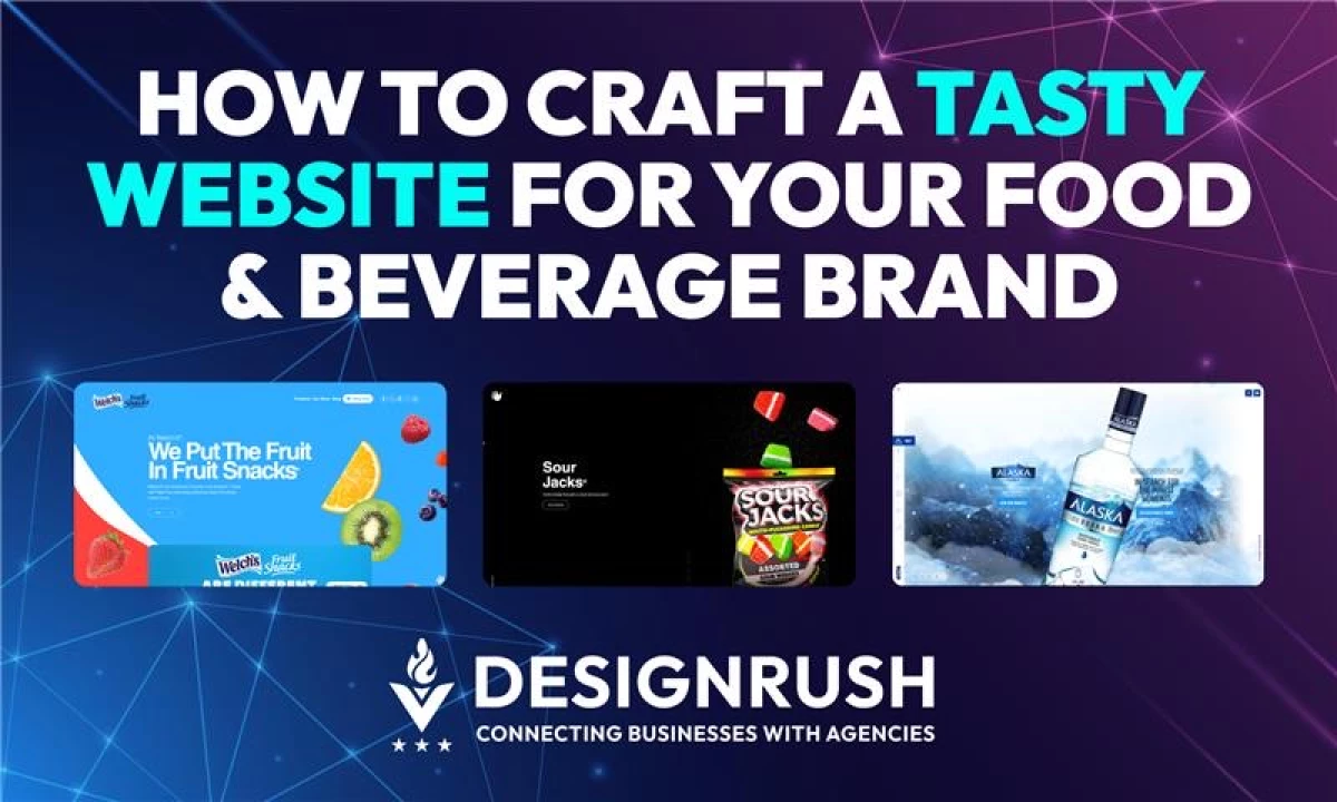
Sour Jacks: Turning a Candy Website Into an Immersive Brand Experience

Sour Jacks needed a website as bold and energetic as their wedge-shaped candy.
eDesign Interactive delivered a gamified, Gen Z-friendly experience full of animated visuals, 3D product packaging, and interactive scrolling effects that mirror the product’s punchy, sour personality.
The site’s neon color palette and retro gaming feel make it unforgettable, just like the candy itself.
Welch’s Fruit Snacks: A “Fruit First” Website That Wins Awards

To appeal to Millennial and Gen X parents, Welch’s needed a digital refresh that balanced fun and trust.
The new site uses oversized fruit photography, color-coded product lines, and playful animations to communicate health, heritage, and taste.
The project won Gold Davey and W3 awards, proving that when you mix compelling visuals with smart UX, even snacks can stand out.
Final Bite
In the food and beverage industry, your website sells the experience.
From crave-worthy visuals and emotionally rich storytelling to intuitive design and frictionless conversions, every element should work together to spark appetite and drive action.
Customers decide fast, and often with their eyes first.
The brands that win online are the ones that combine creativity with strategy, aesthetics with performance.
If you’re looking to craft a site that not only looks delicious but delivers real results, agencies like eDesign Interactive specialize in bringing all the right ingredients together.
Because in 2025’s digital world, taste starts with design.