B2B Website Friction & Conversion: Key Findings
- Most B2B deals stall before closing, as buyers lose momentum during the final validation stage rather than rejecting outright
- Website experience drives late-stage hesitation, where unclear messaging and friction prevent buyers from confidently moving forward
- Reducing friction at the decision stage improves conversion, as structured website design helps turn high-intent buyers into closed deals
B2B deals don’t usually fall apart at the finish line. They tend to lose momentum, timelines stretch, responses slow, and what once felt like a clear decision starts to drift.
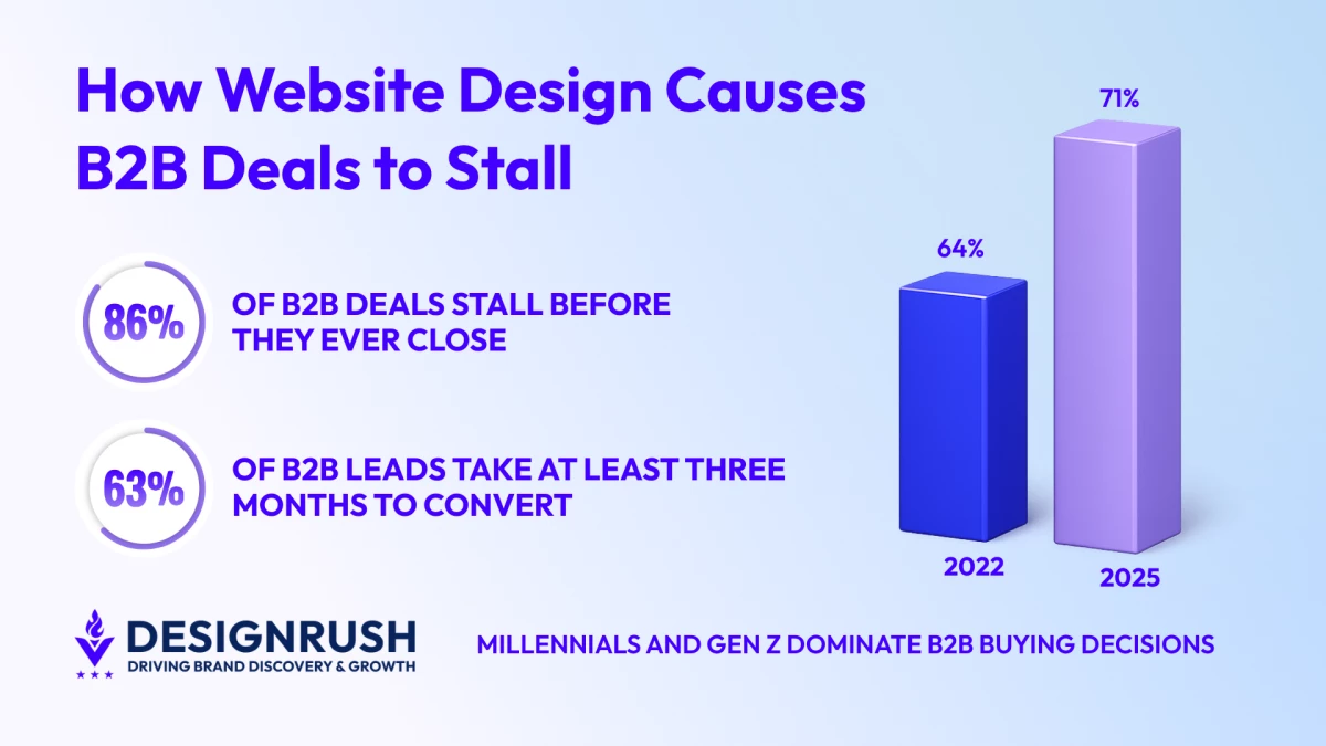
In fact, as many as 86% of B2B deals stall before they ever close, according to Sopro’s 2026 B2B Buyer Statistics and Insights report.
They don’t collapse. They don’t get rejected outright. More often than not, they sit somewhere in between, where progress slows without a clear reason why.
Paul J. Scott is the Founder and Chief B2B Website Strategist of GoingClear, a leading B2B digital agency based out of Boston, Massachusetts, who sees this play out all the time.
“At that point, they’re not really looking for more information. They’re trying to feel confident moving forward, and if something gets in the way of that, things tend to slow down,” Scott says.
That slowdown isn’t always short. In many cases, decisions stretch out for months, with 63% of B2B leads taking at least three months to move forward.
This parody illustrates how most B2B marketing managers approach websites and why teams often turn to experts like GoingClear for lead gen support:
Editor's Note: This is a sponsored article created in partnership with GoingClear.
Why B2B Buyers Struggle to Make Decisions Late in the Process
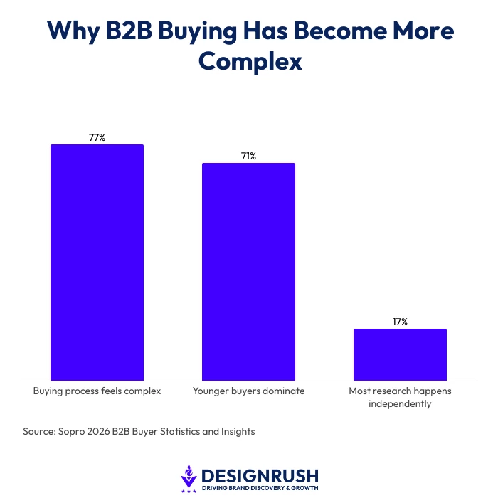
Sopro’s report also shows that 77% of buyers describe their purchasing process as complex or difficult. That helps explain why hesitation tends to linger, even late in the journey.
Generational shifts are also shaping how these decisions play out, with millennials and Gen Z now accounting for 71% of B2B buyers, up from 64% in 2022.
Buying groups have also grown more layered, with the average B2B decision now involving more than eight stakeholders.
At the same time, buyers spend just 17% of their time meeting with potential suppliers, which means most of the evaluation happens on their own, often on company websites.
What stands out is where the decision is actually happening.
“Much of it happens away from sales conversations, in quieter moments where buyers are reviewing, comparing, and trying to make sense of what they’ve already seen,” Scott says.
“And that’s usually where the website plays a bigger role than most teams expect.”
How Website Design Slows B2B Deal Conversion
Once you look at how buyers behave, the role of the website becomes harder to dismiss.
Many B2B websites are still designed to introduce a brand and generate interest. That part still matters, but it doesn’t reflect how the site is used later in the process.
Buyers come with different expectations. They’re not asking what a company does, they’re trying to confirm whether it’s the right choice.
If the site doesn’t support that shift, friction builds in small ways.
A pricing page that avoids specifics can make internal justification harder. A contact flow that asks for too much too early can feel like unnecessary effort. A services page that stays too general can leave buyers filling in the gaps themselves.
“It’s rarely one clear issue,” Scott says. “It’s a combination of smaller ones that make it harder to move forward with confidence.”
That’s usually where momentum starts to slip.
GoingClear shows how they help businesses level up their B2B websites:
Where B2B Deals Lose Momentum
By the time B2B buyers reach this stage, they’re not browsing anymore. They’re deciding.
They come back to the website with a different kind of focus. Less curiosity, more scrutiny. They’re looking for something that reassures them they’re making the right call.
This is often where things begin to slow.
If the messaging feels a bit too broad, it doesn’t fully resolve what they’re trying to confirm. If case studies sound strong but don’t show clear outcomes, they leave room for doubt. If the next step takes effort to figure out, even a small pause can interrupt momentum.
“While none of these issues feel significant on their own, together, they can be enough to stall a decision that was already close,” Scott says.
As part of GoingClear’s 22 Must-Haves for Websites e-book, Scott unpacks why adding a credibility strip to your website will unlock opportunity and leads:
What High-Converting B2B Websites Do to Close More Deals
The difference tends to show up in how websites handle that final stretch.
Stronger performers are more deliberate about what they surface and when.
They make outcomes easier to understand. Instead of relying on broad descriptions, they show what success actually looks like in a way that feels relevant to the buyer’s situation.
They remove friction where it matters. That could mean simplifying decision paths, making key details easier to find, or cutting steps that slow someone down when they’re already close.
“They treat proof differently. Real examples, specific results, and enough context to help a buyer picture how things might work for them,” Scott says.
“Individually, these changes don’t seem dramatic. But together, they make the experience easier to move through at the exact moment a decision is being made.”
Augusta, a caregiver recruitment platform, explains why they chose GoingClear to help them revamp their website to be more appealing to B2B audiences:
Why High-Intent B2B Buyers Still Don’t Convert
This is where many deals stall.
High-intent buyers don’t need more persuasion. They need clarity.
They’re trying to resolve a few key questions. Whether this will solve the problem. Whether it has worked in similar situations. What moving forward actually looks like.
If those answers aren’t easy to find, hesitation tends to take over.
This is also the point where website structure starts to matter more than messaging alone.
“It’s where approaches like GoingClear’s G3 Framework begin to come into play, particularly its focus on growing the pipeline by reducing friction at the decision stage,” Scott says.
“Instead of treating the website as a static asset, it positions it as part of how buyers move from consideration to commitment.”
Business Insider recently featured GoingClear’s G3 Framework update and how it helps B2B companies drive traffic, conversions, and pipeline growth:
How to Design B2B Websites That Convert at the Decision Stage
This shift changes how websites need to be approached.
It’s not just about visibility or engagement anymore. The real question is whether the experience supports decision-making when it matters most.
That often comes down to structure. How information is layered, how quickly key points become clear, and how naturally someone can move from one step to the next.
“The sites that perform well here don’t feel heavy,” Scott says. “They feel easy to move through, which makes a bigger difference to conversion than many teams expect.”
For leaders, the focus becomes simpler. Where is hesitation creeping in, and why? What are buyers looking for but not finding?
Because in most cases, the decision isn’t a firm no.
It’s a pause, waiting for clarity.
Want to find out how to redesign your B2B website to convert leads?
Take a look at our list of the Top B2B Web Design Agencies in 2026.