Xbox's Rebrand: Key Findings
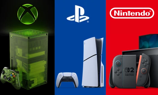
- Microsoft dropped the Microsoft Gaming name on April 24, returning its gaming division to Xbox with a new glossy green logo.
- New CEO Asha Sharma laid out four priorities across hardware, content, experience, and services, with daily active players as the key focus.
- Game Pass Ultimate dropped from $29.99 to $22.99 per month, with PC Game Pass falling from $16.49 to $13.99.
Xbox is dropping the Microsoft Gaming name and returning to the brand identity it has carried since the original console launched in 2001.
A new logo accompanied the announcement, swapping the black-and-white design in use since 2019 for a glossy green version that revives the brand's earlier neon coloring.
We Are Xbox pic.twitter.com/tJs10kGLwn
— Xbox (@Xbox) April 23, 2026
The rebrand was announced by new CEO Asha Sharma, in a memo co-authored with chief content officer Matt Booty titled "We Are Xbox."
"Microsoft Gaming describes our structure but it does not describe our ambition," she wrote.
"So, we are going back to where we started and changing our team's name. We are Xbox."
The Microsoft Gaming umbrella was introduced in 2022 alongside Microsoft's bid to acquire Activision Blizzard, and represented a push toward a platform-agnostic model built around cloud gaming and mobile.
This strategy, which produced campaigns like "Everything is an Xbox" and "This is an Xbox," faced internal resistance and failed to reverse declining hardware revenue.
Reactions to the Logo Change
The new logo was unveiled on Xbox's official social channels before the full memo was published, and people immediately responded with enthusiasm.
we are so back 💚
— Mountain Dew® (@MountainDew) April 23, 2026
Mountain Dew's official account responded in the comments, while Razer posted a green heart.
Xbox's positive social reception reflects something both brands and agencies will recognize.
A color returning to a logo generated immediate organic conversation, because the green meant something to the audience that had been waiting for it to come back.
Microsoft Gaming's "Everything is an Xbox" positioning was widely mocked for deviating too far from the brand's core audience, which is its console community.
View this post on Instagram
Conversely, the green logo functions as a visible correction and places Xbox back into a context its followers understand.
The Wider Strategic Reset
The logo is the most visible element of a bigger reset Sharma has laid out across four priorities, covering hardware, content, experience, and services.
On hardware, Sharma committed to stabilizing the current Xbox Series S/X generation before delivering Project Helix, the next-gen console, which is expected to run both console and PC games.
Game Pass Ultimate has become too expensive for too many players. Starting today, we’re dropping the price from $29.99 to $22.99/month.
— Asha (@asha_shar) April 21, 2026
Future Call of Duty titles will no longer join Game Pass Ultimate on day one. They will join this tier the following holiday after launch (about…
On services, Game Pass Ultimate dropped from $29.99 to $22.99 per month, and PC Game Pass fell from $16.49 to $13.99.
Sharma also said the company would "reevaluate [its] approach to exclusivity, windowing, and AI."
This promise has garnered significant attention, given that Xbox had spent the past two years releasing first-party titles including "Starfield" on rival platforms including PS5.
Since the announcement, Sharma has confirmed that Xbox will deliver bi-weekly console updates for Xbox Series S/X through the end of 2026, and that teams are meeting daily on Project Helix.
On the exclusivity question, she also told Game File that she wants to make "the right decision, not the fastest decision," describing it as a long-swinging call with decade-long impact.
The poll results so far reflect the mood among Xbox's audience, with most voters saying the rebrand is a good start, but needs more effort.
This tracks with a fanbase that is cautiously optimistic about Sharma's early moves, but that also wants to see her listen to her audience and deliver on her promises.
Xbox's recent rebrand is also worth studying for how a single visual decision can do more brand repair work than a full campaign:
- A color can carry real brand equity: The green logo generated significant organic social conversation the moment it appeared.
- Naming clarity is commercial strategy: Four years under Microsoft Gaming diluted the brand's identity with audiences who already knew what Xbox was.
- Rebrands need operational changes to hold: Price cuts and a published strategy give the logo something concrete to stand on.
For brands managing platform or product line complexity, the Xbox case is a reminder that consolidating under a name people already trust is a faster route back to audience confidence.
Our Take: Is the Green Logo Enough?
We think it's a strong start, and the positive social reaction confirms that the green color still carries real brand equity with Xbox's audience.
However, we'd say the harder work is still ahead.
Sharma's memo is honest about how much ground Xbox has lost on PC, on pricing, and on feature velocity, and changing the logo won't fix any of those things on its own.
The Game Pass price cuts and the exclusivity reevaluation are the moves that will determine whether this reset has real traction, and both of those take time to show up in the numbers.
We are Xbox https://t.co/QxKTXxGgojpic.twitter.com/mF7OeqY801
— Asha (@asha_shar) April 23, 2026
What the rebrand has aced is giving the ideal reset to Xbox's visual identity.
The green is a signal to the audience that the previous era is over, and this is a useful thing for a brand to be able to communicate without having to say it directly.
Brands navigating major identity resets need agencies that understand how to align visual changes with operational ones so the rebrand holds up over time.
Explore the top branding agencies in our directory.