Great design continues to shape how brands tell stories, build trust, and guide people through meaningful experiences.
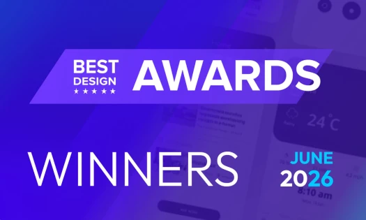
DesignRush spotlights standout creative work across website, logo, print, app, packaging, and video for its monthly Design Awards.
The selected projects reflect a shared focus on craft and intentional execution, with each winner demonstrating how design choices can elevate function and feeling at the same time.
Below are the February Design Award winners, chosen for their thoughtful approach, visual strength, and ability to translate brand values into clear design systems.
Best Website Design: TMFL Studio
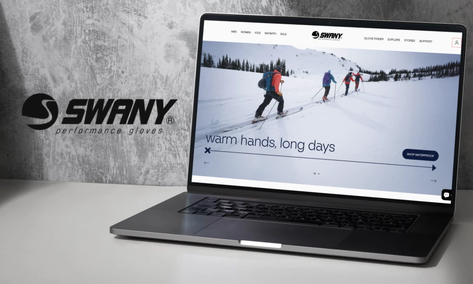
TMFL Studio redesigned Swany’s e-commerce website with an editorial sensibility that focuses on confidence and ease in product discovery.
The site strays away from technical jargon and instead shows how gloves are actually worn and experienced in real conditions.
Full-bleed photography introduces the brand’s century-long history, while plainspoken and human typography and easy navigation keep the experience approachable.
Product grids remain clean and consistent, with neutral backgrounds that keep attention on the gloves while making pricing, ratings, and color options easy to scan.
“This site is exceptionally well designed, engaging, and offers so much more than just another shopping experience,” juror and advertising agency owner Andrea Owsinek-Brucker said.
Best Logo Design: Alana Washington
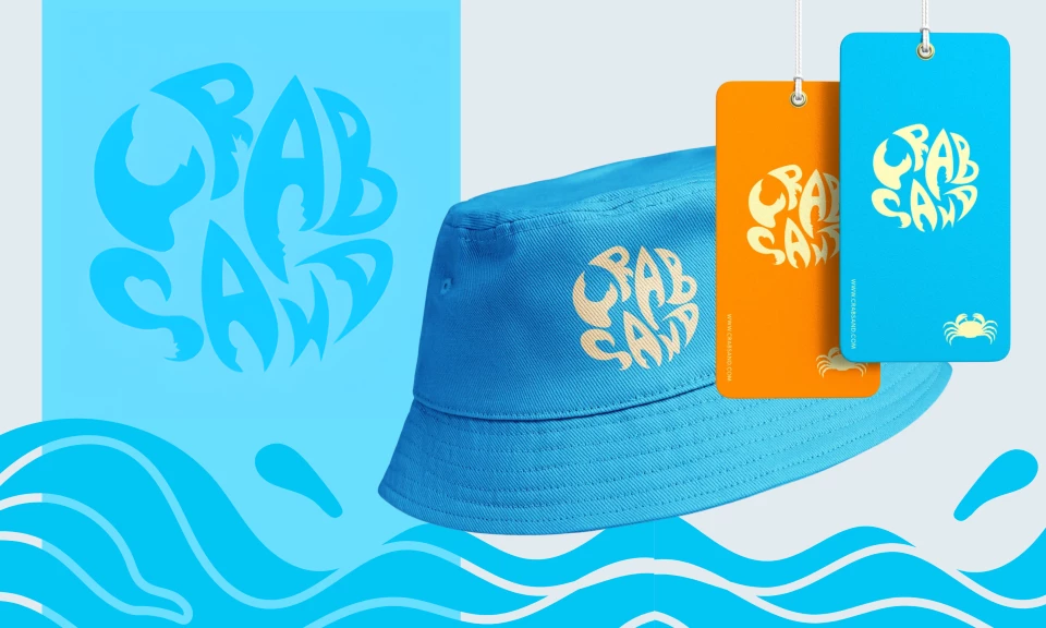
Alana Washington created a logo for Crab Sand that captures the relaxed rhythm and warmth of everyday beach culture.
The design embraces hand-drawn imperfections, favoring personality and emotional connection over polished uniformity.
Rounded letterforms interlock into a compact emblem that feels casual yet distinctive, making it adaptable across apparel, accessories, and digital platforms.
Organic curves subtly echo waves and sand patterns without relying on literal coastal imagery, while the bright and sun-washed brand colors give off an energizing feeling.
“Playful and fun, easily identifiable and invokes a sense of warmth of beach culture,” Owsinek-Brucker shared.
Best Print Design: Pang Brands
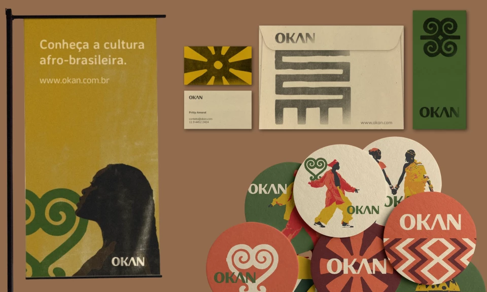
Pang Brands developed a visual identity for Okan that reflects its Afro-Brazilian heritage through symbolic illustration, earthy tones, and organic forms.
Designed for an educational and experiential tourism agency, the design system communicates authenticity and cultural respect through its materials and visual language.
Posters and print assets use warm color palettes and flowing shapes to create an inviting presence that supports Okan’s mission of cultural preservation through travel.
Applied across formats, the system avoids decorative excess and feels cohesive, reinforcing Okan’s focus on experience, history, and learning.
“Not a classical piece by some standards, but strong and individual and relevant with powerful use of color,” strategy and design expert Lee Selsick commented.
Best App Design: Proyect.io
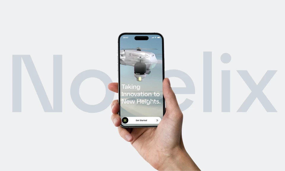
Proyect.io designed the Notelix app with a clear focus on precision, simplicity, and reliability.
Clean layouts and high-contrast visuals keep each screen easy to navigate, while subtle motion adds responsiveness without distracting.
The app interface maintains a lightweight, technical feel that mirrors how Notelix positions its drone technology.
Consistency across views drives trust, allowing users to focus on function, with a visual system that supports the brand's emphasis on innovation and accuracy.
“Micro interactions, creative use of color and minimalist design,” said Owsinek-Brucker.
Best Packaging Design: SEV/Studio
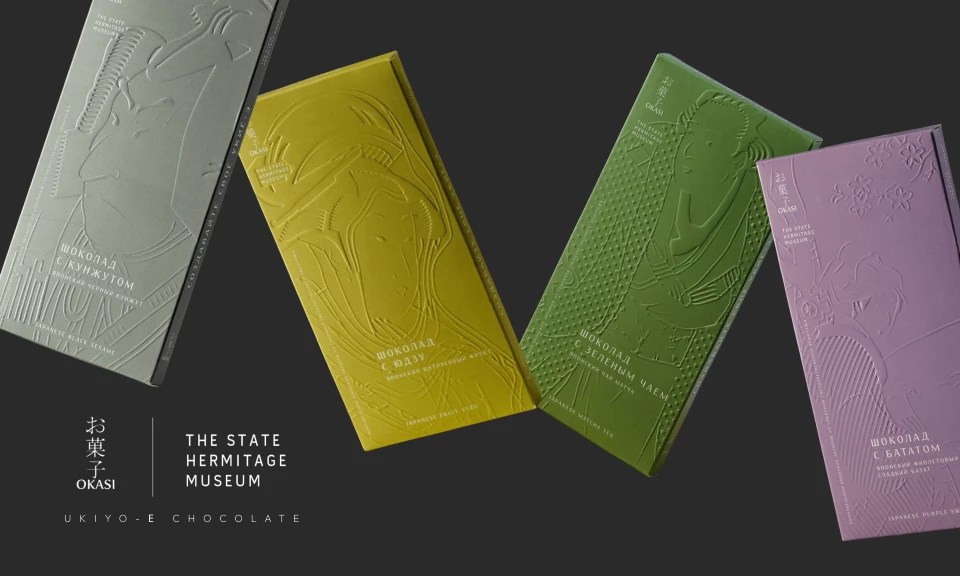
SEV/Studio designed limited-edition chocolate packaging for the State Hermitage Museum that treats packaging as an experiential object.
Deep embossing references Ukiyo-e woodblock carving techniques, translating cultural process into tactile form through muted monochrome palettes that suggest flavor.
Typography remains understated, functioning more like exhibition labeling than what would be traditional product branding.
Across the collection, a consistent structure reinforces the sense of a curated series, with variation introduced through embossing and color alone.
“It’s great to see such considered design and curated colors. The embossing makes a huge difference,” creative director Kitty Lai pointed out.
Best Video Design: Blend&Frame
Blend&Frame crafted a trade show film that communicates craftsmanship through cinematic abstract visuals.
The video uses shifts in material, from stone-like mass to refined metal, as a metaphor for precision knife-making.
Particle simulations and slow-motion sequences move at a deliberate pace, reinforcing a sense of control.
Thin metallic lines and flowing paths guide the eye, while the knife reveal favors texture and silhouette over overt hero framing.
“This was a beautiful piece that held my attention from start to finish,” juror and creative director Marc Strong shared.
Design has the ability to clarify, connect, and carry intention across every user or consumer interaction.
February’s Design Award winners show how thoughtful execution and restraint can translate creative work into really meaningful brand experiences.
DesignRush looks forward to highlighting more projects that continue to push design forward with purpose and conviction.