Design continues to define how brands present themselves, tell stories, and connect with audiences across platforms.
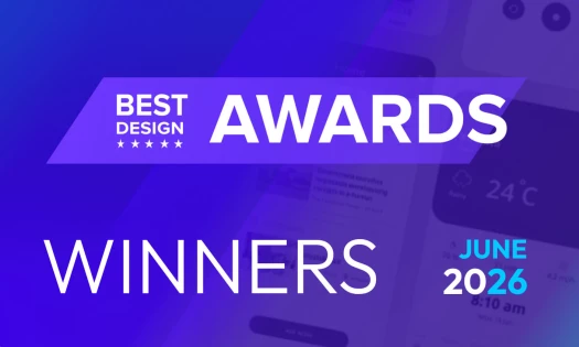
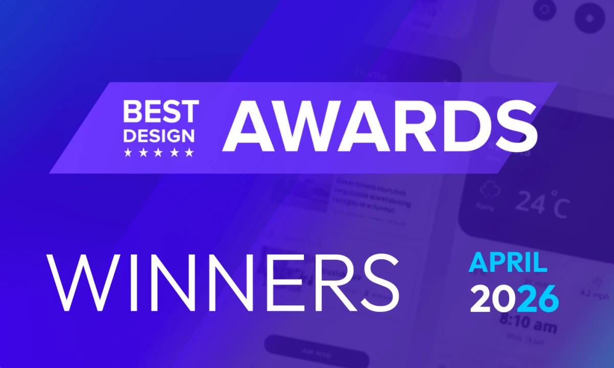
Each month, DesignRush highlights standout creative work through its Design Awards, recognizing projects that show clear thinking, strong execution, and distinct visual direction.
April’s winners span six categories: website, logo, print, app, packaging, and video, each reflecting how design continues to shape brand perception and user experience.
Here are the DesignRush April 2026 Design Award winners.
Best Website Design: Off+Brand
Off+Brand developed a high-performance website for Formula 1 driver Lando Norris, built to function as both a personal brand hub and a platform for engagement.
Neon accents inspired by Norris’ helmet design highlight his racing identity within a modular layout that separates on-track performance from off-track content.
This gives users a clear way to explore results, partnerships, and the story of Norris' personal brand.
“Wild designs and bright colors depict the brand perfectly," said Andrea Owsinek-Brucker, an advertising agency owner and DesignRush juror.
"The element of excitement is consistent and cohesive with the messaging," she added.
The structure balances personality with performance, allowing the platform to serve fans, sponsors, and media without overwhelming the user.
Best Logo Design: Oneway Agency
Oneway Agency created a logo for DUAL Fitness centered on balance, movement, and long-term progress.
The design uses clean curves and minimal forms to show the brand’s focus on sustainable training.
Its simplicity helps communicate clarity and discipline, establishing DUAL as a steady and reliable fitness brand.
"Simplicity with a mission, it's a design that conveys the message of the brand, brand experience, and strength of outcome," Owsinek-Brucker shared.
The visual approach avoids aggressive or extreme cues often seen in fitness branding, instead focusing on consistency and control.
Best Print Design: Daniel Shaskey
Daniel Shaskey created a print identity for Butter Pastry that draws from French baking heritage while maintaining a modern feel.
The system centers on a woodcut-style emblem of Saint Honoré, paired with refined typography to create a cohesive look across packaging and printed materials.
The print design reflects craftsmanship while remaining visually distinct on shelves.
"Texture, color, technique elevate the brand and the strength of message to a truly unique level with a distinct point of view," Owsinek-Brucker noted.
Historical references and expressive type choices translate the brand’s artisanal approach into a clear visual language that works across formats.
Best App Design: Eno Inyangete
Designer Eno Inyangete developed the Amani Gallery app as a digital platform for discovering contemporary art.
The app design focuses on clean navigation and structured browsing, organizing artists, exhibitions, and artworks into a simple, intuitive flow.
Its layout allows users to explore content without distraction, while still offering deeper insight into each artist’s story and work.
"Intriguing mix of medical clinical and natural holistic," Owsinek-Brucker commented.
Ultimately, the experience comes off as a balance of editorial storytelling and gallery-style presentation, keeping the artwork at the center of the interface.
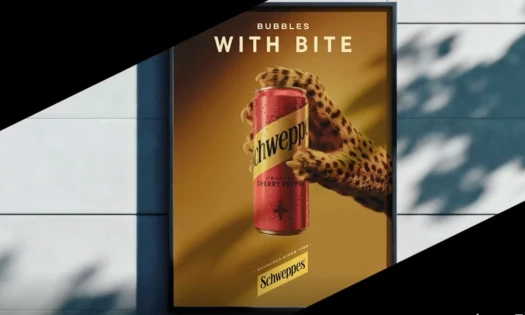
Best Packaging Design: Poppy Design
Poppy Design created a packaging system for Numood that strays away from traditional beverage design cues.
The work uses bold fruit graphics, bright colors, and minimal layouts to communicate flavor and ingredients clearly.
A refined wordmark includes a subtle leaf detail formed through negative space, connecting the brand to natural elements without overcomplicating the design.
"Vibrant, bold graphics and a pleasing color palette create instant recognition of product and choices," Owsinek-Brucker commented.
Overall, it's a clean and modern look that stands out on shelves while remaining easy to understand.
Best Video Design: Breakwater Studios Ltd
Breakwater Studios Ltd marked its 10th anniversary with a short showreel that highlights a decade of documentaries.
The video brings together moments from various films without naming them, letting the subjects and their stories drive the narrative.
Editing follows emotional beats instead of chronology, creating a clear arc that moves from discovery to struggle, and finally, to resolution.
Across different projects, the cinematography maintains a consistent visual tone, using warm lighting, close framing, and intimate shots that reflect human-centered storytelling.
Design continues to play a central role in how brands communicate and differentiate themselves.
April's Design Award winners show just how strong visual systems, clear storytelling, and thoughtful execution can create work that is both functional and memorable.
DesignRush continues its commitment to showcasing standout designs. Stay tuned for next month's winners.