Walmart's Great Value Redesign: Key Findings
- Packaging and branding agency JKR partnered with Walmart's internal creative team on the new identity.
- The overhaul spans nearly 10,000 products across more than 100 categories, making it the largest private brand update in Walmart's history.
- Rollout begins with snacks in May 2026, with the full transition taking 18 to 24 months.
Walmart has launched the first full redesign of Great Value in over a decade.
Packaging and branding agency JKR, working alongside Walmart's internal creative team led by VP of Creative David Hartman, developed the new identity.
The goal was to make the packaging reflect a product quality that shoppers already trust but no longer feel proud to put on the counter.
"What they felt was this sense of it being a compromise," Hartman said in a statement.
"They love the product across food and consumables, but they didn't particularly feel very proud to display it in their home or with their families."
Great Value Redesign Built for Shelf and Digital
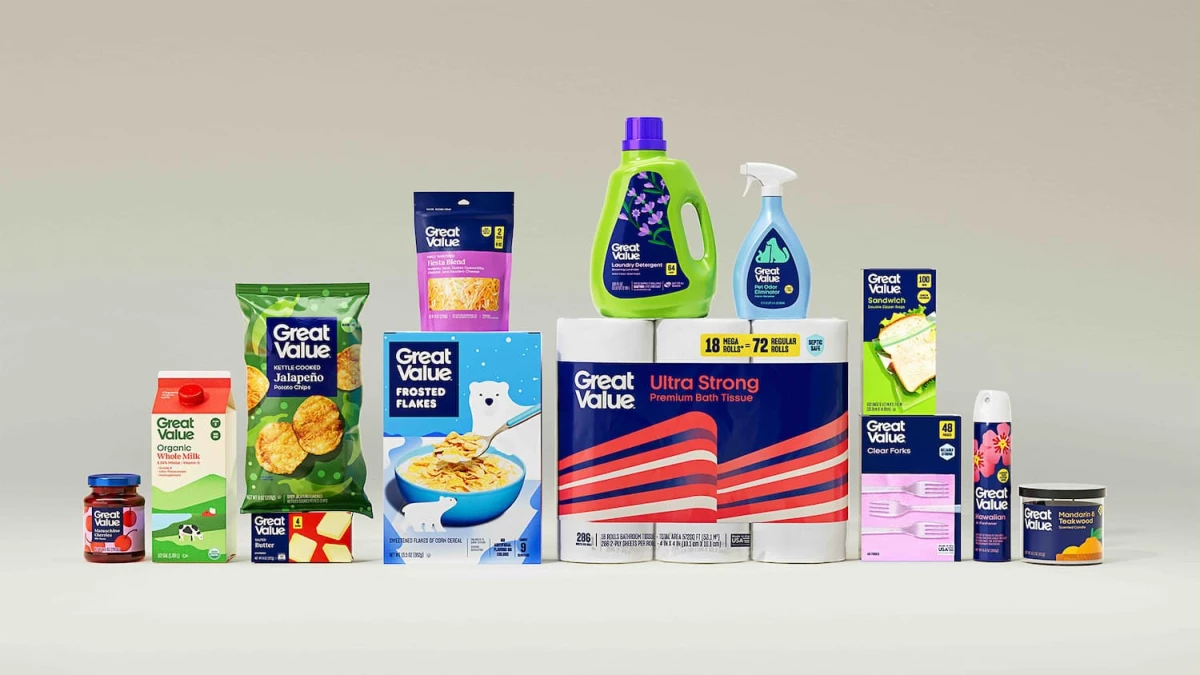
The new typeface is larger and set in a deeper shade of blue. A detail buried in the wordmark has the two Es in "Great Value" aligning to form an interlocking shape that reads as a smile.
The original stark white backgrounds and block lettering signaled no-frills by design.
The new system is more colorful and built to work on two surfaces: the physical shelf and Walmart's app, where pickers pull items fast for online orders.
Snacks arrive first in May, with cereals, cream cheese, and sour cream to follow. The full rollout completes within 18 to 24 months.
"We've built a system that does exactly that, bringing consistency, clarity, and a sense of discovery to every shelf," Hartman said in a press statement to Walmart.
A packaging design strategy at this scale is as much a logistics problem as a creative one. A system designed for tens of thousands of SKUs has to hold up before it can stand out.

Private Label Growth Raises Design Expectations
According to the Private Label Manufacturers Association, store brands are growing almost three times faster than national brands, with U.S. private-label sales reaching $330 billion in 2025.
Households earning more than $100,000 accounted for the majority of Walmart’s recent market share gains, according to earnings commentary reported by CNBC.
As this audience expands, expectations around design, quality cues, and overall brand presentation are rising.
Great Value was already winning on product. It is found in nine out of 10 American homes and saves the average family 35% annually.
The company describes it as the largest food and consumables CPG brand in the U.S. But its packaging was still speaking the language of budget, a gap the redesign is built to close.
This redesign continues a broader repositioning effort. Walmart launched its premium private label line, Bettergoods, in 2024.
In January 2025, the retailer's parent brand refresh, also developed with JKR, updated the corporate wordmark and color system. Great Value is the next layer.
Walmart Scales Packaging Across 10,000 Products
Store brand packaging must now compete visually with premium DTC brands, not just outprice national brands on the shelf. That bar has moved, and Walmart's overhaul is the clearest evidence yet.
The scale of this project actually works against creative risk-taking. A system that has to function across 10,000 SKUs cannot afford ambiguity.
The dual-channel requirement adds another layer of constraint. Packaging designed purely for shelf presence fails the moment it shrinks to a thumbnail inside an app.
The retailer's pickers and its online shoppers are looking at the same product through very different screens.
Budget-tier brands shedding generic aesthetics is a shift visible across 2026 graphic design trends.
The question was never whether Great Value's product was good enough. It was whether the packaging permitted shoppers to believe it
Our Take: Can Budget Brands 'Glow Up' Without Losing Buyers?
Great Value's "cheap" aesthetic was never an accident. The entire point was to communicate affordability instantly, without question.
Making that packaging look premium could confuse consumers. But we think Walmart's approach is careful enough to avoid losing loyal shoppers.
The new system keeps Great Value’s familiar blue but shifts it to a darker tone, keeping the brand recognizable while removing the cues that made it feel like a compromise.
The real test is whether a year from now, shoppers still reach for Great Value out of confidence, and not just out of habit.
Brands rethinking their packaging at scale need top packaging design agencies with systems thinking, not just visual skill.
Find the right partner on DesignRush for your next brand identity project.