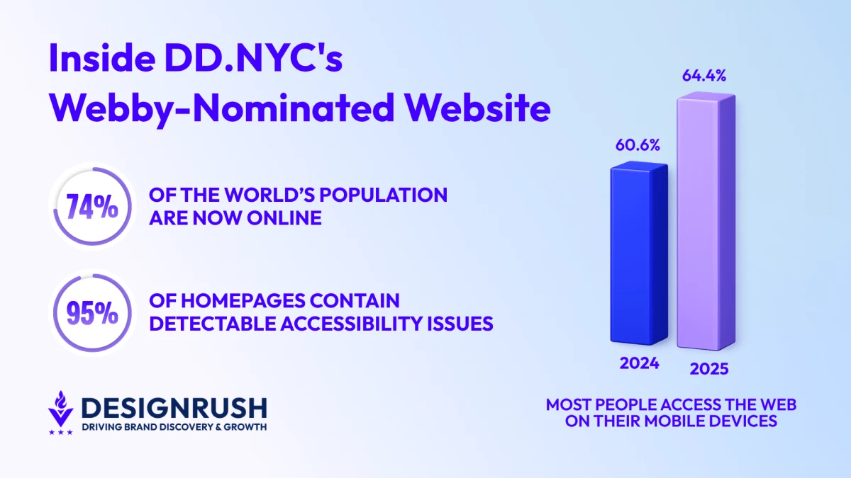

More than 74% of the world’s population are now online, according to the International Telecommunication Union.
For many of them, the first interaction with a brand, destination, or event happens through a screen.
For websites, getting seen today isn't the hard part anymore. Relevance, usability, and performance are now the deciding factors that separate forgettable digital experiences from memorable ones.
It’s one of the many reasons why leading creative design agency, DD.NYC, recently earned a Webby Award nomination for its work on the FIFA World Cup 2026 New York New Jersey website.
For many fans, the website will be their first introduction to the host region.
Alongside tournament information, it points visitors toward transportation options, local attractions, and the places they'll likely encounter once they arrive.
The experience also reflects the personality of New York and New Jersey, giving fans a sense of the region before they set foot there.
How DD.NYC Built for 1.2 Million Visitors
Not only will the audience of 1.2 million visitors be massive, but so will the financial rewards, with the tournament projected to generate an estimated $3.3 billion in economic impact.
With New York and New Jersey preparing to host the FIFA World Cup Final, the assignment carried enormous visibility, particularly as the website would be their first interaction with the region long before they arrived at a stadium, hotel, or fan event.
Anjelika Lours’ Kour, Creative Director and Managing Partner at DD.NYC, reflects on what made the project stand out from the rest, adding that the nomination boiled down to the combination of visual ambition and functional discipline.
"A lot of sites at this scale default to safe, utilitarian design. We didn't,” Kour explains. “We wanted every scroll to feel like the event itself, high energy, globally relevant, and unapologetically New York, New Jersey."
Designing a FIFA World Cup Website for a Global Audience
The audience for a FIFA World Cup website is unlike almost anything else.
Visitors could be arriving from São Paulo, Seoul, London or even Cape Town. Some may know exactly where they're going. Others may be trying to figure out transportation, accommodations, and match information.
They won't all approach the website in the same way. Some will be familiar with the region, while others will be seeing it for the first time.
To make information easier to find, DD.NYC leaned on bold visuals, clear iconography, and language support throughout the site. Culturally relevant content also helped ensure the experience resonated with fans traveling from abroad.
"Fans coming from 100 different countries have completely different reference points," Kour says. "The visual language had to transcend words.”
The same audience-first thinking influenced the site's navigation.
Most people visiting the site aren't there to browse. They're looking for something.
Maybe it's a match schedule. Maybe it's transportation information. Maybe they're trying to figure out what to do between games.
"We structured the navigation around what a fan actually needs the moment they land on the site," Kour adds.
"The site needed to work for the person who booked flights that morning just as much as the one who's been planning for two years."
A visitor looking for a match schedule shouldn't have to hunt for it. The same goes for transportation details, venue information, or things to do around the region.
Why Performance and Accessibility Matter at Scale
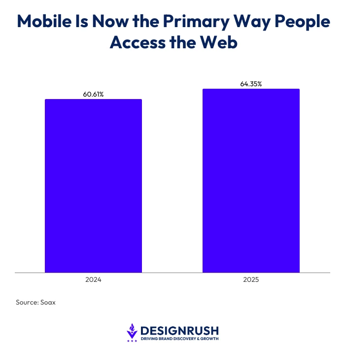
The team knew many visitors would be browsing on mobile, particularly since industry research from Soax found that smartphones accounted for 64.35% of global web traffic in 2025, up from 60.61% at the start of 2024.
With this in mind, DD.NYC responded with a mobile-first approach, optimizing assets and load times for people accessing the site from different devices and network conditions.
"Performance was a non-negotiable from day one," Kour says.
"We built mobile-first, optimized every asset, and put serious thought into load times. You cannot have a world-class event with a slow website."
Likewise, accessibility received the same level of attention.
WebAIM's 2025 Million Report found that 94.8% of the internet's top one million homepages contain detectable accessibility issues.
Accessibility was part of the process from the start, with the team building around WCAG standards and incorporating features such as keyboard navigation, screen-reader compatibility, and strong contrast ratios.
"A FIFA World Cup website serves everyone," Kour says. "That means everyone, no matter where they're from or how they experience the web."
YouTube channel, SpurIT, show why accessibility matters, especially for those with disabilities:
Managing a FIFA World Cup Platform in Real Time
The platform functions as more than just an event website.
Visitors use it as a tourism hub, transportation guide, event calendar, ticketing resource, and destination guide. At the same time, information continues to evolve as preparations for the tournament progress.
All of it exists under a live countdown to kickoff.
New information continues to roll in as preparations for the tournament progress. Schedules change. Details are updated. Expectations grow as the event gets closer.
"The website had to function as a tourism hub, a ticketing guide, a transportation resource, an event calendar, and a brand experience all at once," Kour explains.
"The content was constantly evolving and the stakes kept rising as the event drew closer."
What Brands Can Learn From DD.NYC's Webby-Nominated Website
Award-winning digital experiences rarely begin with awards in mind.
The strongest lesson from this project is how relentlessly the team focused on the people using the platform.
Navigation was built around audience needs. Performance was treated as part of the user experience rather than a technical checkbox. Accessibility was integrated from the start.
"Design for clarity," Kour concludes. "Beauty matters, but if someone can't find the shuttle schedule in under 10 seconds, the design fails. The best thing we did was relentlessly pressure-test the experience from a user's perspective."
For executives, the key to success is hard to ignore.
- Build around user behavior rather than internal assumptions
- Treat speed as part of the brand
- Make accessibility foundational
- Test experiences against real-world use cases long before launch
Because in the end, awards may be decided by judges, but digital experiences are judged by everyone else.