Minimalism took over the web because it made sense.
Cleaner layouts are easier to read, pages got faster, and a stripped-back aesthetic signaled confidence in a way that cluttered, busy designs never could. Those were real gains.
The issue is that somewhere along the way, minimalism stopped being a design decision and started being a content decision too.
Navigation got hidden. The copy got cut down to almost nothing. Context disappeared.
The result is a generation of websites that photograph well but function poorly.
When Hiding Navigation Hurts Users
The hamburger menu stuck around because it solved the problem of having too many navigation options and not enough screen space.
It looks clean. Developers and designers like it, but users, on the other hand, barely tolerate it.
In fact, hiding navigation through the use of a hamburger menu cuts feature discoverability by nearly half, according to Nielsen Norman Group.
And while users recognize the hamburger icon more readily than they did a decade ago, the core finding remains unchanged.
Content hidden behind a click is used less frequently, and visible navigation still produces higher interaction rates with conversion-relevant elements.
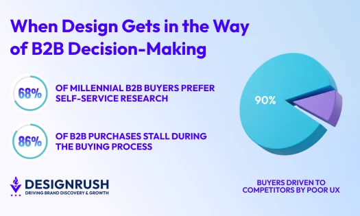
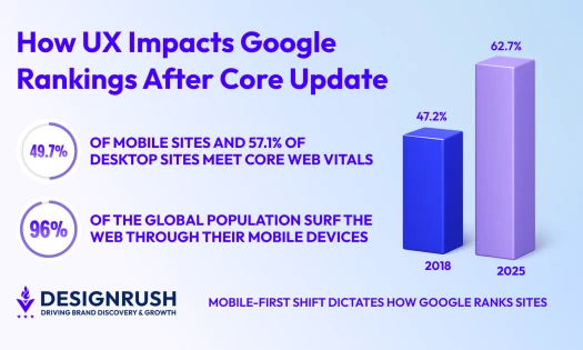
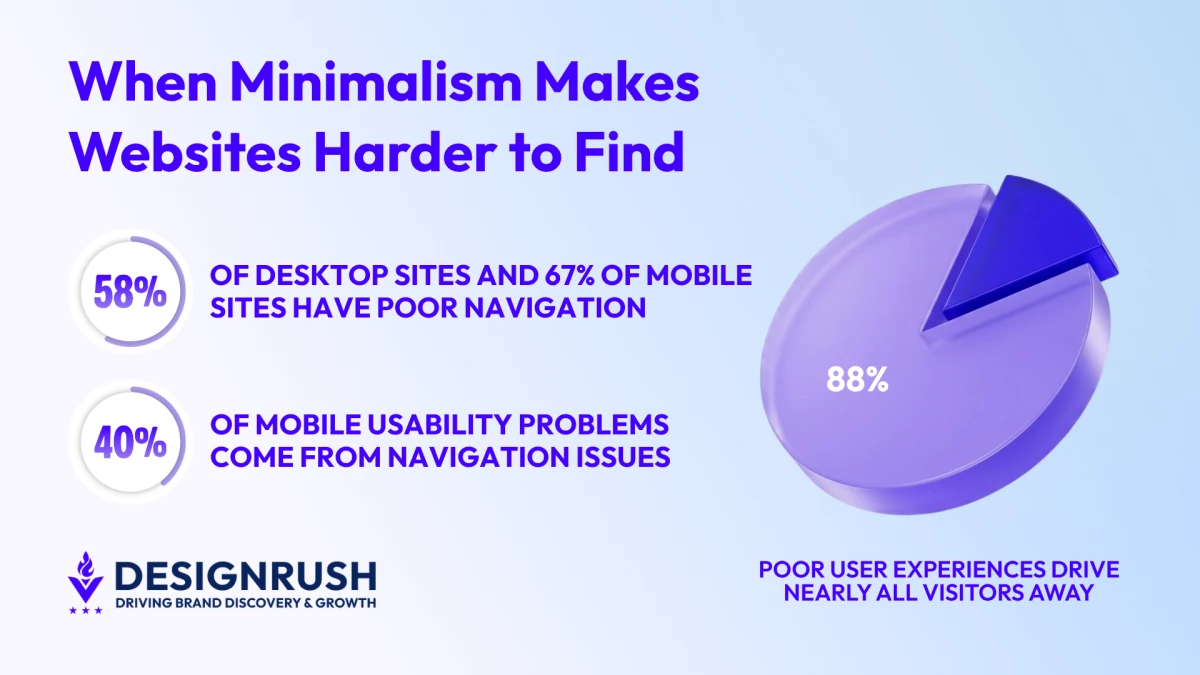
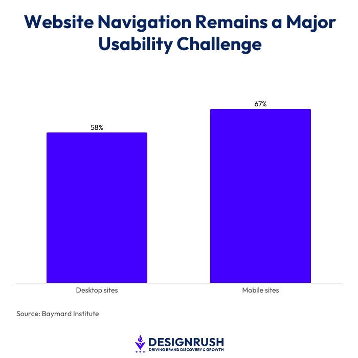
This explains why over 58% of desktop sites and 67% of mobile sites have “mediocre” or “poor” homepage and category navigation, according to Baymard’s Institute 2025 Benchmark, via Parallelhq.com.
This means that users can’t buy, enquire, or convert if they can’t navigate to the correct page.
Case in point, navigation issues account for 30-40% of mobile usability problems across web products, per Phone Simulator.
Nielsen Norman Group explains how hidden navigation and hamburger menus can reduce discoverability, making it harder for users to find information and complete tasks:
Sparse Copy Is a Search Visibility Problem
Minimalist design often extends beyond layout into content. Common examples of this include:
- The three-word hero headline
- The service page with two short paragraphs
- The product page where the main design choice is how much white space to add
These became templates that spread across agency sites, SaaS products, and eCommerce stores because they looked modern. What they look like to a search crawler is a different story.
Google has termed this thin content, where pages don't give users or crawlers enough information to work with.
In January 2025, Google updated its Search Quality Rater Guidelines, as mentioned in SearchAtlas, to call this out more explicitly by targeting pages with minimal useful information.
When someone lands on a vague page and immediately leaves, that bounce signals unmet intent. Enough of those signals, and the page gets demoted.
Google's March 2024 core update, the most complex in years, integrated its Helpful Content System into core ranking logic and reduced unhelpful content in search results by 45%, per Saffron Edge.
Sites that optimized for surface-level aesthetics without informational depth absorbed significant ranking drops.
The problem this creates is poor SEO structure.
Thin pages waste crawl budgets, disrupt internal ranking signals, and weaken how Google evaluates the overall quality of a domain, which means high-quality pages on the same site also suffer.
YouTube channel, Google Search Central, breaks down the risks of thin content and what it can mean for your website's search visibility, rankings, and overall performance:
AI Search Has Made Content Depth Non-Negotiable
Traditional search was already punishing thin content. AI search makes the problem structural.
When Google or ChatGPT pulls a source to answer a user's question, it needs something to extract, like a statistic, a clear explanation, or a defined answer to a specific question.
A page built around a background image and a three-sentence value proposition gives an AI system nothing to work with. It doesn't get cited or referenced. It doesn't exist in that answer.
A Gartner study projects that traditional search volume will drop 25% in 2026 as more users shift to AI-powered answer engines, as reported by Search Engine Land.
In fact, Google's AI Overviews is already at 2 billion monthly users, while ChatGPT is at 800 million weekly users.
A Princeton, Georgia Tech, and IIT Delhi study, as cited in AI Thinker Lab, established the formal methodology for GEO and found that content built around statistics, citations, and structured answers can increase visibility in AI-generated responses by up to 40%.
AI-referred sessions grew 527% year over year in the first half of 2025, according to Frase. And while that traffic is going somewhere, it’s not going to minimalist websites.
Another analysis by LLMrefs of 10,000 real-world queries found that pages with structured lists, quotes, and statistics had 30 to 40% higher visibility in AI-generated responses than pages without this content architecture.
Conversion Pathways Disappear with Context
Minimalist design doesn’t just reduce discoverability, but removes the on-page signals that move users toward action.
Trust signals, pricing context, social proof, service descriptions, and clear calls-to-action are often removed in pursuit of visual cleanliness.
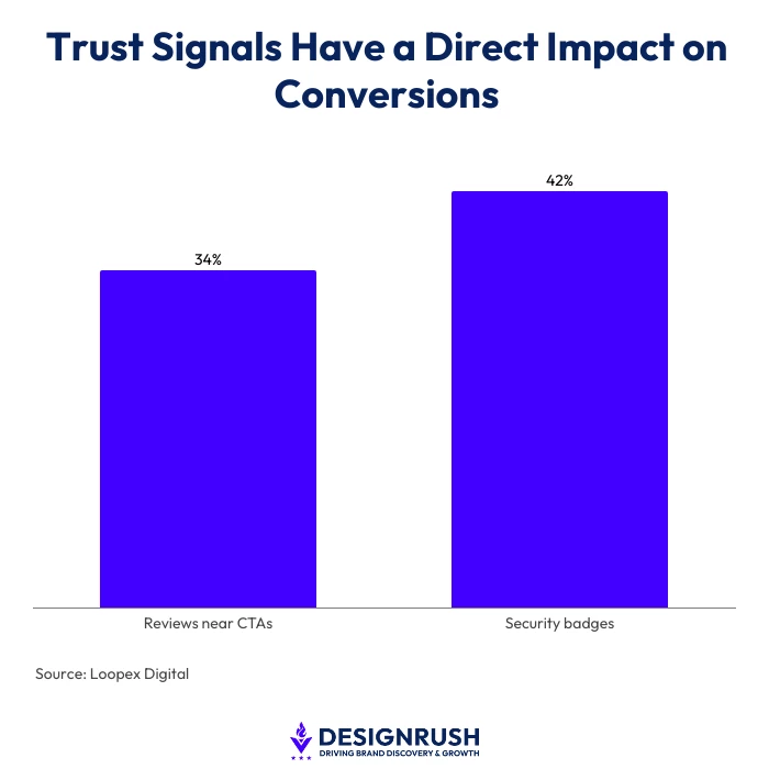
This practice is problematic since 61% of users will not complete a purchase without visible trust indicators, according to Loopex Digital.
Meanwhile, reviews placed near CTAs increase conversions by 34%, and security badges increase conversions by 42%.
Poor information architecture driven by minimal design thinking carries a direct revenue cost.
Here, research cited by DesignRush found that poor user experiences drive 88% of visitors away, while thoughtful, clear design can boost conversion rates by 200 to 400%.
Similarly, the same Loopex Digital report adds that users leave websites within 10 to 15 seconds when they cannot locate the information they need.
Minimalist interfaces that provide no visible hierarchy of information accelerate that exit.
YouTube channel, Smarter Online Business, explains how visual trust signals work, why they matter so much, and how small changes to your website can make visitors feel safer, more confident, and more ready to say yes:
Clarity and Depth Are the Corrective
The problem is not minimalism as a design philosophy. It is minimalism applied to content and navigation decisions without accounting for the functional cost.
In my experience at Quixta, most clients come to us having invested heavily in a beautiful website that no one can navigate, and no search engine can interpret.
But a website that cannot be found and cannot guide a visitor is not a brand asset. It is an expensive placeholder.
This is why, in 2026, a brief that only describes the visual elements of a website isn’t enough. Proper briefs should also include functional elements as well.
Clean visual design and informational depth are not in conflict. The distinction is between reducing clutter and reducing context. Removing decorative elements and simplifying visual hierarchies serves the user.
Removing explanatory copy, hiding navigation, and stripping on-page context serve the aesthetic at the user's expense.
In AI-driven search environments, where structured, factual, and contextually rich content is the primary signal for citation and visibility, the websites that perform well will be those that communicate clearly and completely.
Visual restraint remains a legitimate design goal.
Informational restraint, on pages built to attract, inform, and convert, carries a measurable and growing cost.