Dunkin's 'Iconic Home' Campaign: Key Points
- The OOH ads make the pack the hero to cue at-home consumption in a single glance.
- They match flavor to moment by pairing each SKU with gradient skies tied to dayparts and seasons.
- The concept operates on buying reach where the system reads fast with placements from Times Square to street posters and across socials.
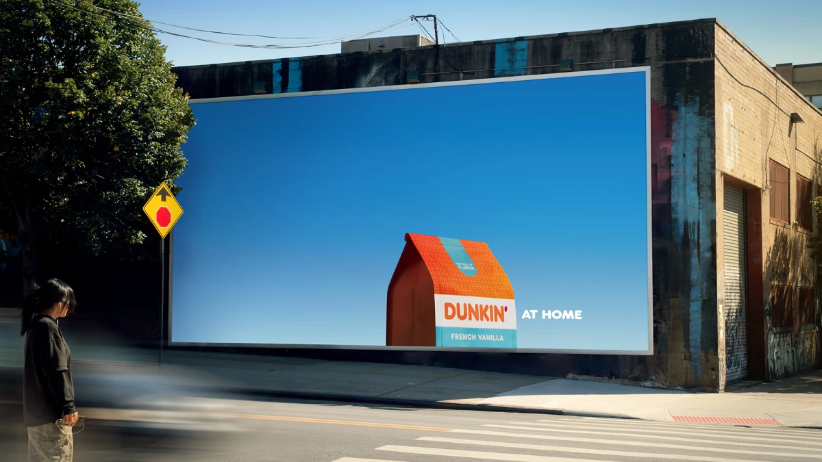
A simple yet eye-catching visual turns the Dunkin’ At Home pack into a home.
PSOne, the Publicis Power of One solution for The J.M. Smucker Co., partnered with BBH USA on “Iconic Home,” a design-led campaign that transforms the product pack into a house.
The visual focuses on a clean packaging shot, cropped at the roofline, set against colorful gradient skies.
The intent is to move Dunkin’s in-store equity into the home and keep the brand top of mind when people stock up.

The J.M. Smucker Co. Director of Brand Experience Coffee Josh Williams put the brief plainly:
“Dunkin' at home is loved for its unpretentious vibe and coffee that fuels millions every day, but it’s not always the first at-home brand that comes to mind.
Our challenge was to continue to remind people they can enjoy that same unmistakable Dunkin’ taste at home.
This campaign rises to that challenge by using timeless, beautifully crafted design to spark that 'I can have this at home' realization."

Meanwhile, BBH USA Group Creative Director Sapna Ahluwalia highlighted that the concept's power lies in its simplicity:
"It is literally just a bag of Dunkin’, cropped at the perfect angle to resemble a house.
Stripped of clutter, the aesthetic conveys warmth, comfort, and the inviting feeling of home, standing out in a world that’s become visually too much."
The idea works because it makes the packaging design instantly recognizable, while giving shoppers a new way to picture the brand in their own homes.
Bringing Dunkin’ Home
The creative system is built to be fast to read and easy to scale.
Across seven product variants, the minimalist design keeps the layout spare so the pack can convey the meaning without extra copy:
- Pack-as-house motif that encodes “at home” in one move and travels cleanly across formats.
- Gradient skies by daypart and season to align flavor cues with morning, afternoon, evening, or seasonal use.
- Format flexibility from a Times Square billboard to wild postings, digital OOH, and social.

The packaging-first approach makes it easy to extend the design into retail displays and product detail pages without losing brand recognition.
This consistency should help at the shelf and in retailer media where quick recognition matters.
Our Take: Does Simple Design Drive Real Impact?
I see this OOH campaign as a smart example of design doing the heavy lifting.
Because the concept revolves around the packaging design, Dunkin’ At Home sidesteps clutter and builds a cue that consumers can recognize instantly.
This kind of discipline matters in OOH, in feeds, and on shelves where attention is fleeting.

Here are some points brand and agency leaders should consider:
- Use the packaging as a memory anchor so the brand shows up clearly in channels where attention is limited.
- Tie variants to real moments to make targeting feel natural and relevant.
- Extend the design into retail and e-commerce so the same system drives recall.
The main lesson here is that one distinctive asset can work harder than a dozen fragmented executions.
If “Iconic Home” lifts recall and near-purchase metrics in early markets, Dunkin’ At Home gains a scalable system that justifies more media and retailer investment.
Meanwhile, DUDE Wipes' national OOH campaign targeted toilet paper rivals and comprised 650 billboards across the U.S.