
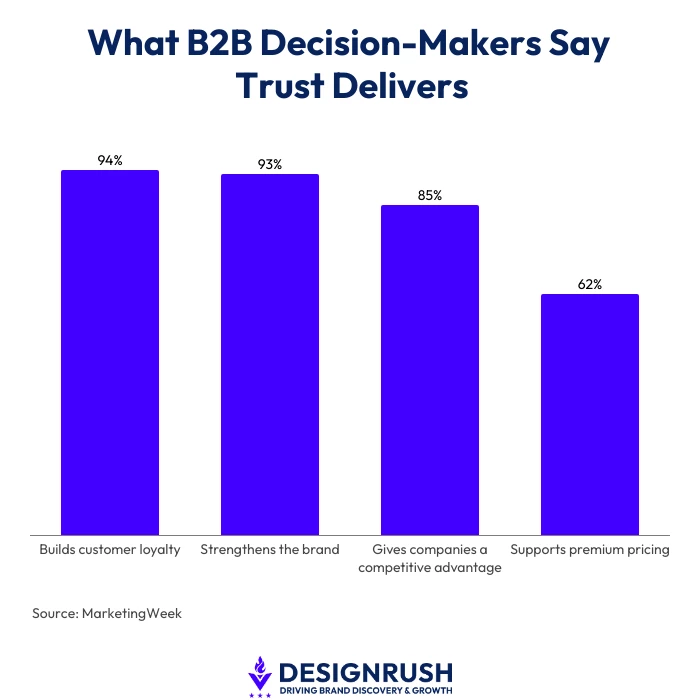
As many as 85% of B2B decision-makers said trust gives companies a competitive advantage, per findings from IPA and Financial Times cited by MarketingWeek.
The same research found that 94% believe trust builds customer loyalty, 93% say it strengthens the brand, and 62% think it supports premium pricing.
Respondents also linked trust to reliability, competent human interaction, and data security.
And for many buyers, a company’s website is where they decide whether a business has earned their trust or put the sale at risk before it started.
That is the problem GoingClear addresses in its updated 22 Must-Haves for B2B Websites eBook, which starts with trust, design, and navigation.
Founder and chief B2B website strategist, Paul J. Scott, explains that buyers who stumble across a poor website can judge a company long before they ever make contact.
"If I can't work out what you do or find something that backs up what you're telling me, that's already a problem before I get anywhere near a form," Scott says.
Buyers Need Proof They Can Check
Testimonials and case studies only help if buyers actually see them.
"Put the proof where they are already looking for an answer, not on a page they may never reach," Scott adds.
Someone arriving from search or a referral should not have to piece together what the company does from several different pages. If the offer takes that much work to understand, the site is already asking too much of them.
If those answers only come on a sales call, the sales team is then left filling in gaps that the B2B website should have covered.
GoingClear addresses those gaps in its G³ Framework, with the “Give Knowledge” criteria covering guides, resource hubs, messaging, and other content that helps visitors find the information they need.
"The strongest proof is specific to the problem a buyer is trying to solve. Give them enough detail to judge whether your experience actually applies to them," Scott says.
Confusing Navigation Makes Buyers Work
A visitor may have no idea which department handles what, and several pages that seem to offer the same service only make things harder.
GoingClear tests page labels and navigation with users before deciding how the site should be organized.
"Listen to the language buyers use when they talk to sales. That language is often a better starting point for navigation than the names companies use internally," Scott says.
An old service page or a dead link can create the same kind of doubt, especially when another page says something different.
Sales Questions Can Expose Website Gaps
Scott points to four checks that can show where the website is falling short:
1. Start with what prospects keep asking
Questions about services, fit, or what happens next can point to information that is missing or difficult to find.
2. Compare the site with what sales is selling now
An older case study may still be accurate while saying little about the work the company wants to win today.
3. Submit the forms yourself
Follow the contact path, see where the inquiry goes, and check what the buyer receives next.
4. Give high-intent pages an owner
Services, teams, and offers change, and those pages can fall behind if nobody is responsible for keeping them accurate.
"If sales keeps having to explain what the website should already have answered, something is wrong," Scott says.
"The buyer should come into that conversation ready to talk about their problem, not still trying to figure out what you do."