
Fireart’s 2026 web design trends report takes a hammer to premium website sameness, trading cookie-cutter polish for raw geometry, high-contrast typography, and textures borrowed from the physical world.
That pushback comes as brands selling entirely different products start to look interchangeable, leaving customers with fewer reasons to remember one over another.
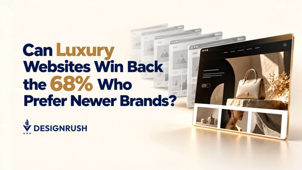
Sixty-eight percent of U.S. luxury consumers said newer or disruptive brands better reflect their identity, compared with 63% who said the same of established luxury houses, according to McKinsey’s June 2026 report on luxury consumers in the United States and China.
That leaves established luxury brands with one question to answer.
Does their website give customers a reason to feel connected to the brand, or does it simply display expensive products?
Lidia Drzewiecka, Founder and Creative Director at Visuable, says that distinction must come through without making shopping harder.
"The customer should remember the brand, not the effort it took to navigate the website," she says.
How premium brands can make their websites feel distinctive
So, what does a website tell customers about a brand before they’ve read its story or even recognized its logo?
Would the combination of imagery, typography, language, and presentation still feel identifiable without the brand name at the top?
As much as 40% of consumers’ perceptions of a brand’s value can stem from factors beyond price, Deloitte reported in June 2025.
And 88% of consumers across 15 countries also said brand trust was an important purchase factor, according to Edelman’s 2026 Trust Barometer special report.
But a premium price and a promise of quality only go so far if the website fails to convey what sets the brand apart.
Visuable uses typography, color, photography, and art direction to express that distinction while keeping shopping intuitive.
For Maison Munch, Visuable developed a complete brand identity and Shopify website using refined typography, a neutral palette, and editorial photography to give its luxury dog accessories the look of high-end fashion products.
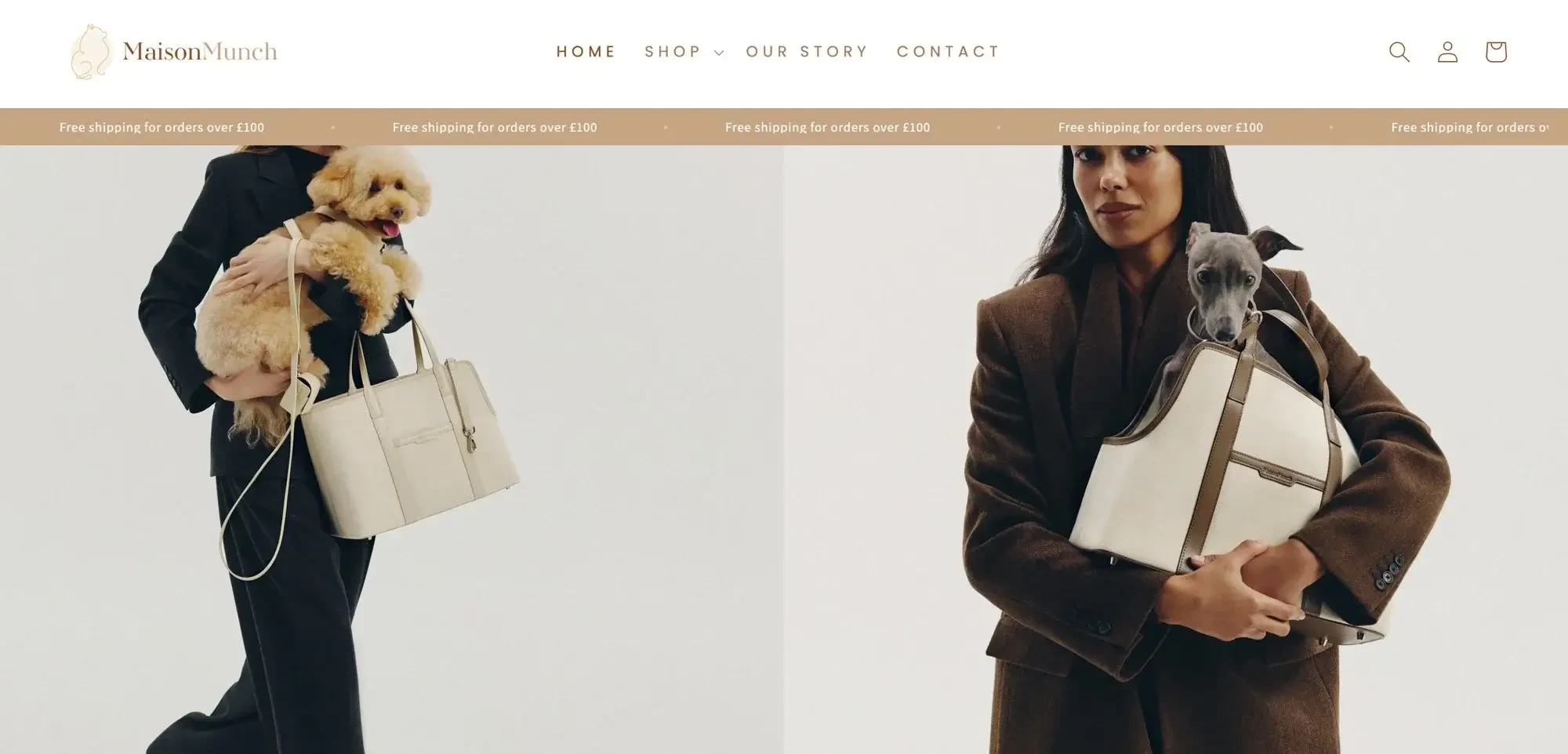
The agency combined:
- Refined typography: A modern serif paired with clean sans-serif text gives the website an editorial feel associated with luxury fashion.
- Soft, neutral color palette: Understated colors reinforce the brand’s premium positioning and complement the product photography.
- Editorial product presentation: Large images, generous white space, and consistent product photography give each accessory room to stand out and highlight its craftsmanship.
- Intuitive navigation: A stripped-back menu and consistent product layouts help shoppers browse the collection without unnecessary distractions.
- Immersive imagery: Tightly framed photography, natural lighting, and zoom functionality let shoppers examine product details more closely.
- Clear path to purchase: Minimal product descriptions and uncluttered shopping and checkout areas help customers move from browsing to buying without unnecessary steps.
"The result is a cohesive brand and ecommerce experience that positions each product as a considered design object while making shopping feel effortless," Drzewiecka says.
How can distinctive website design support conversions?
Drzewiecka also says design should support the entire purchase journey, from the first impression to checkout.
"The real value lies in knowing which structural decisions should already be solved, and where a brand genuinely needs room to be different."
For Arbor Row, the challenge was to showcase luxury homeware while communicating the craftsmanship behind each piece.
Visuable paired story-driven product pages and high-resolution imagery with organized categories and advanced filters, helping shoppers narrow their options while learning more about the products.
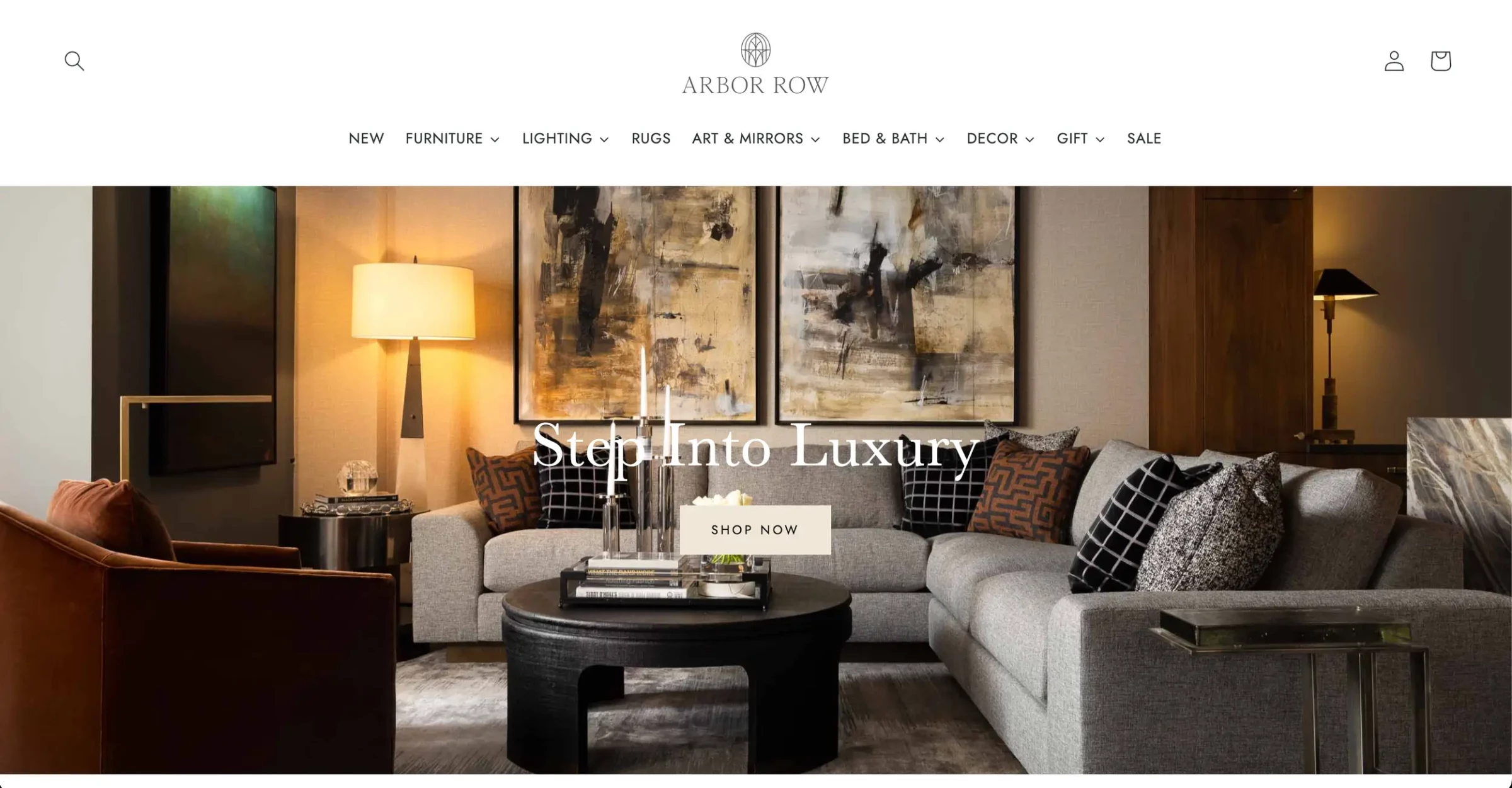
Related-product suggestions give shoppers more pieces to consider, while a clear visual hierarchy and calls to action guide them towards a purchase.
"Premium design does not need to mean complicated design," Drzewiecka adds.
"In fact, the more elevated the visual experience becomes, the more important it is that the underlying customer journey remains simple."
She adds that the structure of an online store should reflect the size of its product range.
For Stella’s Kitchen, a Visuable client with a smaller catalog, the journey can move directly through "brand introduction, product benefits, trust-building information, and purchase."
The site also needed to accommodate two buying patterns:
- Customers ordering individual meals
- And those signing up for weekly subscriptions
Visuable created separate purchase paths and used dietary labels such as Whole, Primal, Paleo and Low Carb to help customers find meals that suited their preferences, while founder stories and sourcing details gave them more information about the brand.
For Grill and Gear, the challenge was helping shoppers navigate an expanding catalog of grills, fuels, accessories, heaters and camping gear.
Visuable grouped products into clear categories through a mega menu, while image-led product listings displayed prices and availability upfront so shoppers could compare options before opening individual product pages.
Those pages also feature related products and suggested accessories, giving customers relevant options to consider alongside their initial purchase.
Drzewiecka recommends four elements to help shoppers make a purchase decision:
- Product details: Cover sizing and fit for clothing, or dimensions, materials, delivery, and care for furniture.
- Photography: Show the product clearly, including details and how it looks or works in real life.
- Quality signals: For higher-priced items, include craftsmanship details, customer reviews, or other trust signals.
- Page hierarchy: Keep essential purchase information and the call to action prominent, with supporting details organized into sections or accordions.
Likewise, product pages need to answer the questions shoppers would ask in a physical store.
Drzewiecka describes them as “the digital equivalent of picking something up in a shop,” where imagery and written details compensate customers for being unable to handle a product before buying.
The information required depends on the product.
When shoppers cannot inspect a product in person, missing information can leave them unsure about committing to a purchase.
Drzewiecka concludes that product pages should address the doubts most likely to delay a decision, from fit and sizing in fashion to dimensions, materials and delivery requirements for furniture.
Why premium website design needs to do more than look good
A premium website can make a strong first impression and still lose buyers if customers struggle to understand the brand, find the right products or feel confident enough to complete a purchase.
As Visuable’s work with Maison Munch, Arbor Row, Stella’s Kitchen and Grill and Gear demonstrates, there is no single formula for an effective ecommerce website.
Each brand needs a distinctive visual identity and a shopping experience shaped around its products and customers.
The goal is to make the brand memorable while keeping the buying journey simple.
When design, navigation, product information and trust signals work together, a website can do more than communicate premium positioning.
It can give customers a reason to choose the brand and the confidence to buy.