
YouTube is once again testing a desktop layout that pushes comments into a sidebar on the right and shrinks the video player to make room for larger recommendations underneath.
Viewers noticed quickly, and the response hasn’t been friendly.
Some are already installing browser filters and extensions built specifically to undo the change before it becomes permanent.
YouTube has said its interface changes are meant to give more screen space to content, but the current test raises the same question the last one did.
How much of a page’s primary job should a company give up for the features surrounding it?
Alex Khmelevsky, Head of UX at design and branding studio Clay Global, has spent his career helping brands make exactly this kind of trade-off.
His take on YouTube’s second attempt offers a useful framework for any company weighing a redesign its own users might resist.
Reviving a Design Users Already Rejected
Bringing back a layout that failed once isn’t automatically a mistake, but it does require a reason.
Khmelevsky says a company shouldn’t repeat an experience without evidence that the result will land differently this time.
"If you’re bringing back the same experience, you should have a good reason to believe the outcome will be different.
"User behavior changes, and sometimes an idea is right, but the execution isn’t."
Without that evidence, a second attempt risks reading as stubbornness rather than iteration.
"Without new evidence or meaningful changes, you’re just asking users to accept something many of them have already said doesn’t work," Khmelevsky adds.
YouTube has framed the change as an effort to give more screen space to content, but that rationale doesn’t address why viewers pushed back on a similar layout the first time around.
How Much Room Secondary Features Deserve
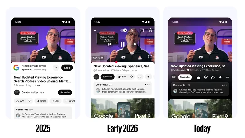
The test shrinks YouTube’s video player to make room for comments and oversized recommendations below it.
This forces a judgment call every redesign eventually faces: what’s the page actually for, and how much can you hand over to everything else?
Khmelevsky starts with intent.
"I’d start with why people came to that screen in the first place," he says.
"Most people are on YouTube to watch videos. Comments and recommendations are valuable, but they shouldn’t compete with the content itself."
He added that he watches almost exclusively in Theater mode for that reason, preferring the player to take up as much of the screen as it can.
That doesn’t mean a one-size layout is the answer, Khmelevsky said.
Someone reading through comments wants something different from someone settling in for a documentary, and he argued interfaces need to serve both.
"A good interface should accommodate both without forcing everyone into the same experience," he adds.
There’s data behind that tension.
Research from Adobe found that roughly half of consumers will stop engaging with a brand once a personalized experience starts to feel irrelevant or out of step with what they actually want.
That line between helpful and intrusive personalization is also the focus of a talk from UXDX, which looks at where AI-driven personalization starts to build user trust and where it tips into breaking it:
Applied to YouTube, that cuts both ways. Recommendations given more screen real estate only pay off if they’re relevant enough to justify the space.
There’s also a case for the opposite argument.
Deloitte research on media consumption found that about 40% of fans, and closer to half among Gen Z and millennial viewers, wish they could pull everything related to a favorite creator or franchise into a single place rather than hunting across platforms for it.
That doesn’t validate YouTube’s specific sidebar execution, but it does complicate any argument that secondary content should simply get out of the way.
Some viewers genuinely want more of it visible, not less.
What the Workarounds Are Really Signaling
Perhaps the clearest sign of how this test is landing isn’t in YouTube’s own metrics.
It’s in the fact that a segment of users cared enough to go find or build tools to reverse the layout entirely.
Khmelevsky says that behavior deserves attention even if it isn’t proof of a company-wide failure.
"When people go out of their way to install an extension just to undo your redesign, that’s worth paying attention to."
"I don’t think it’s proof that everyone dislikes the change, but it’s a strong reason to investigate."
Standard engagement numbers can miss that frustration entirely, he adds.
"Analytics might still show those people watching videos every day."
"What it won’t necessarily tell you is how frustrated those users are or how much effort they’re putting into avoiding the new experience."
That distinction applies well beyond YouTube’s scale.
Most companies don’t have the user base to absorb a redesign backlash and keep testing anyway, which makes the rollout process itself matter more, not less.
Khmelevsky recommended starting narrow.
"I’d start with a relatively small audience, look at how the change affects different types of users, and combine behavioral data with direct feedback," he says.
For brands without YouTube’s cushion, the margin for error shrinks considerably.
"Smaller companies have less room for error, particularly when they have a loyal audience that uses their product every day," Khmelevsky adds.
"I’d involve existing customers early, test prototypes before committing to development, and introduce major changes gradually.”
Clay’s post on customer journey mapping explores how teams can uncover the frustration and friction behind user behavior:
Scale isn’t the deciding factor in getting this right, he said.
"You don’t need YouTube’s scale to make good design decisions."
"You need to understand what your users value and be willing to change course when something isn’t working."
YouTube hasn’t said whether this second sidebar test will stick around longer than the first one did.
Given how quickly viewers reached for extensions to reverse it, YouTube may end up getting its answer the same way it has before: from users who didn’t wait for an official response.