
Every website redesign starts with a bunch of questions and decisions.
What should the navigation look like? How should content be organized? Which audiences deserve their own paths?
What belongs in the primary menu? What should the homepage prioritize?
For B2B organizations, those choices get even more complicated because the website often needs to serve multiple audiences across a longer buying journey.
The problem is that many of these decisions are still made largely through internal discussion.
Marketing has one opinion, sales has another, and leadership settles it, all without asking users.
For Rightworks, a B2B SaaS company serving accounting firms with cloud technology and cybersecurity solutions, our team at GoingClear brought users into that decision instead.
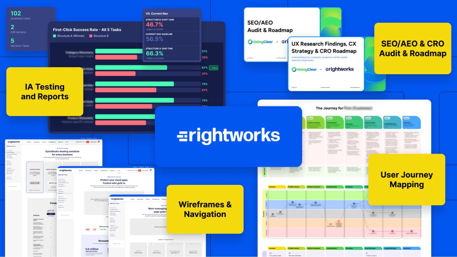
Rather than moving directly into a website redesign, we spent 90 days helping the company figure out what its future website needed to do.
That meant validating the biggest decisions before design or development began.
When the New Website Still Confuses Everyone
Budget and timeline get the attention in most website redesigns. Development, content migration, SEO, and internal resources tend to cause real problems.
The risk that's easier to miss is a site that ships on time and on budget and still doesn't work for the people using it.
That risk usually hides in three places.
- Good visual design doesn't guarantee usable navigation.
- Strong engineering doesn't guarantee customers can find the product.
- Clear writing doesn't guarantee information is organized the way people look for it.
Navigation, findability, and organization are all decisions made early. Once they reach design and development, changing them gets expensive fast.
That's why we wanted to validate the foundation first.
Start by Listening Before Designing
Our work with Rightworks began with research rather than screens.
We ran more than 20 in-depth interviews, some inside the company, some with customers already using the product, a few with prospects who hadn't bought yet.
Every question dug into how people reason through a decision.
What are customers trying to accomplish? What questions do they have? How do they evaluate solutions?
What terminology makes sense to them? Where does friction occur? What information helps them move forward?
Those conversations shaped the customer journey maps and user flows that came next.
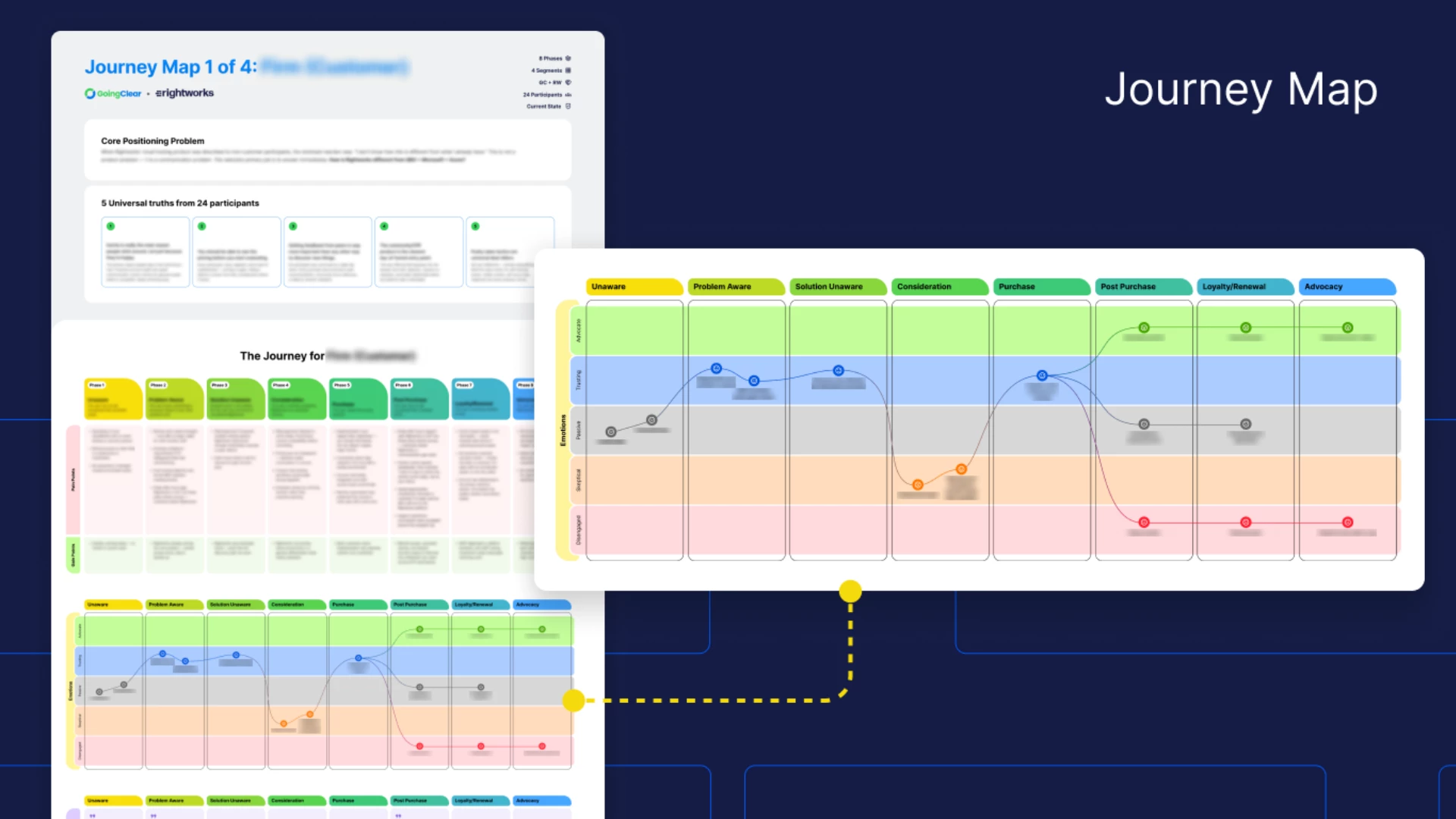
They also fed directly into the information architecture, the wireframes, and the strategic recommendations we delivered.
But there was one particularly important area we wanted to validate at a much larger scale: website navigation.
Putting the Navigation in Front of 100+ Users
Navigation is one of those website elements that can look perfectly logical on a whiteboard.
Until someone tries to use it.
For Rightworks, we developed multiple information architecture concepts and then conducted structured navigation testing with more than 100 participants.
The testing didn't ask whether people liked a navigation concept. It measured whether they could actually find what they were looking for in it.
Good UX research measures whether the structure you built matches how people naturally look for information, not whether they liked it or would have designed it differently themselves.
A sample of that size turns individual opinions into real patterns. Areas of confusion become easier to identify. Labels that seemed obvious internally can suddenly look less obvious. Paths that work well become easier to defend.
Most importantly, decisions stop being subjective. Instead of "We think this navigation works better," it becomes "users were more successful with this navigation."
And that's a very different conversation.
Research Doesn't Eliminate Creativity. It Gives It Direction.
There's sometimes a misconception that research-driven website projects somehow limit creativity.
We’ve found the opposite.
When strategy and UX questions are resolved earlier, designers have a stronger foundation from which to work.
The team isn't asking design to solve unanswered business problems.
They already have clarity around audiences, journeys, information architecture, conversion opportunities, and website priorities.
In the Rightworks engagement, that research informed a broader website strategy. It covered customer journey maps, user flows, and a new sitemap and information architecture.
The deliverables also included more than 15 primary wireframes, conversion rate optimization recommendations, and a prioritized optimization roadmap.
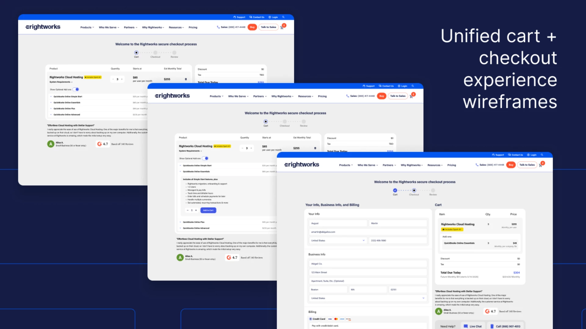
We also looked beyond UX.
The engagement also included a comprehensive SEO and Answer Engine Optimization assessment and a WordPress CMS strategy.
On the analytics side, the team built an enterprise attribution strategy spanning Salesforce, Marketo, Google Analytics 4, and Power BI.
The objective was to make sure the future website wasn't simply easier to use.
It needed to be easier to find, easier to measure, easier to manage, and better positioned to support the business.
De-Risk Before You Redesign
The biggest takeaway from this project isn't that every website redesign needs exactly 100 user tests.
It doesn't.
The takeaway is that the larger and more important the website investment becomes, the more valuable validation becomes.
If you're investing significant time and money into rebuilding one of your company's most important marketing and sales assets, it makes sense to test the assumptions underneath it before committing those assumptions to code.
- Interview customers customers.
- Study analytics
- Map journeys
- Test navigation
- Review search behavior
- Understand conversion paths
Only then do you start with the design.
At GoingClear, we've found that some of the most valuable work on a website redesign happens before anyone opens a design file.
Because the goal shouldn't simply be to launch a new website.
The goal should be to launch the right website.
And sometimes the best way to reduce the risk of getting it wrong is remarkably simple: ask the people who are actually going to use it.