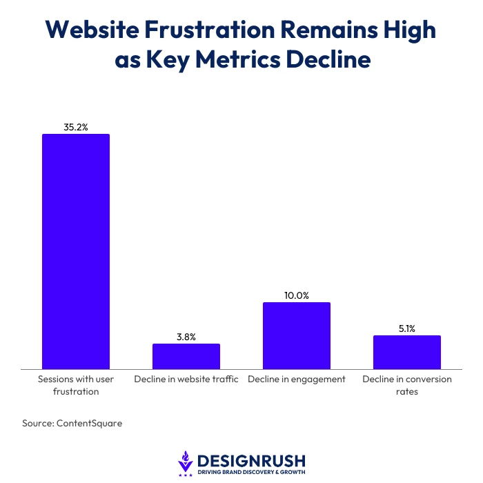
More than 35.2% of online sessions still frustrate users, according to ContentSquare.
The company’s 2026 Digital Experience Benchmark report adds that website traffic has also fallen 3.8% year-on-year, while engagement has dropped by as much as 10% and conversion rates declined by 5.1%.
“That means every visit is becoming harder to earn,” says RainCastle President, Donato Dandreo.
“And when someone does reach your website, they may already have very little patience for a difficult experience.”
At the same time, websites themselves have become more complex.
Organizations are creating more content to give visitors information that is specific to their needs.
That kind of personalization might mean separate pages for different industries or audiences, case studies, resources, FAQs, service or product categories, and other content designed to answer increasingly specific questions.
“That’s a good thing. More relevant content can create a better experience and help organizations reach people through search,” Dandreo adds.
“But it also means websites are much larger than they used to be.”
The more content a website has, the more important it becomes for visitors to quickly identify what is relevant to them.
That creates one of the core challenges of modern web design.
How do you give people more relevant information without making them work harder to find it?
Website Usability Starts With Clarity
The first job of a website is not simply to look impressive. It needs to quickly reassure visitors by answering two questions:
- Am I in the right place?
- Can I easily find what I need?
If a website cannot pass that test, its visual design will not solve the underlying problem.
“A website can look great, but if people can’t find what they need, it’s not doing its job,” says Dandreo.
“Good design should make the experience easier without making people think about why it’s easier.”
There is another major piece of usability as well. The content itself.
Clear, concise, scannable writing plays an important role in making any website easier to use.
That makes design and structure especially important because they determine how easily visitors can find and act on the content they need.
So, what actually makes a website easier to use?
According to Dandreo, there are five areas to consider:
1. Make It Immediately Clear Where Users Have Landed
When someone arrives on your website, whether through the homepage, a search result, an advertisement, or a direct link, they should quickly understand who you are and whether what you offer is relevant to them.
Many websites try to be clever or abstract in their opening message.
That can work for some very well-known brands, but for most businesses and organizations, clarity is more important.
A clear headline and supporting text can immediately ground visitors and give them confidence that they have reached the right place.
Understanding user intent can help make those decisions.
For a redesign of the Belmar Pharma Solutions website, RainCastle began with keyword research, an AI brand visibility audit, and an analysis of customer service calls.
Those calls revealed questions that patients and healthcare providers were already asking.
That information then helped inform the sitemap, wireframes, navigation, and content.
The resulting site gave patients and providers distinct paths and prominent access to common tasks, such as refilling a prescription, finding a medication, registering as a provider, or placing an order.
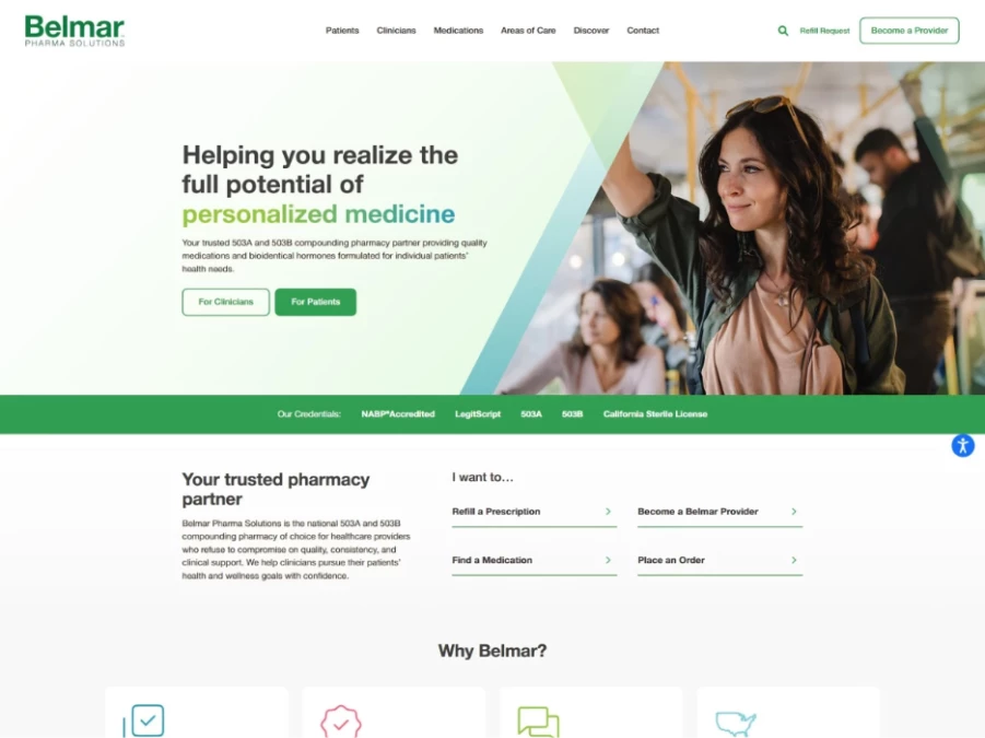
The site was featured in DesignRush's Best Website Designs, where its navigation, patient-focused UX, content structure, and visual design were reviewed.
“People don’t come to your website thinking about your departments,” Dandreo explains.
“They come because they need to do something. If you know the main reasons they’re there, those paths should be right in front of them.”
RainCastle took a similar user-focused approach to the Maine Medical Association website, focusing on making information easier to find across devices.
2. Make Personalized Information Easy to Find
Once an organization has created all of that tailored content, the next challenge is making it accessible.
Simply creating more pages does not necessarily improve the experience. Visitors still need an intuitive way to reach them.
Navigation and information architecture therefore become increasingly important as websites grow.
A visitor may need information tailored to their industry, condition, location, role, or particular challenge.
The website needs to help them move from broad information to increasingly specific content without making them hunt for the next step.
On the Belmar website, for example, visitors can move from a broad area of care into a health topic and then into specific treatment information.
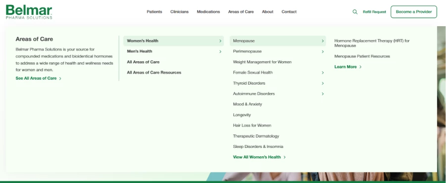
This type of progressive navigation allows someone to reach content several levels deep without repeatedly loading pages just to determine where that content lives.
The goal is not necessarily to eliminate clicks. It’s to make every click feel logical.
A visitor looking for something very specific may need to go three or four levels into a site. That can still be a good user experience if each step clearly moves them closer to what they need.
Scroll depth matters here as well.
“People are not going to scroll indefinitely looking for an important link, action, or piece of information,” Dandreo says.
“If something critical is buried several screens down a page, many visitors may never reach it.”
Important actions and pathways should therefore appear relatively early on key pages rather than requiring visitors to work through long sections of content before discovering what to do next.
The same principle applies to dense blocks of text.
Most visitors are scanning before they are reading. Design should support that behavior through clear headings, visual hierarchy, spacing, shorter sections, and obvious pathways to additional information.
Medication and condition pages on the Belmar website follow this principle as well.
A page on low-dose naltrexone, for example, first helps visitors understand the treatment before presenting available dosage forms.
3. Don’t Make Users Wait
High-quality visuals matter. Animation can matter. A polished, modern experience matters.
But people do not want to wait for any of it.
Performance needs to be considered as part of the design process rather than treated as something to address after the website has been built.
Images, scripts, animations, video, third-party tools, and other page elements all add weight.
“Every additional element should therefore provide enough value to justify the performance cost,” Dandreo says.
“This is particularly important because a website that loads quickly on a fast office internet connection may perform very differently for someone using a mobile network or a slower device.”
Long pages deserve scrutiny as well.
If very few visitors ever reach the bottom of a page, continuing to add content may not improve the experience. It may simply create a larger page that takes longer to load and requires more scrolling.
Analytics and user behavior can help determine what people actually use, how far they scroll, where they leave, and which information deserves the most prominent placement.
YouTube channel, TAHCHE, looks at how website usability can affect what happens after visitors arrive, including the role of navigation, page speed, and layout in the user experience:
4. Design for the Device, Not Just the Screen Size
Responsive design is now expected.
But making everything technically fit on a smaller screen is not the same as creating a strong mobile experience.
Consider what someone using that particular device is most likely trying to accomplish.
If phone calls are an important conversion for your business, for example, the phone number should be prominent and easy to tap on mobile rather than buried inside a navigation menu.
“The same principle applies to directions, forms, appointment scheduling, product ordering, registration, and other important actions,” Dandreo adds.
“The experience should be evaluated on desktop, tablet, and mobile based not only on whether the layout works, but whether the most important tasks remain easy to accomplish.”
Accessibility is part of that experience as well.
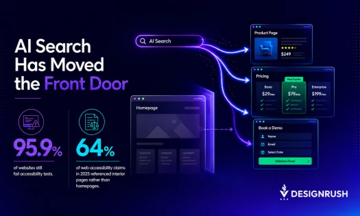
WebAIM’s 2026 analysis of one million homepages found that 95.9% had detectable WCAG 2 failures, up from 94.8% the previous year.
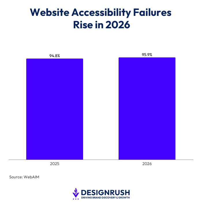
Researchers detected more than 56.1 million accessibility errors. Low-contrast text appeared on 83.9% of homepages, 53.1% had missing alternative text for images, and 51% had missing form input labels.
Those are not simply technical issues. They are usability issues.
“If someone is struggling to read a page or figure out where to go next, something isn’t working,” Dandreo says.
“You have to think about that while you’re designing the site, not once everything is already built.”
5. Don’t Make Users Relearn Your Website From Page to Page
Consistency is another important part of usability. But consistency is about more than using the same colors and fonts.
A website should also behave consistently.
As visitors move from one section to another, they should recognize familiar patterns for navigation, calls to action, page hierarchy, tabs, buttons, forms, and other interactive elements.
The website can still accommodate different types of content and page structures, but users should not feel as though they need to learn a new interface every time they click.
Flexible, component-based layouts can help accomplish this.
They give designers enough variation to properly present different content while preserving predictable patterns throughout the website.
Visual consistency still matters as well.
Belmar’s established blue and orange brand colors, typography, imagery, and page styles carry across patient information, medication pages, and provider resources.
Likewise, RainCastle’s award-winning work for Spear Bio offers another example of creating a distinctive visual experience while maintaining a consistent system throughout the site.
Trust signals should also be considered as part of the experience. But what builds trust varies considerably by industry.
“On Belmar’s website, that includes NABP accreditation, LegitScript certification, 503A and 503B information, and licensing information,” Dandreo says.
“On another website it might include customer testimonials, case studies, security information, measurable results, certifications, pricing information, or industry affiliations.”
The important question is not simply whether these trust signals exist.
It is whether visitors encounter them at the moment they are deciding whether to move forward.
Give Your Website a Quick Usability Check
You do not need to conduct a complete website audit to uncover some of the most obvious areas of friction.
Before you begin, run this exercise on both desktop and mobile.
Marketers naturally spend a significant amount of time looking at their websites on desktop computers while working.
This is a good opportunity to also walk through the experience on your phone and evaluate the website the way a large portion of your visitors may experience it.
To achieve this, Dandreo advises that brands should ask themselves seven questions:
- Within five seconds, is it clear who we are and what we do? Bonus points if it is also clear why someone should choose us.
- What are the three to five most important things visitors come here to do or find?
- Can I reach each of those things within one or two logical clicks?
- Are those pathways visible without requiring excessive scrolling?
- Do navigation, buttons, layouts, and other common elements behave consistently from page to page?
- On mobile, are the most important actions still prominent and easy to use?
- Are the trust signals someone needs before taking the next step available at the appropriate point in their journey?
This type of self-check can uncover a surprising amount.
But it is still only a starting point.
Some usability problems are difficult to identify simply by browsing your own website.
Nielsen Norman Group outlines six ways brands can test how effectively a website’s visual design supports usability and user behavior:
Test Website Performance Under Different Conditions
A website may feel fast when you test it from your office on a strong internet connection, but that does not necessarily reflect what every visitor experiences.
Tools such as Google PageSpeed Insights and GTmetrix can provide a more objective view of performance on your key landing pages.
“Where available, test under different devices and connection conditions rather than evaluating performance only under ideal circumstances,” Dandreo says.
“Pay particular attention to the pages where visitors commonly enter the website or take an important action.”
Run an Accessibility Check
Accessibility issues can also be difficult to identify through a visual review alone.
Automated tools such as UserWay or WAVE can provide a useful first pass and flag potential problems involving contrast, alternative text, form labels, page structure, and other accessibility considerations.
Automated testing should not be treated as proof that a website is fully accessible or compliant.
Manual review, keyboard testing, screen reader testing, and testing with real users may uncover issues that automated tools cannot.
But an automated scan can be a practical way to identify obvious problems and determine where deeper review may be warranted.
“Great web design is not any one of these things,” Dandreo says.
“It is messaging, navigation, information architecture, performance, accessibility, visual design, and trust working together.”
When those elements work well, visitors usually do not stop to think about the design.
They simply find what they need and know what to do next.