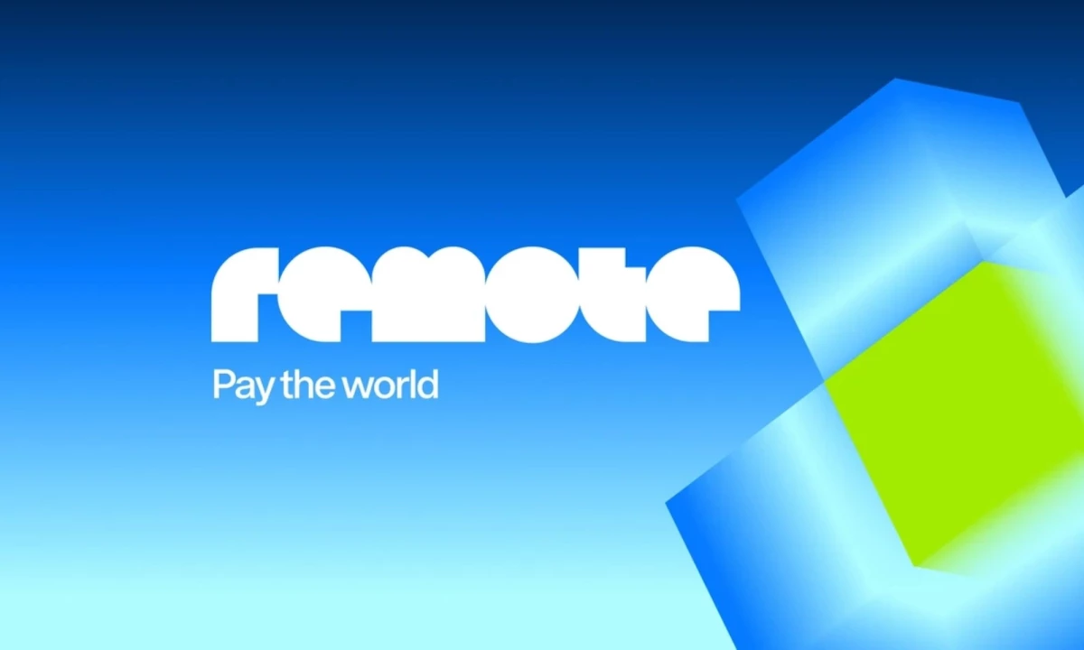

Remote's founding promise was that talent is everywhere and opportunity shouldn't depend on where someone is born.
Its new brand puts a practical condition on this brand promise.
People must get paid correctly, on time, and in their own currencies.
The global payroll company unveiled a new identity with creative agency COLLINS, anchored by banknote-inspired colors and a modular cube.
Its largest brand campaign to date, "For a World That Works," backs Remote's pitch as the financial operating system for the global workforce.
"Our new brand identity was created to build an external representation of our internal momentum," Remote VP of Corporate Marketing Leah Walters told DesignRush.
"With our recent decision to focus on the hardest challenge of paying anyone, anywhere, we needed a brand that reflected that. Everything in our brand identity grew from that focus."
The new focus highlights the company's infrastructure for payroll, employment, and contractor management.
"Our mission is distilled into three words: pay the world," Job van der Voort, Remote's co-founder and CEO, said in a press release.
The rebrand strategy also reflects a change in how Remote describes its business.
Remote was already calling itself a financial operating system in September, a month before the new visual identity arrived.
COLLINS Designs Remote's Global Payroll Identity
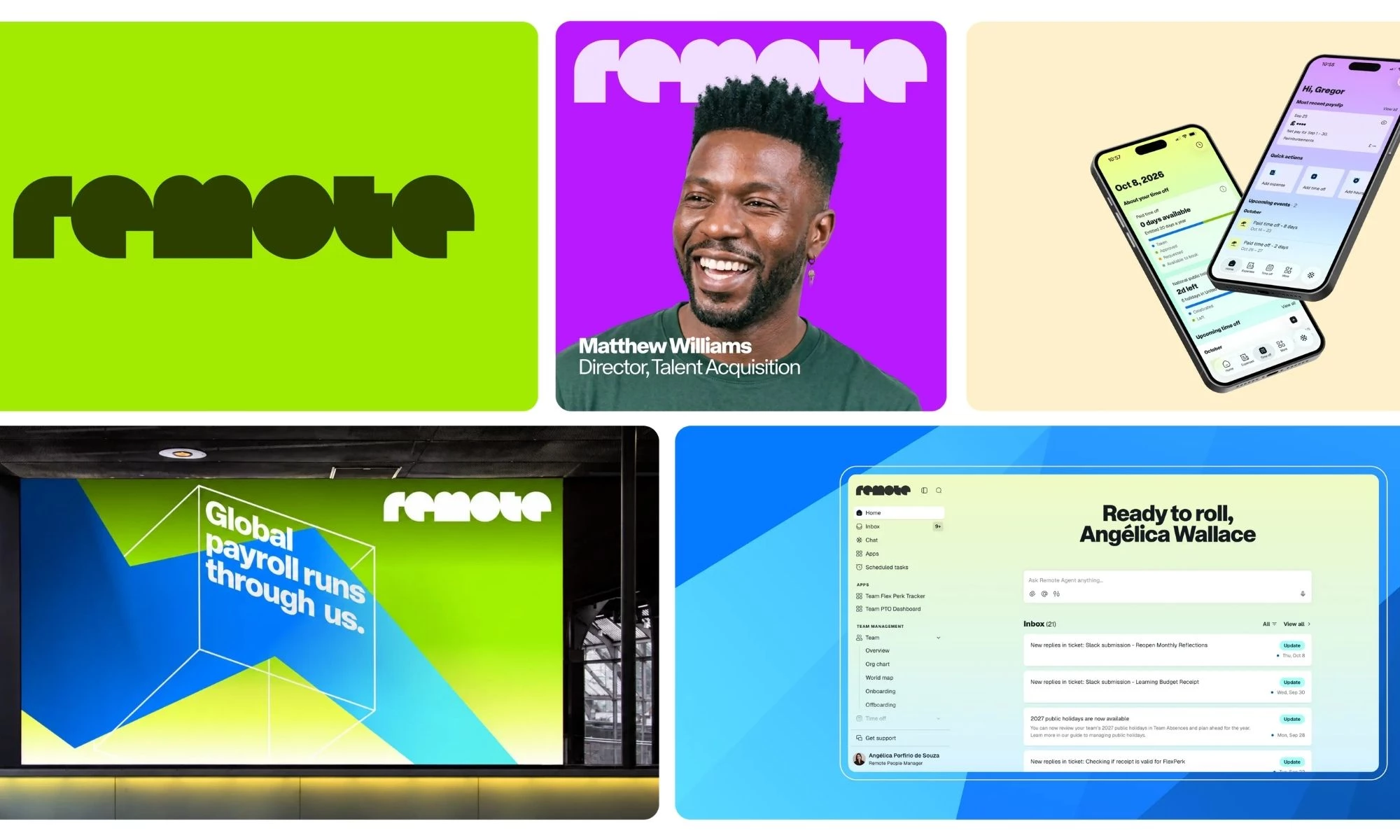
Remote's new identity uses visual elements drawn from the service it provides.
The color palette takes inspiration from international banknotes.
Reds, oranges, greens, blues, and violets stand for the 77-plus currencies that Remote uses to pay its clients' workers.
"We worked with COLLINS to build a color palette that is both entirely unique and has deep meaning behind it," Walters shared with us.
"Our customers rely on us to pay people all over the world and they will now see the currencies they use reflected in our brand."
A modular cube serves as the central graphic element, which Remote compares to bricks or shipping containers, "repeated parts that form one system."
Like these plain units, the cubes stack, rotate, extend, and merge in three treatments to mirror how companies configure the platform:
- Flat line drawings support diagrams and data.
- A one-point perspective version stretches toward a vanishing point.
- An isometric version maintains its form across dimensions.
COLLINS also redesigned Remote's logo and wordmark and paired the system with Rotina, a modernist sans-serif from type foundry Sharp Type.
The new identity stays recognizable on a billboard or a favicon, with room for whatever customers build on the platform.
Asked whether the cube's modular construction considered the AI agents that customers build, Walters answered, "Absolutely!"
"The modular design of our cube can grow, expand, be manipulated or animated to reflect the various ways our customers build with us."
"For a World That Works" runs in digital and out-of-home placements across seven U.S. and European cities this quarter, ending with a Stink Studios hero film.
Remote's design strategy connects a complex service to tangible visual cues.
This gives the company a way to explain its financial infrastructure before customers read the product details.
Remote's Payroll Growth Supports Its Repositioning
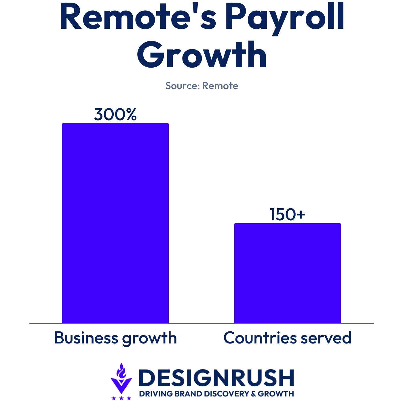
Remote says its payroll business grew 300% year over year and that it processes billions of dollars in payroll annually.
Its platform lets businesses hire and pay workers in more than 150 countries.
The company lists Anthropic, Box, GitLab, Lovable, Vercel, Miro, Datadog, and Zapier among its customers.
Remote says demand is expanding across industries outside of technology, increasing the need for a platform that combines payroll, EOR, and local compliance.
These developments offer three lessons for B2B marketing:
- Business growth can expose a positioning gap. Companies should update their brand language once a core service starts driving growth.
- Product details can give abstract services a visual language. Teams should translate operational features into recognizable design elements to make complex offerings easier to understand.
- Flexible platforms need identities for future use cases. Brands should build adaptable visual systems to keep new integrations and customer applications consistent with the core product.
A rebrand only sticks when customers can trace the new promise back to something the product actually does.
Our Take: Will Payroll Clients Get the Cube's Meaning?
Remote's cube gives customers a picture of the payroll infrastructure they never actually see.
We'd say most buyers will read the cube as infrastructure, since bricks and shipping containers are familiar building blocks.
Customers still need to connect the cubes and currency colors to the specific services that Remote runs.
Its product experience, website, and campaign copy have to show how the system handles payroll, EOR, and contractor management.
Paze cleared the same explanation hurdle with Elizabeth Banks and Gabrielle Union, using the actors' surnames to sell its bank-backed checkout.
Remote's rebrand will be most effective when the design system helps customers understand the service before a sales conversation begins.
Looking to clarify your company's positioning through a stronger visual identity?
Explore these top B2B branding agencies in DesignRush's directory.