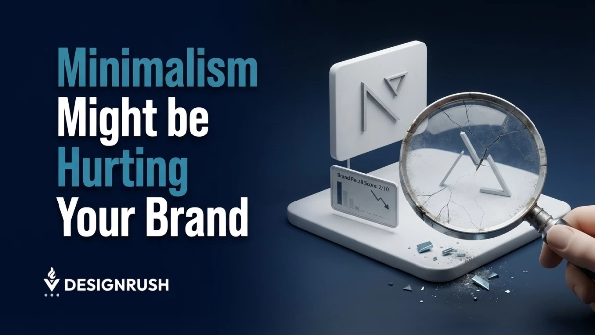

Minimalism, from simplified logos to restrained color palettes, has become one of the most popular choices in branding.
Across industries, brands are converging on visual identities that are easier to scale, easier to adapt across screens, and easier to manage across increasingly complex brand systems.
Now, there is nothing inherently wrong with that.
But in my years of experience building brands at ANML, the problem starts when simplicity becomes so common that it stops helping a brand stand apart.
I see this particularly often with growing brands.
An established company can afford to simplify its identity because the audience already knows what sits behind the logo.
But unfortunately, a growing brand does not have that luxury.
After all, a growing brand is still teaching people what it looks like, what it stands for, and why it should be remembered.
If the brand removes too many distinctive cues in the pursuit of a polished identity, it can end up looking professional without becoming recognizable.
Build Recognition Before Removing Distinction
Every brand needs recognizable assets, whether they be visual, verbal, behavioral, or experiential.
A particular color can become associated with a company. So can a distinctive typeface, illustration style, shape, sound, packaging format, or way of communicating.
Over time, those associations accumulate and shape how consumers identify, experience, and relate to a brand.
Since a growing brand hasn’t accumulated years of association, its branding has a lot of legwork to do.
And if they go with minimalist branding and try to compete with existing brands, it becomes that much more difficult to stand out and create those associations.
However, this doesn’t mean every emerging brand needs to be loud or complicated. But emerging brands have to make deliberate choices around their branding.
I would rather see a growing brand own one distinctive visual or verbal cue than add ten decorative elements simply to look different.
Distinctiveness doesn’t come from adding more. It comes from making certain elements recognizable and consistently associated with the brand.
Know When Simplicity Becomes Sameness
The challenge becomes more obvious when brands in the same category start making similar choices.
A financial services company adopts a clean sans serif. A consulting firm moves toward neutral colors and restrained typography. A consumer brand removes visual complexity and relies almost entirely on its wordmark.
Individually, these decisions can make sense.
But if everyone is simplifying in the same direction, simplicity stops functioning as differentiation and becomes a visual baseline.
This is where brand strategy has to come before aesthetic preference.
A brand shouldn’t ask whether a particular identity looks modern. That’s a secondary, maybe even tertiary, decision.
Instead, an emerging brand should start by asking what the identity communicates that competitors cannot communicate as easily.
Growing brands should pay particular attention to this because they are competing for recognition rather than simply maintaining it.
And the more crowded the category their brand is in, the more important distinctive cues become.
Give Distinctive Assets Room To Work
One of the mistakes I see in brand development is treating every element of an identity as equally important.
But they aren’t equally important.
A strong brand system should have elements that carry more recognition than others. Those are the assets worth protecting and repeating.
This is particularly important when a brand begins to scale.
As the number of channels grows, teams often respond by simplifying everything. They want an identity that works everywhere, so they remove anything that might create friction.
The result is a system that is technically flexible but underwhelmingly generic.
So instead of asking how to make every application as neutral as possible, I would ask which distinctive elements need to survive across every application.
For example:
- Preserving a particular color even when the rest of the palette becomes more restrained
- Keeping a distinctive typographic relationship rather than defaulting to a generic type system
- Developing a recognizable graphic device that can work across campaigns, products, and digital experiences
We faced exactly this on the Salesloft rebrand.
As the company combined with Clari into a broader platform, the brand had to stretch across far more pages, products, and audiences, and the instinct in that situation is to neutralize everything so it scales.
Instead, we carried one signature cue forward, a cluster of dots that resolves into an S, drawn from Salesloft’s previous identity.
Everything around it got more structured and restrained, but that mark stayed, so the larger brand still reads as unmistakably Salesloft rather than a generic enterprise refresh.

The goal here was to retain important and recognizable brand elements even when the expression or channel changes.
This is the key detail many brands miss when they opt for minimalist branding.
Minimalism can be sophisticated, but it can also feel generic.
The difference depends on what remains after everything unnecessary has been removed.
A brand does not become distinctive because it has more visual elements.
It becomes distinctive because the right elements are repeated consistently enough to become associated with it.
Make Simplicity Serve Distinction
Minimalism will continue to influence how brands look, and there is a good reason for that.
Simple systems can be easier to use, easier to scale, and more adaptable across an expanding range of brand experiences.
But for a growing company, minimalist branding needs to be balanced against the need to establish recognition in the first place.
At the end of the day, minimalism should make a brand clearer.
And businesses that plan to adopt minimalist branding need to make sure that what remains is unmistakably theirs.