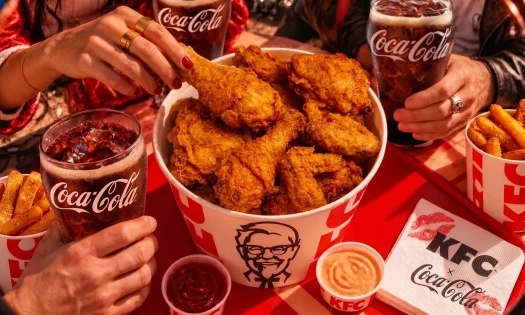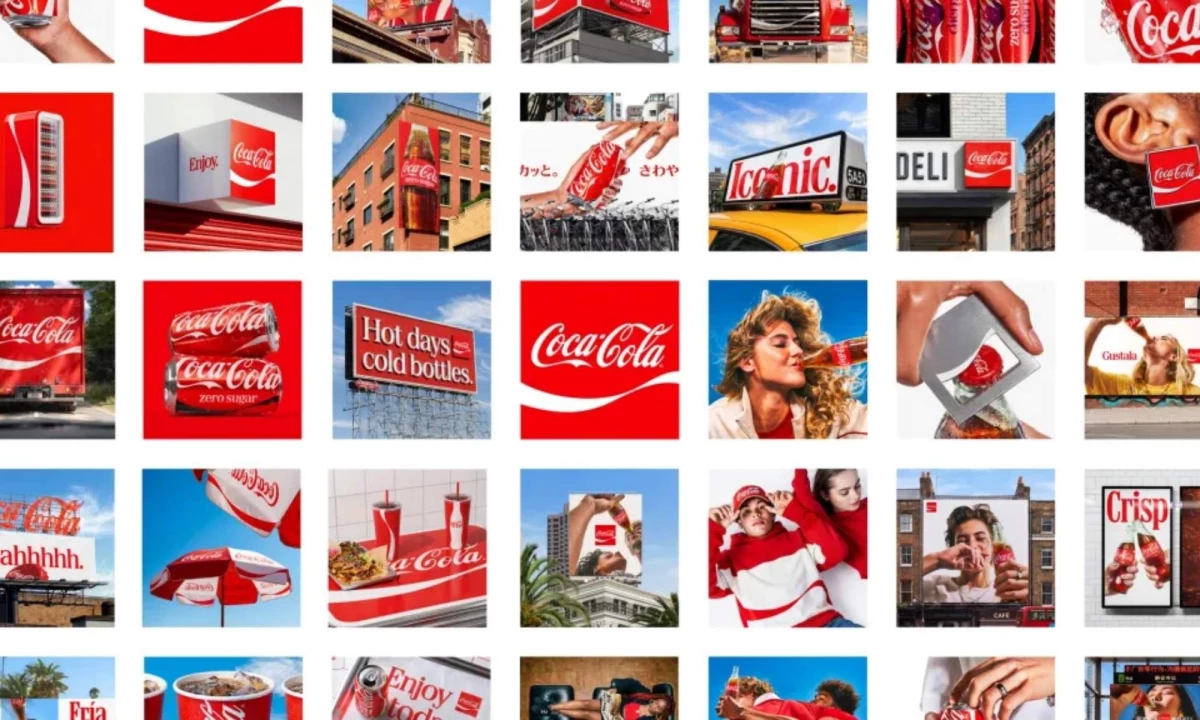

Coca-Cola is refining one of the world's most recognizable logos without changing what made it famous.
The company revealed a new global visual identity developed with branding agency JKR.
It gives greater prominence to its signature red-and-white brand colors, Spencerian script, Dynamic Ribbon, and Arden Square.
The redesign rolls out across more than 200 markets and extends from packaging and retail environments to digital experiences.
"This refresh is about being clearer and more consistent in how we show up, wherever people experience our brand," President of Coca-Cola Global Category, Arnab Roy, said in a statement.
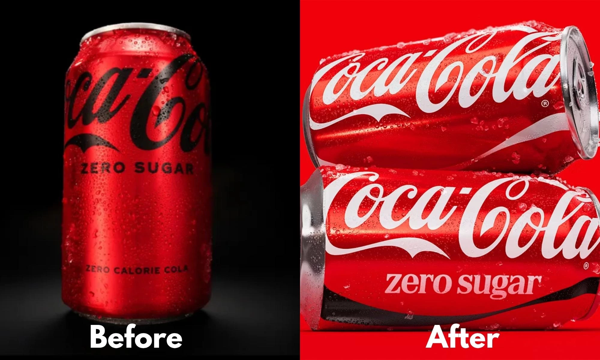
Meanwhile, Coca-Cola Zero Sugar reinforces its place in the brand with updated typography, a stronger black ribbon, and black PET bottle caps.
For a company serving more than 2.2 billion beverages every day, consistency has become as valuable as recognition.
The 1969 Dynamic Ribbon, Amplified
The redesign deliberately amplifies Coca-Cola's longest-standing visual cues.
JKR centers the visual identity around the Dynamic Ribbon, originally introduced in 1969 to unify the brand across expanding packaging formats.
The agency also strengthens the visibility of the Spencerian script, Arden Square, and signature color palette.
The updated design system will appear across cans, bottles, coolers, vending equipment, retail signage, and digital channels.
It creates a more recognizable experience regardless of where consumers encounter the brand.
Coca-Cola Zero Sugar also adopts a clearer hierarchy with larger "Zero Sugar" typography and prominent black accents that distinguish it from Coca-Cola Classic.
"For over a century, Coca‑Cola has been a global symbol of optimism and authenticity," The Coca‑Cola Company Global VP of Design Rapha Abreu added.
"Now, with one seamless visual identity, we can deliver one recognizable brand experience to consumers."
The redesign also arrives alongside a new Brand Center and AI-powered Design Intelligence tools that help maintain the system across markets.
The Brand Center gives internal teams and agency partners one source for approved assets, colors, and typography.
Design Intelligence, developed with Adobe and trained on Coca-Cola's archives, checks new work against the standards before it rolls out.
A centralized design system like this makes brand governance a daily production tool.
Local teams can pull approved assets and ship consistent executions on their own.
Karine Khamoyan, creative producer at multidisciplinary agency Shakuro, told DesignRush that the smartest call here is where Coca-Cola put the guardrails.
"Most global brands lose their consistency in the approval queue, where a design just sits for days waiting on someone to confirm it's on brand," she commented.
"Bake that check right into the tool, and a team anywhere gets an answer in seconds and keeps moving.
That's the real gap between a brand system that looks sharp in a launch deck and one that holds up when thousands of people are actually using it every day."
$60 Billion in Brand Value
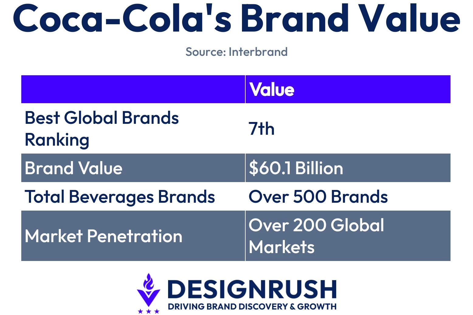
Coca-Cola ranks No. 7 on Interbrand's Best Global Brands list, with a brand value of $60.1 billion.
It is the world's largest total beverage company, with around 500 brands sold in more than 200 countries.
Brand power this strong makes consistency a competitive advantage.
Every market that renders the identity the same way compounds recognition, the asset that Interbrand is really pricing.
Our breakdown of the Coca-Cola logo shows how it used its visual assets to become one of the most recognized in branding.
Coca-Cola's global refresh highlights how enduring brand assets can outperform constant reinvention.
- Familiarity lowers decision friction. Brands should strengthen recognizable assets to make products easier to identify across every channel.
- Governance supports creativity. Teams should establish clear design systems to maintain consistency while allowing local adaptation.
- Technology scales brand identity. Organizations should pair creative standards with AI tools to improve execution across global networks.
The hard part is getting thousands of people across all markets to apply the new system every day, once the launch buzz fades.
Our Take: Did Coca-Cola Learn From Its AI Backlash?
Coca-Cola's AI holiday ads flopped two years running because the company kept handing AI the one job it's worst at, and that's making people feel something.
We think this redesign shows that Coca-Cola finally worked it out.
Design Intelligence puts AI on the grunt work, applying one visual system across 200 markets.
This move frees its designers to own the creative calls, the part that AI kept fumbling.
Handled this way, AI becomes the invisible quality-control layer behind the world's biggest brands.
JKR also delivered the same heritage-driven brand update for Schweppes months earlier, reviving its Skittle bottle and mascot Clive the Leopard.
That is two heritage revivals for Coca-Cola brands from one agency in under a year, a sign that this is becoming the company's default fix for a tired label.
A strong visual identity is only as effective as its execution.
Explore these top branding agencies to find partners that can create scalable identity systems across every customer channel.