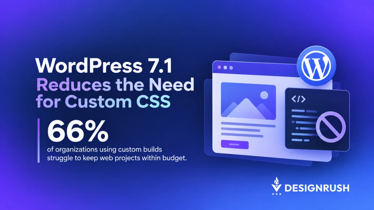

WordPress 7.1 now allows designers to set tablet and mobile styles inside the block editor, cutting the need for custom CSS for responsive adjustments the editor supports.
Released on August 19 of this year, the update added responsive styling to Global Styles and individual blocks. Theme developers can also set their own mobile and tablet breakpoints in theme.json.
A smaller heading on mobile or different tablet spacing can now be handled in the editor when the block supports those controls.
The desktop style remains the default, with mobile and tablet settings overriding it only where a different value has been set.
That line between native WordPress features and custom development is one that leading WordPress development agency, IT Monks, weighs when scoping redesign projects.
The agency’s Founder and CEO, Alex Osmichenko, says WordPress 7.1 gives agencies more reason to check what core can handle before adding custom work to the estimate.
“Before, even fairly standard responsive adjustments could end up in the development scope,” he says.
“Now you can look at those requirements and ask whether WordPress already handles them well enough before you write custom CSS.”
WordPress 7.1 Adds Responsive Styles to Block Editor
Users can switch the editor preview to tablet or mobile and apply style changes only to that screen size.
Global Styles can apply those changes across every instance of a block, while individual block settings keep them on a specific page.
The controls cover supported typography, color, background, borders, dimensions, spacing, and layout settings.
WordPress 7.1 builds on existing viewport visibility controls by allowing teams to change how supported blocks actually look at different screen sizes.
WordPress sets its default breakpoints at 480 pixels for mobile and 782 pixels for tablet. Theme developers can change both values in theme.json, so the responsive rules can match the widths used in a particular site design.
“If you’ve designed the mobile version around a specific breakpoint, you’re no longer stuck working around WordPress defaults,” Alex Osmichenko says.
“You can set those widths at the theme level and build around the breakpoints the design actually uses.”
Native Responsive Styles Change WordPress Redesign Scope
Routine responsive work can now stay inside WordPress when the required controls are available.
A mobile font-size change or tablet spacing adjustment no longer has to be handled through custom CSS simply because the desktop version needs to look different.
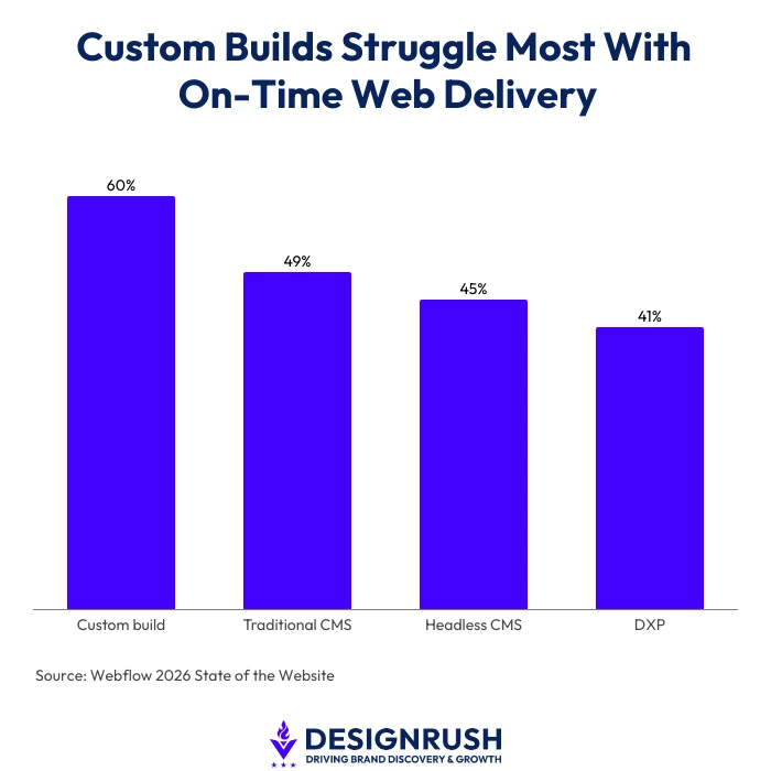
Webflow’s 2026 State of the Website report found that 60% of organizations using custom builds struggled to keep web projects on time, compared to 49% of traditional CMS users, 45% of headless CMS users, and 41% of DXP users.
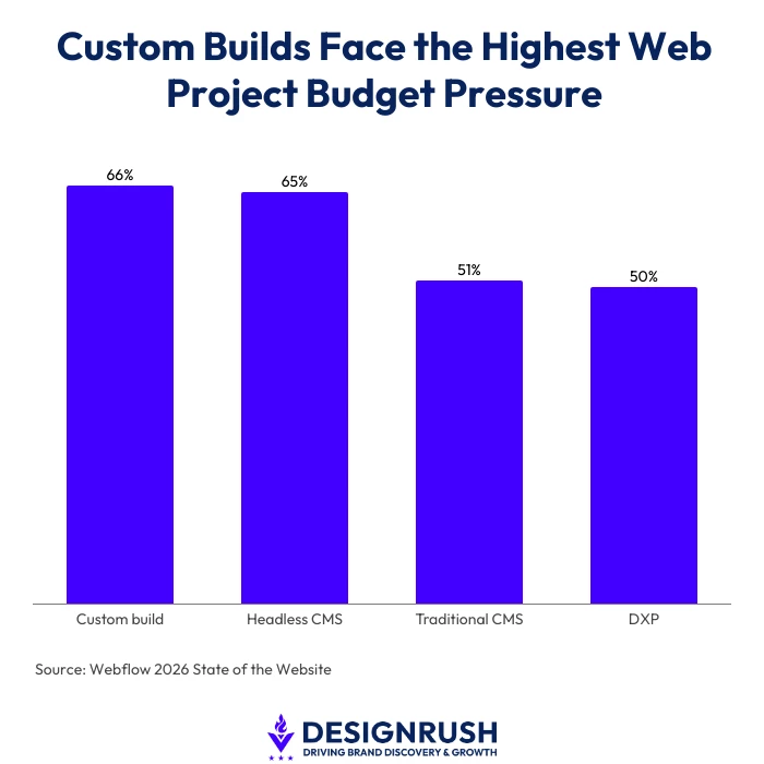
Budget pressures were also highest among custom builds, at 66%.
Headless CMS users followed at 65%, compared with 51% for traditional CMS users and 50% for DXP users.
After launch, supported styles saved through Global Styles or individual block settings remain editable inside WordPress without someone opening a stylesheet.
“If the client can change a mobile spacing value in the editor without touching CSS, we don’t need to build a developer handoff around that task,” Alex Osmichenko says.
“Developer time can go to the parts of the site that actually need code.”
That doesn’t give every WordPress redesign the same cost reduction.
The amount of work that moves into core depends on the theme, the blocks being used, and what the design asks those blocks to do.
Custom WordPress Development Beyond Core Responsive Styles
WordPress 7.1’s responsive styles are available only with block themes. Updating an existing WordPress site does not automatically give a classic theme the same controls.
Support also varies by block.
Blocks using WordPress core style supports can inherit responsive controls for properties such as typography, spacing, borders, color, dimensions, and layout.
Blocks with their own custom style controls do not receive that support automatically.
Before the scope is locked, teams can establish whether the site will use a block theme, whether the chosen blocks expose the settings the design needs, and whether the mobile and tablet behavior fits the breakpoints set for the theme.
They can also ask the agency to separate work that WordPress now handles natively from requirements that still need custom CSS or development.
“Go through the design screen by screen and make that split before you approve the scope,” Alex Osmichenko says.
“If something is still listed as custom, the agency should be able to tell you what WordPress can’t do there and why code is needed. You should know what those development hours are actually buying.”
The maintenance plan should also reflect who can make routine changes after launch and which parts of the site still need a developer.
So before approving your next WordPress redesign, can you tell which custom line items solve a limitation in core and which ones recreate something WordPress 7.1 already handles?