Domino's New Logo: Key Points
- Domino’s new identity introduces a brighter color palette, updated packaging, and a jingle sung by Shaboozey.
- The refresh highlights sensory-driven storytelling and aims to spark emotional connections beyond the product itself.
- Following Pizza Hut and Burger King, Domino’s update reaffirms the value of heritage in modern brand design.
Domino’s wants its branding to reflect the craveable aspects of its signature pizza.
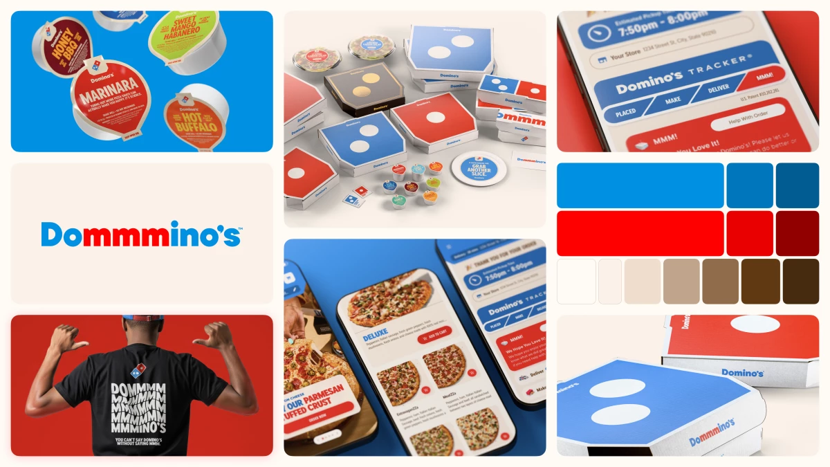
The world’s largest pizza chain has launched its first major brand refresh in over a decade, introducing a brighter look, bolder fonts, updated packaging, and even a sound logo that doubles as a craving cue.
Notably, the new campaign folds its name into the humming jingle “Dommmino’s,” and features the voice of five-time GRAMMY-nominated artist Shaboozey.
View this post on Instagram
According to Kate Trumbull, Domino’s executive vice president and global CMO, the shift brings the brand back to its roots.
“Over the past decade, we became known as a technology company that happens to sell pizza,” Trumbull said.
“But with our 'Hungry for MORE' strategy, we’re bringing the focus back to making and delivering the most delicious products and experience, which is what Domino's customers really want."
The refresh comes in alignment with modern food marketing, where brands use sound and sensory cues to spark emotional engagement.
For Domino’s, that cue comes in the form of a "Cravemark," its playful spin on its name designed to make customers smile (and salivate) before they even open the box.
Where Crave Meets Design
Rolling out across the U.S. and international markets, Domino’s new identity builds on its roots, while modernizing how it looks and feels.
Its brighter packaging puts the logo front and center in simple, instantly recognizable layouts.
A premium black-and-gold design will grace the boxes for its Handmade Pan and Parmesan Stuffed Crust pizzas, giving them a more indulgent feel.

The company’s signature red and blue now appear in hotter, more vibrant tones.
It serves as an intentional nod to the heat of a pizza fresh from the oven.
Its new typeface, "Domino’s Sans," carries rounder, doughier edges and playful curves that reinforce the brand’s warm, approachable image.
These elements will appear across physical stores, delivery boxes, dominos.com, the Domino’s app, and team member uniforms over the coming months.

Trumbull said the timing reflects momentum, not recovery.
“Most companies rebrand themselves when they're struggling, but after years of category-defying growth, this refresh is about continuing to push to be the best version of ourselves,” she added.
“It's vibrant, it's bold, and it's fun. It's pizza.”
What Marketers Can Learn from Domino's Modern Redesign
Domino’s rebrand is nothing short of a masterclass in sensory-driven brand storytelling.
- Modernizing brand assets should amplify a company’s heritage, not overwrite it.
- Introducing sound and tactile cues can make a brand more memorable.
- Coordinating packaging, logo design, and tone of voice strengthens the perception of the brand and creates a unified experience.
Similar efforts have emerged from other food chains like Pizza Hut, which recently did a silent and discreet touch-up on its logo.
View this post on Instagram
Overall, these fast-food classics showed that a return to roots can be a strategic advantage, not a regression.
Last year, Domino’s was ranked No. 364 on the Fortune 500 list, with $19.1 billion in global revenue.
Our Take: Can a Pizza Have a Soundtrack?
There’s something undeniably satisfying about a brand that knows what it tastes like... and sounds like.
Domino’s refresh is more than the chase for pretty aesthetics, because it puts craving into the brand’s DNA.
View this post on Instagram
I like that it’s unpretentious, straightforward, and simple: brighter boxes, rounder fonts, and a hum you can’t forget. It’s all very Domino’s.
To me, it's more a reminder than a reinvention.
Like when you hear “Dommmino’s,” you don’t need a tagline. You already know what’s coming out of the oven.
In other news, Cracker Barrel's logo redesign sparked a billboard battle between the brand and the Steak 'n Shake CEO.