Some SMB owners tend to have trouble generating the high-quality leads necessary to scale their businesses.
But instead of allocating more money towards advertising, perhaps they should look closer at their websites.
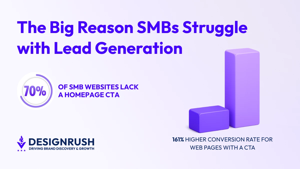
According to a WPBeginner report, 70% of small business sites are missing a homepage call-to-action, removing the most direct conversion path on the page.
This matters because studies show that simply having a clear and specific CTA can increase conversions by 161%.
View this post on Instagram
Sierra Goldstein, founder of Market Minds Creative, says this is a common design issue she and her agency encounter when onboarding new clients:
"Small business websites we work with have solid traffic and a real offer. What they are missing is the moment where the site actually asks for the sale. One clear CTA can change that immediately," she said.
A homepage that asks for nothing gets nothing. Visitors read, scroll, and exit simply because they didn’t know what the next step was.
In other words, a 70% CTA adoption rate points to a structural problem. Small business sites present information but never close because vague CTAs remove the reason to click.
Small Business Sites Are Losing Leads at the Homepage
Of course, CTA placement (or the lack of it) isn’t the only reason why SMBs are losing out on potential leads. Other common homepage mistakes include:
- Suboptimal mobile optimization.
- Slow page speeds.
- Cluttered navigation.
All together, these issues create a frustrating user experience (UX) for visitors.
And that's a problem since 88% of customers who've had a poor experience on a website never come back.
Addressing these does not require a full rebuild. But it does require knowing where visitors are dropping off and why.
CTA Placement
"Above the fold" CTAs, or those placed in the top portion of a webpage, are often preferred.
But this isn’t an ironclad rule.
For some offers, people like to understand the deal before they take action.
Placing a CTA too early on a complex offer page means visitors either click before they are convinced or, more often, do not click at all.
In some cases, moving the CTA “below the fold,” or towards the bottom of the page, has been shown to increase conversions.
According to experts like Goldstein, the ideal placement depends on the context of the page:
- For straightforward services, CTAs should be above the fold.
- When visitors need to understand the deal before they act, below-the-fold CTAs work better.
CTA Text That Converts
"Get a Free Quote" or "Book a Call" consistently outperform "Learn More" or "Contact Us" because they state what the visitor receives rather than what they must do.
Button text should answer “Why should I click this?”
The clearer the answer, the less hesitation before the click.

Netflix, for example, puts "Get Started" next to one email field.
The price sits above the button. "Cancel anytime" sits below the headline.
By the time a visitor reaches the CTA, the two questions that stop people from clicking are already answered.
Likewise, the above-the-fold position of the CTA helps funnel hooked visitors before they can be distracted by other elements on the webpage.
CTA Design and Prioritization
In general, CTA buttons should use high color contrast to attract user attention.
That blends into the page gets skipped, regardless of where it sits. This is why color and contrast determine whether the button gets seen at all.
Using Netflix as an example again, the CTA button uses the brand’s signature bright red color. This helps it stand out from the rest of the page.
Personalized CTAs convert 42% more users than generic ones. A button that reflects what the visitor came to do removes the moment of hesitation before the click.
Mobile Is Where Small Business Sites Break Down
Over 50% of all web traffic now comes from mobile devices, meaning SMBs must make sure their websites function correctly on smaller screens.
If not, sites that don’t display correctly on a phone are a direct lead loss, including:
- Text too small to read without zooming
- Buttons too close together to tap accurately
- Forms that require horizontal scrolling to complete
These gaps add up to create an experience that drives users away before they even get to the call to action.
Responsive Web Design for Mobile Usability
Due to the rise of mobile as the primary Internet-access device, experts at Market Minds Creative highly recommend that SMB websites transition to responsive web design.
A responsive layout adapts to various screen dimensions and has long been the go-to for web designers over the last decade.
But this alone doesn’t ensure usability.
Some websites may be technically responsive, yet still provide a subpar mobile experience.
To test this, load the site on a phone and try to complete the primary conversion action. Whatever requires pinching, zooming, or multiple tap attempts is costing leads.
One of the most neglected aspects is the use of touch targets. Links and buttons must be big enough to be tapped without precision.
44x44 pixels is the standard minimum. Smaller than that, and missed taps end in exits.
"A site that looks great on a desktop mockup can completely fall apart on a phone. We see it constantly. The buttons are too small, the form is buried, and the visitor gives up before they ever reach out," said Goldstein.
“A phone is the most honest audit tool a small business owner has. If the conversion path does not work there, it is broken.”
Desktop performance does not compensate for a mobile experience that pushes visitors out.
Page Speed Decides Whether Mobile Visitors Stay
Speed problems hit mobile visitors first and hardest. Conversion rates might drop by 7% for every second that a page takes to load.
Uncompressed images are the single biggest culprit. A homepage hero image saved at full resolution adds seconds of load time that visitors will not wait through.
Converting images to WebP format and compressing before upload is one of the highest-ROI fixes available without touching the design.
Pages that pass Core Web Vitals thresholds see a 24% lower bounce rate than pages that fail.
This means a slow site does not just lose conversions. It also ranks lower, reducing the traffic that would have converted in the first place.
Start With the Homepage, Then Work Down
A website that focuses on what the business wants to say instead of what the visitor needs to see or do will continue to lose leads, regardless of traffic numbers.
And a website that doesn’t generate leads and close deals just isn’t worth the trouble.
View this post on Instagram
This is why Goldstein advises starting with the homepage and working your way down:
- Find the CTA
- Test the mobile experience
- Run a page speed check
Those three audits will surface where lead loss is happening.
Fix what breaks first, then work down the page.
And given how web design and funnel restructuring projects deliver conversion lifts ranging from 94% to 900%, this is one area of improvement that’s worth its weight in gold.