
After Doodle N Dash worked across more than 250 projects in three years spanning websites, apps, social campaigns, and digital platforms, patterns start to emerge.
Some of it is in what works. More of it is in the gap between what businesses think customers want and what they do once they land on a page.
Here's what we've learned.
The Research Happens Before Customers Arrive
The decision journey used to happen on your website.
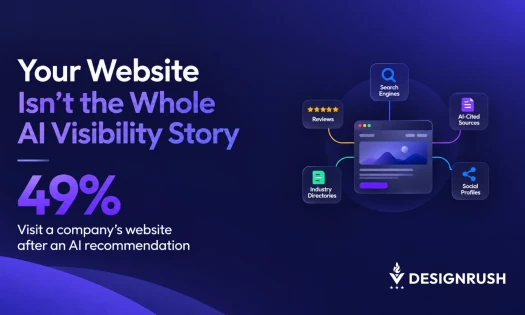
Now, by the time someone lands there, they've already done the research through AI search, social proof, and word of mouth.
Your site isn't where they discover you anymore. It's where they confirm or reject you. That distinction changes everything about how a digital experience should be designed.
Concretely, a visitor has already compared your prices against what a friend mentioned and checked whether your team photos match the names in your reviews.
That same visitor also formed an opinion about whether you're legitimate. Your homepage's job now is to confirm or contradict all of that.
Convenience Has Become the Baseline
A few years ago, a fast-loading mobile-friendly website felt like a differentiator. Today it's table stakes.
Customers have been trained by the best experiences on the internet, and they apply that standard everywhere, including to a local contractor's website or a niche B2B platform.
If something feels slow, confusing, or requires unnecessary effort, they're gone. Not frustrated. Just gone.
What surprises most of our clients is how little tolerance people have for friction they can't immediately name.
A customer won't say "your information architecture was unclear." They won't say anything at all, which is exactly what makes the problem easy to miss.
Put simply, "unnecessary effort" shows up in specific, avoidable places.
- A pricing page that requires creating an account first.
- A contact form that asks for information already given twice.
- A checkout that adds a step nobody explained upfront.
None of these individually feels like a dealbreaker. Together, they're why someone leaves without saying why
Proof Signals Trust More Than Polish Does
One of the most consistent issues we see is businesses underinvesting in trust signals. Generic stock photography. Service descriptions that could apply to any competitor.
No faces, no real work, no proof. Clients often push back on this because they think the logo, the domain, and the polished layout are enough to look credible.
But customers are making micro-assessments constantly. Is this real? Have other people used them? Would I feel safe giving them my money or my time?
Real work, real clients, and real voices convert far more reliably than polish alone.
The fix costs little, a phone photo of the actual team, a specific project with a specific outcome, a testimonial that mentions a real detail instead of "great service."
Design Follows How Customers Read a Page
We've sat in enough discovery calls to know the pattern.
A business describes their customer as someone who reads thoroughly, values detailed information, and takes their time deciding.
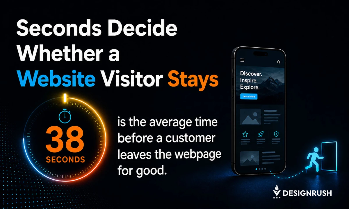
Then we look at the analytics. Average time on page comes in at 38 seconds.
Customers don't behave the way businesses wish they would. They skim. They scroll to the bottom. They look for a phone number or a button before they read a word of copy.
With 38 seconds on average to work with, the first screen has to carry the weight the whole page was supposed to carry, not the third scroll down.
In the end, design around the customer you actually have, instead of the one you wish you had. That's one of the most important shifts a brand can make.
What's Changed in the Last Few Years
The bar for "good enough" hasn't just moved. It's moving faster than most redesign cycles account for.
A website built three years ago met the standard back then. That standard has shifted twice since.
The site can look dated today, even though nothing about the business changed.
What's also changed is how little patience people have for brand-centric design.
After all, pages that open with a tagline about your mission make visitors wait for an answer. That answer is "what do you do, and why should I care."
Visitors who already found it on a competitor's page don't wait around.
How We've Adjusted Our Process
These patterns have shaped how Doodle N Dash approaches every project, whether it's a brand-new website, an ecommerce build, or a digital product.
A kickoff call now spends more time on what a visitor needs to believe before they'll act than on what the homepage should look like.
The visual direction gets decided after that and not before. That means pushing clients toward specificity over polish, and treating conversion as something threaded through every touchpoint instead of a final step.
The agencies and brands winning right now deeply understand what their customer is trying to accomplish.
They remove every obstacle between arrival and action and treat features and polish as what comes after that.
After 250 projects, that's still the lesson.