Lay's Rebranding: Key Findings
Start with purpose, not just looks. Lay’s went back to what really matters: real ingredients, real farmers, and the joy the brand’s always stood for.
Keep it consistent, but make room to flex. With 200+ markets in play, Lay’s built a global system that holds together, but still lets local teams make it their own.
Don’t throw out what people love. The team refined familiar brand elements instead of replacing them, and it paid off with stronger shelf visibility and deeper connection.
Authenticity is one of the strongest forces behind consumer choice.
Data from McKinsey shows that social and digital channels are shaping perceptions, so brands are under more pressure to show up clearly and consistently.
So, how do you evolve a brand as familiar as Lay’s without losing what people already love?
View this post on Instagram
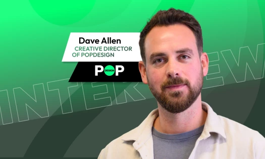
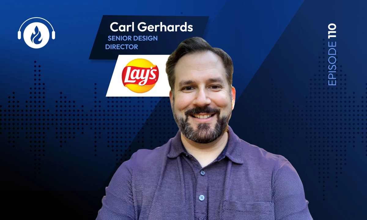
In this episode of the DesignRush Podcast, Carl Gerhards, senior design director at PepsiCo, shares how his team led Lay’s boldest refresh in nearly a century.
He walks us through the redesign process, from evolving core symbols to building a flexible global system that works across 200+ markets.
The refresh focused on:
- Real potatoes and the farmers behind them
- A story that feels consistent everywhere, yet personal in each market
- Cultural moments that extend beyond the shelf
- A visual identity grounded in purpose
Keep reading to see how Lay’s used design to bring clarity, connection, and joy to one of the world’s most recognized brands.
Watch the full episode on YouTube, or listen on Spotify and Apple Podcasts.
Chapter Summary
- 1:52 – The “why” behind the rebrand
- 3:47 – Inside the 360° design process
- 5:30 – Managing stakeholders at scale
- 6:45 – Core truths: potatoes, sun, togetherness
- 7:38 – Timeline & global rollout plan
3 Pillars Behind Lay’s Global Rebrand
Why the refresh mattered, how it was built, and how it lives in culture.
1. Authenticity, Not Aesthetic, Drove the Redesign
The Lay’s rebrand was a return to truth.
Gerhards and his team rooted the visual identity in what had always been central to the brand but had faded from view: the product, the people behind it, and the joy it brings.
Lay’s sources its potatoes from 300,000 farmers around the world, yet that human connection was almost invisible in previous branding.
“We retooled the visual identity system to be able to tell our story in an authentic way,” Gerhards explains.
The new design puts real ingredients and real moments back at the center, aligning every visual choice with the product’s origin and the emotional role it plays in people’s lives.
2. The Design System Had to Scale and Flex At Once
Lay’s operates in over 200 markets, often under different brand names. To function globally, the redesign had to be both systematized and adaptable: a shared design language with room for regional nuance.
The core system established consistent brand elements like the sun icon, red ribbon, and a warm, approachable typographic voice.
But it also empowered local teams to interpret the identity through their cultural lens, adjusting name treatments, layouts, and language without losing recognition.
“We’ve got bilingual logos… we kind of kept some consistent elements that made it familiar for people,” Gerhards says.
This balance of control and freedom ensures Lay’s feels cohesive worldwide without becoming generic.
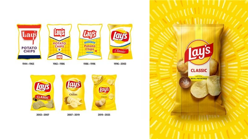
3. Design Bravery Means Honoring What Works Then Building On It
As rebrands often chase disruption, Gerhards took a different view: bravery in design is about being intentional.
Instead of discarding familiar brand elements, his team focused on refining them.
The sun icon was clarified. The red ribbon gained new meaning. Even the typography was reshaped to echo the tactile quality of a potato peel, adding subtle storytelling through detail.
“Bravery sometimes is mistaken as doing something that is unpopular,” Gerhards says. “I find bravery [in] building on the past.”
Throughout the process, the team tested rigorously in labs and in real stores. They mocked up bags, observed shopper behavior, and measured how quickly customers could find their favorite flavor.
The result was a redesign that increased findability, even for a brand as established as Lay’s.
That, Gerhards notes, is when you know the design is doing its job.
How Lay’s Brought Its Identity to Life
Lay’s made the brand feel real in the world.
A standout moment: the “Chip Cam” activation, filmed live at San Siro Stadium with David Beckham and Thierry Henry. Fans with Lay’s bags became part of the show. No CGI. No post-production tricks.
Just a simple idea executed in real time, and it resonated.
What made it work wasn’t the celebrity factor. It was the same principle driving the redesign: authenticity.
That kind of experiential storytelling creates memory, emotion, and cultural relevance, all important for a brand looking to stay meaningful.
Design Advice for Brand Leaders
A refresh at this scale is complex. It’s years of work. Hundreds of decisions. Thousands of touchpoints. So how do you lead it with clarity?
Start with your “why.” Gerhards was clear: don’t redesign because it’s been a while, or because sales dipped. Do it with intent.
“It is the tool you will use to express everything about your brand,” he says.
Stay resilient through the messy middle.
Design processes stretch over years. Progress often feels unclear. But the only way out is through. Trust the intent, the team, and the process.
Test, validate, and prototype early.
Mockups. Shelf tests. Real shopper behavior. Lay’s team didn’t guess; they measured. Even with a well-known brand, they improved shelf findability. That’s not design as art. That’s design as performance.
Unify your teams around one story.
Marketing, ops, product, all aligned under a shared visual system. That’s what allows a brand to scale with coherence, not chaos.
Respect your brand’s past.
Evolution beats disruption. Gerhards describes bravery as knowing what to keep, and how to make it work harder. You don’t earn trust by erasing history. You earn it by making history relevant again.
About Carl Gerhards
Carl Gerhards is the senior design director at PepsiCo, where he leads global brand design for Lay’s. He’s guided identity refreshes for Pepsi, Mtn Dew, Rockstar, and Pure Leaf, and has held leadership roles at Landor, Interbrand, and Sterling Brands. Known for his clarity and system thinking, Carl bridges creative strategy with business goals to build brands that thrive across markets and cultures.
Why Purpose-Led Design Outperforms Cosmetic Rebrands
Too often, brands treat redesigns like cosmetic exercises. Lay’s shows what happens when design becomes strategy.
For agencies and internal teams, the lessons are clear:
- Design systems must be built to scale and flex
- Campaigns and activations work best when they’re grounded in brand truth
- Leadership means aligning creative and business goals from day one
- Change starts with purpose
Thinking about a rebrand? Start with the story you want to tell, and design to bring it to life everywhere your brand shows up.
Watch the full episode on YouTube or listen on Spotify and Apple Podcasts.