Lay's Logo & Packaging Redesign: Key Points
- The PepsiCo snack brand launches a global rebrand after nearly a century with a new logo, packaging, and ingredient-first visuals that highlight real, farm-grown potatoes.
- The redesign features the “Lay’s Rays” sunburst, a matte finish, a custom typeface, ingredient-inspired colors, wood-grain backdrops, and close-up chip photography.
- Packaging and logo work as brand media, and every redesign should center on one clear product truth, expressing it consistently across shelves and digital channels.
Lay’s is changing how it looks so people can see it for what it really is.
The brand’s biggest visual overhaul in almost 100 years will roll out globally, pairing a refreshed logo and packaging with a simple message.
Its chips are made from real, farm-grown potatoes, but Lay’s internal research says nearly 42% of consumers do not realize this.
View this post on Instagram
The redesign tackles this gap with ingredient-forward visuals, a warmer palette pulled from recipes, and photography that puts texture and seasoning up close.
Lay's calls it a return to authenticity, a way to honor the farm-to-bag story while keeping the fun and familiarity that built its reach.
It is also a reminder that packaging design does real work in the aisle long before an ad runs.
Back to the Potato: Rooting the Rebrand in Authenticity
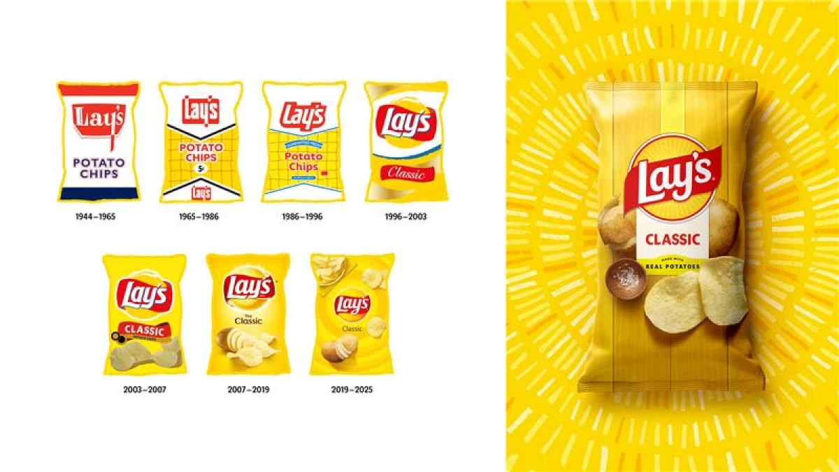
The new identity is designed to make the product feel closer to the source.
It starts with a “Lay’s Rays” sunburst that centers the logo and reflects the sun that grows the crop.
“We redefined [the logo] as the sun to be more overt. Now there are these Lay’s rays inside it that come out of it.
The red ribbon that wraps it is meant to be a bow being tied by our farmers, giving the gift of our product to the world,” Carl Gerhards, senior design director at PepsiCo, said on the DesignRush Podcast.
Some rays were even created using potato stamping in production art to add organic texture.
A custom brand typeface carries across touchpoints and pairs with a matte finish, so the packs read cleanly under store lighting.
The palette moves beyond bright yellow to hues drawn from flavors, from savory reds to pickle greens.
In the backdrop, ingredients sit against wood-grain slats, a subtle cue to farm crates and picnic tables.
Close-up chip imagery also shows crisp edges, golden color, and seasoning.
Together, these choices turn the pack into a short story about origin and quality.
The goal is clarity at the shelf and a consistent look across retail, out-of-home, and social.
Changes You Can Taste: What’s New in Lay’s Rebrand
Lay’s is extending the refresh to what's inside the bag.
The core portfolio is moving to no additives or colors from artificial sources by year-end, with other variations meeting the same standard.
For instance, Lay’s Baked will be made with olive oil and keep its 50% less fat positioning versus regular potato chips.
A new Kettle Cooked Reduced Fat Original Sea Salt will also now use avocado oil.
These changes track with what shoppers say they want: familiar snacks that feel cleaner, without losing the taste that made them reach for the brand in the first place.
“These updates were shaped directly with our consumers, offering more choice, more transparency, and more joy with every bite.
Lay’s continues to set the gold standard in snacking, and we’re proud to carry that legacy forward," PepsiCo Foods SVP of Marketing Denise Truelove told DesignRush.
Real progress comes from listening, then adapting without losing identity and flavor.
This is the kind of wisdom a heritage brand earns over time.
It’s this balance that turns a rebrand into a long-term strategy, one that keeps the product relevant and the message believable.
Design That Does the Work
Lay’s has built a new system that can flex globally while staying readable at arm’s length:
- Logo and Rays focus the eye and add movement across packaging and retail.
- Type and Color bring cohesion across languages, formats, and limited editions.
- Backdrops and Photography create a repeatable canvas for flavors and seasonal runs.
A design system earns its keep when it travels well.
This one is built to scale from corner store shelving to high-resolution ecommerce tiles without losing the product truth at its center.
It shows how design becomes strategy when it connects meaning to function.
Remember that clarity, consistency, and purpose can turn visual branding into something that moves products and builds trust at the same time.
A Rebrand With Something to Teach
PepsiCo reported $91.85 billion in 2024 revenue, with Frito-Lay North America among its most profitable divisions, taking up 27% of total net revenue, and the U.S. making up 54%.
The company’s size means small lifts in shelf conversion can translate into huge dollars across markets.
For a flagship like Lay’s, clearer brand storytelling at the point of decision has real commercial value.
Lay's rebrand offers lessons that any brand, no matter its size or history, can apply to make design work harder and mean more.
- Lead with the product truth your customer undervalues or does not know, then make that truth visible in every asset.
- Build a design system, so the identity reads the same on the shelf, in search results, and on social.
- Tie formula changes to the story so that claims on the packaging and ads match what is in the bag and withstand scrutiny.
Done well, a visual refresh becomes a measurable performance tool.
Our Take: Where Does Lay’s Go From Here?
I think Lay’s is already going forward by staying grounded in what made it a household name while finding fresh ways to show it.
This redesign gives it room to grow without losing its personality.
It’s like Lay’s is saying to me, “Here’s who we really are,” in the simplest, clearest way possible.
It’s getting back to what people already love about it and making this connection visible again.
And the brand has been preparing for this rebrand for months, maybe even a year.
Lay's Super Bowl LIX commercial, for instance, already brought the spotlight back on the farmers growing its potatoes.
For me, this is how a legacy brand moves into its next era, by making every detail, from the logo to the ingredients, feel intentional.
Lay’s just needs to keep proving that authenticity still sells, one bag at a time.
Consistency builds recognition and trust. These top branding agencies create design systems that perform across shelf, digital, and social spaces.