
Instagram has spent a decade building one of the internet’s most recognizable brands.
Now Meta is asking users to get used to a new version of its name.
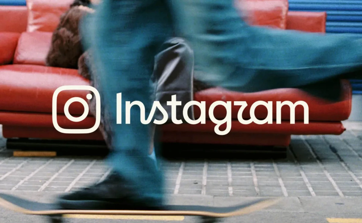
The platform introduced a refreshed wordmark on August 13 as part of a brand identity update.
Meta is rolling it out globally through the rest of the year, so plenty of users haven't seen it in their own app yet.
The change affects the text treatment at the top of the app while leaving Instagram’s multicolored camera icon untouched.
Instagram Head Adam Mosseri said the wordmark had remained unchanged for 10 years and that it was time for an update.
"Cleaner and more modern, with references to the original and the simplicity and craft that’s always made it Instagram," Mosseri wrote.
Meta shared in a press release that its design team had hundreds of directions before returning to a script-based approach.
The thinking was that a fluid script could better express individuality and personal voice.
For Instagram Director of Product Design Jasmine Probst, the new wordmark is "bolder and simpler, with touches of unexpectedness."
The update may look overdue, but it puts Instagram in an uncomfortable position familiar to many legacy brands.
A familiar mark holds years of accumulated memory, and changing it too much can make a brand's own equity harder to place.
Users Struggle to Read the New Script
Early reactions show where the risk sits.
While some users praised the cleaner appearance, others had a hard time reading the stylized letters.
Several commenters have joked that the name looks like "Instagzam" or "Instaguam" because of the treatment of the "r" and "s."
"Can we like not make unnecessary changes and listen to the users instead?" another user commented.
Legibility is the whole point here, because a wordmark has to do one thing an icon never has to do, which is spell the name.
It has to read fast and register the same way everywhere, including places where people glance at it for a second.
Instagram also updated Instagram Sans and added two typefaces, a handwriting face called Instagram Pen and a monospace font called Instagram Mono.
The gradient stays, with the company using it more sparingly across motion, layout, and user interface.
The three typefaces hand Instagram's design team a full toolkit, so the wordmark stops being the only place the refresh shows up.
A brand identity holds together when the pieces reinforce each other, and the new fonts now do some of the work the script once did alone.
The risk here sits in the tradeoff, since every point of recognition Instagram gives up on the wordmark has to come back somewhere else in the design system.
Four Rebrands Show the Range of Risk
Instagram is hardly the first legacy brand to learn that touching a familiar mark invites scrutiny.
Coca-Cola played it cautious with the identity refresh it launched last July 20.
The company kept the red-and-white palette, the Spencerian script, and the Dynamic Ribbon.
The system around them exists to keep every execution consistent across 200-plus markets.
Netizens still found something to pick at, comparing the new Better With slab serif to the typeface on a pack of Marlboro.
Coca-Cola never addressed the jokes, which ran for days across X and Threads.
Consistency at scale gave the update a business case, though even a cautious refresh can hand the internet a reading that the brand never intended.
BMW's subtle logo update in 2025 was made to be digital-first, debuting a refreshed version of its roundel on the new iX3.
It removed inner chrome rings and dividing bars, giving the emblem a cleaner and flatter look.
Every new BMW has worn the updated badge since February 2026, and almost nobody noticed.
Jaguar shows the other end of the spectrum.
Its 2024 rebrand introduced a new wordmark, monogram, typeface, and graphic system as the automaker prepared to reposition itself around electric vehicles.
The overhaul drew heavy backlash from people who felt the new identity had gone too far from the Jaguar they knew.
The brand put its global creative account under review in May 2025, roughly six months after the campaign ran.
Chief Creative Officer Gerry McGovern was gone by December, with Autocar reporting he had been escorted out of the building.
JLR denied terminating him, then confirmed in March 2026 that he was leaving after 21 years.
Cracker Barrel faced an even harsher response.
After dropping Uncle Herschel from the logo in August 2025, the restaurant chain reversed course eight days later and restored the old design.
Reuters reported that shares fell nearly 16% in the weeks after the announcement.
Store traffic dropped about 8% once the backlash reached the parking lot.
Reuters reported that the backlash coincided with stocks falling as much as 12%.
Instagram sits between these approaches, keeping the camera icon in place while changing the name above it.
The criticism still arrived, though it split far more evenly than what hit Jaguar or Cracker Barrel.
All four were managing the same piece of equity, and the ones that came out clean protected the brand asset that customers use to identify them.
Marketers, take note:
- Protect recognition before chasing novelty: A refresh should identify which visual elements already carry disproportionate brand equity.
- Modernize the system around the asset: Instagram is changing its typography alongside the wordmark. This gives the redesign a strategic role more than simply making the logo look newer.
- Test legibility like a business metric: A distinctive letterform means little if customers cannot read the name quickly. Tropicana showed how recognition can become a commercial problem when redesign decisions reach the shelf.
The camera icon is the piece that now holds brand recognition steady while people keep reading "Instagzam."
Our Take: How Much Familiarity Can Instagram Afford to Lose?
Instagram has chosen one of the hardest assets to experiment with: how the brand name is written.
We think that it can afford to lose more familiarity than the panic suggests, mostly because the icon already does the recognition work.
Users stopped looking at the wordmark years ago and started recognizing it on sight.
This fact makes every strange letterform suddenly feel louder than it probably would on a newer brand.
Jaguar's rebrand backfired because it changed everything at once, and Cracker Barrel lost because customers read the change as a statement about values.
If users eventually stop noticing the redesign and start reading it instantly again, then Meta has probably done the difficult part right.
Legacy brands need agencies that can modernize recognizable assets while protecting the equity built into them over decades.
Explore the top branding agencies in our directory.