UPDATE — August 27, 2025: Cracker Barrel has scrapped its new logo after days of backlash and a 12% stock drop that erased nearly $100 million in value. In a statement on Instagram, the company admitted it “could’ve done a better job sharing who we are” and confirmed that the original “Old Timer” emblem will remain as its official logo.
Cracker Barrel Logo Change: Key Findings
- Cracker Barrel introduced a pared-down text logo, marking the brand’s first major redesign in nearly 50 years.
- The campaign includes seasonal menu launches and a marketing partnership with country singer Jordan Davis.
- Shares of Cracker Barrel dropped 12% following the reveal, showing investor unease with the broader $700M transformation plan.
- Cracker Barrel dropped the new logo and brought back its longtime “Old Timer” design after widespread backlash.
Quick listen: Cracker Barrel drops its barrel man — here’s what the rebrand means, in under 2 minutes.
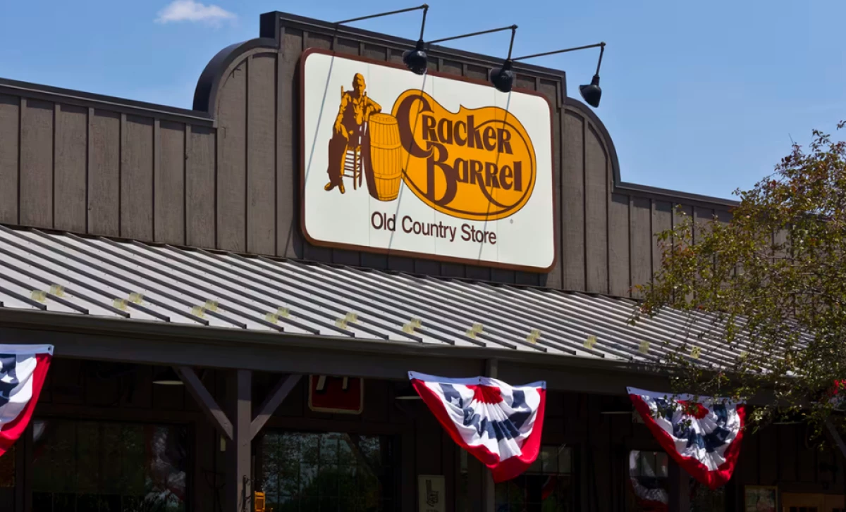
Few symbols have defined roadside dining like Cracker Barrel’s rustic man-and-barrel emblem.
Now, after nearly fifty years, the chain has replaced it with a stripped-back wordmark as part of a sweeping rebrand.
View this post on Instagram
The reveal, part of the company’s “All the More” campaign, includes seasonal menu updates and a brand partnership.
But the move has divided fans and rattled investors, who pushed the stock down more than 12%.
Legacy vs. Modernization
Swapping out a logo tied to almost fifty years of brand identity represents a major step for Cracker Barrel.
The company insists the simplified wordmark is still “rooted in the barrel shape and word mark that started it all.”
Cracker Barrel’s redesign follows a path other major brands like Burger King, Nissan, and Pepsi have taken, trading detailed imagery for minimalist, text-first logos.
@tylietok Why does the @pringles one look good?? Which is your favorite? #logos#logodesign#redesign#rebranding#tylietok#fyp♬ original sound - TheNeedleTok
The challenge is whether this update helps Cracker Barrel feel more current or chips away at the sense of tradition that longtime guests hold dear.
Strategic Rebranding as Market Repositioning
The redesign is one element of a $700M transformation strategy.
The new look came with fresh fall dishes too, from Bacon & Egg Hashbrown Casserole to Herb Roasted Chicken and Butter Pecan French Toast Bake.
To mark the launch, guests nationwide can pick up a free Classic Side with any purchase on August 23 and 24.
View this post on Instagram
Country singer Jordan Davis is helping lead the rollout, starring in new ads and making an appearance at a New York City event staged to spotlight the brand.
With this campaign, Cracker Barrel hopes to reach a wider audience without losing the Southern roots that built its identity.
Design Choices with Meaning
The logo keeps Cracker Barrel’s signature gold and brown palette, inspired by familiar menu staples like scrambled eggs and biscuits.

The stripped-back design also speaks to modern aesthetic preferences for clarity and digital readability.
For agencies, the lesson is that logo simplification works best when paired with storytelling that reinforces authenticity.
Brand Risk and Public Reaction
The backlash was swift.
Loyal fans criticized the redesign as “cold and sterile,” while Donald Trump Jr. attacked it on social media.
I am boycotting @CrackerBarrel until they change the logo back and fire the CEO. pic.twitter.com/9VtEyup3aw
— Aaron 🇺🇸 (@TimberHandsFam) August 20, 2025
New Developments Since Publication
Following the reveal, Cracker Barrel shares fell over 12%, erasing nearly $100 million in market value.
Outlets like Reuters and Barron’s pointed to investor concerns over the company’s broader strategy.
Analysts drew parallels to other heritage brands that faced backlash after simplifying iconic visuals.
While some praised the cleaner design, the polarized response underscores the brand’s deep nostalgic ties.
According to Vincent Mazza, managing partner at eDesign Interactive, the polarized response isn't surprising.
“When a heritage brand touches its logo, it isn’t just changing a random image. It’s essentially rewriting part of cultural memory. Nostalgia is an asset, and stripping it away too abruptly can feel like erasing history. The strongest rebrands evolve symbols without severing ties, preserving the emotional equity that keeps loyal customers invested," he added.
Cracker Barrel Reinstates Its Old Logo
After a week of controversy, Cracker Barrel walked back its most ambitious branding move in decades.
The company confirmed that the “Old Timer” logo, used for nearly fifty years, will stay in place.
View this post on Instagram
The decision came after days of customer criticism across social media, some calling the redesign “cold and sterile,” while others praised its cleaner look.
In its Instagram announcement, Cracker Barrel thanked fans for speaking up:
“We thank our guests for sharing your voices and love for Cracker Barrel. We said we would listen, and we have. Our new logo is going away and our ‘Old Timer’ will remain.”
The message framed the reversal as part of a larger commitment to tradition.
View this post on Instagram
Reversing course may restore goodwill among loyalists, but it also leaves questions about the future of the company’s $700M modernization plan.
Cracker Barrel’s situation parallels the reaction to Range Rover’s recent mirrored “RR” emblem, which fans mocked as looking like a belt buckle rather than a heritage symbol.
As DesignRush reported in that case, a logo alone cannot carry a brand’s story.
View this post on Instagram
When iconic visuals are altered without clear continuity, recognition, and emotional connection are at risk.
Cracker Barrel now faces the same challenge: convincing both loyalists and new audiences that its identity remains intact despite visual change.
Creative & Campaign Takeaways for Agencies
For agencies, Cracker Barrel offers a timely case study in brand evolution.
Key takeaways include:
- Logo redesigns should connect past and present rather than erase legacy symbols.
- Visual changes work best when paired with experiential campaigns, such as menu launches or events.
- When the logo, store design, ads, and digital presence work together, it can soften the shock of a big change like this one..
The real test will be in the months ahead: can Cracker Barrel hold on to its heritage while still winning over diners in today’s crowded restaurant market?
Our Take: Did Cracker Barrel Go Too Far in Simplifying Its Identity?
I have to admit, when I look at this redesign, it feels less like modernization and more like erasure.
From my perspective, Cracker Barrel removed the one element that gave its logo distinction, leaving a wordmark that could belong to almost any casual dining chain.
Comment
by u/Hot-Cancel-6648 from discussion
in graphic_design
I understand the desire to streamline for digital formats, but I believe this move strips away brand equity that took nearly fifty years to build.
As a business reporter, I see a strategic risk here.
When a brand blends too easily into the competitive landscape, it loses pricing power and emotional connection, two of the most valuable assets in hospitality.
In my view, this is less a bold evolution and more a costly gamble that may alienate loyalists without truly winning over the next generation of diners.
For another case of brand identity sparking debate, see how Swatch faced global criticism over cultural sensitivity in advertising.
Editor’s note: This story was originally published on August 21, 2025. It was updated on August 22 to reflect investor reaction and stock performance, and again on August 27 to include Cracker Barrel’s decision to reinstate its original “Old Timer” logo following consumer backlash.