
Spend a few years seeing a logo, and you'll probably recognize it without needing to see the brand name.
This is a tactic that big brands rely on, and Instagram's latest redesign shows just how much.
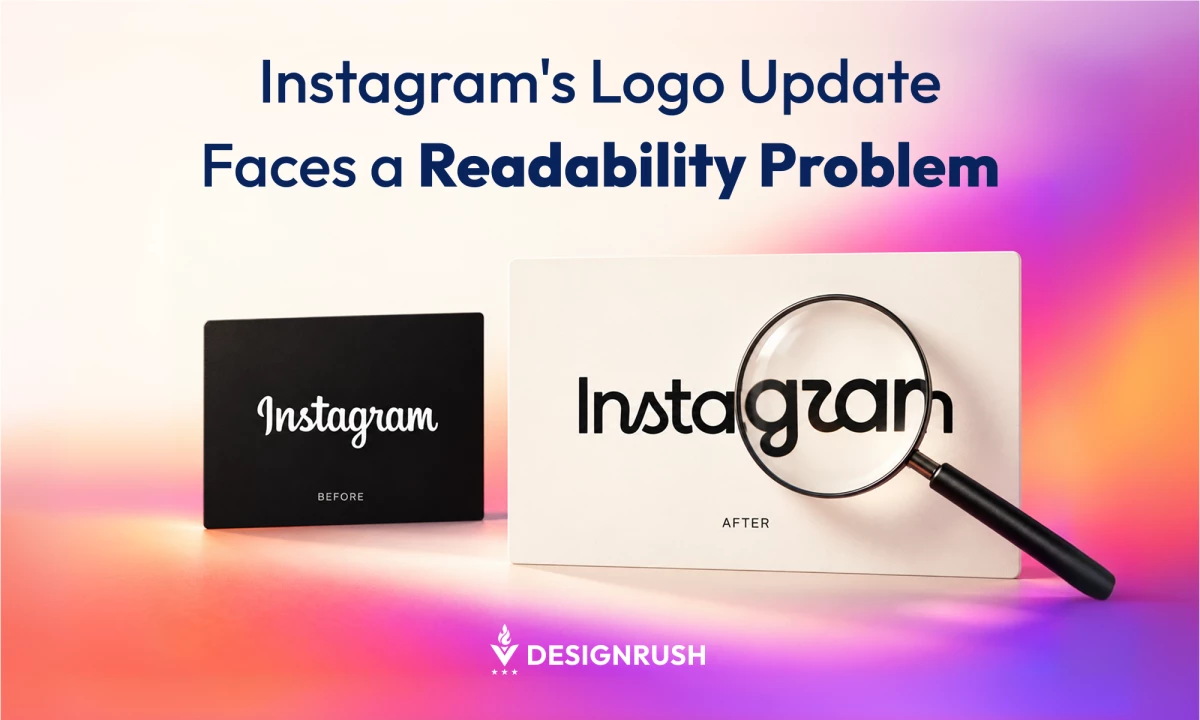
In August, Instagram unveiled its first wordmark redesign in a decade. Despite the social media platform's massive audience and worldwide recognition, many questioned whether people could read it.
What was the issue? One letter. The redrawn "r" looks close enough to a "z" that many viewers read the new logo as "Instagzam," according to Web Designer Depot.
Of course, Instagram has years of brand recognition, and as TechCrunch reports, most people still know what the logo says.
And this is a luxury typically reserved for massive brands, such as Instagram. But smaller or lesser-known brands can't bank on it.
Ahmad Sohail is the founder ofDoodle N Dash, a leading creative and digital agency. He says most brands need to be realistic about how much recognition they can count on.
"Instagram can make people squint for a second and it costs them nothing. A bakery that just opened makes people squint, and those people walk past," Sohail says.
That means businesses need to think about how to make a logo stand out without making people guess. Otherwise, they can face "real consequences," Sohail adds.
Below, the Doodle N Dash founder weighs in on what Instagram's wordmark makeover means for newer brands. He also explains:
- Why a bold logo costs a new brand more than an established one
- What a new logo has to get right on day one, and what can wait
- Where a misread name quietly costs a small business, from lost search traffic to weaker referrals
- How to run a four-step legibility check before launch
- Why Instagram can afford a confusing logo and a small brand can't
Keep reading to learn more.

Who Is Ahmad Sohail?
Ahmad Sohail is the founder of Doodle N Dash, where he helps brands shape their digital identities and build websites that work. His design leadership extends to brand launches, taking new businesses from concept to market.
Logo Personality vs. Readability
The tension between a bold logo and a readable one comes up often in Sohail’s branding work.
Founders who have lived with their business name for years often want a logo that feels as bold as they do. Sohail says this instinct is fair.
A wordmark that plays it too safe can undersell a business that has far more character than the logo shows.
But there is a line between making a logo more interesting and making it hard to read. And that line can get crossed before anyone on the project notices.
When Sohail's team has had to steer a client away from a more stylized design, the conversation usually comes down to cost.
"A brand with ten years of recognition can absorb that. A brand that's a few months old can't, not without paying for it in every interaction," Sohail says.
New Brand Logos: Start Plain, Get Bold Later
Sohail's advice to founders itching for a bold logo on day one: Hold that thought.
"On day one, the name has to read. Color, texture, a quirky letterform, those can grow as people get to know the brand," Sohail says.
Mastercard took the slow route. Its name sat inside the interlocking red and yellow circles from 1968 until 2016, when it moved below them.
In 2019, after more than 20 months of global consumer research, Mastercard said more than 80% of people recognized the circles without the word and announced it was dropping the name from the logo.
Even then, the old logo wasn't going away overnight.
A company spokesperson told Fortune people would still see it occasionally while banks used up existing card stock and Mastercard kept building recognition in some developing markets.
Sohail sees the same logic play out with much smaller brands.
"I'd rather a client start a little plainer and earn the right to get bolder later. Brands that have been around for years usually got there in steps, and most people never noticed the steps," Sohail says.
4 Hidden Costs of a Misread Logo
The damage from a hard-to-read logo usually shows up in places that never get traced back to the design.
View on Threads
For a small business, a logo that customers misread or mispronounce can lead to:
- Split search traffic: People search for whatever spelling they guess, which pulls traffic away from the correct name.
- Weaker word of mouth: A referral is less likely to spread when the person making it can't confidently say or spell the name.
- Constant corrections: The business ends up fixing its own name for customers at nearly every introduction.
- A credibility tax: A company that has to explain its own name can seem less established, even when its work is excellent.
Together, these problems add drag at a moment when a small business can least afford it: right when a potential customer is deciding whether to trust it.
"All four are cheap to catch before launch and expensive to fix after. Once the name is on the signage, the website and the business cards, you're living with it," Sohail says.
How to Test a Logo Before It Launches
Instagram can rely on familiarity. A new brand has to prove its logo works for people who have never heard of it.
"Show it to someone who's never seen the name before. Give them a second, no context, and ask them to read it out loud,” Sohail says.
"If they hesitate, or guess wrong, you have your answer, no matter how good the letterforms look on the mood board.”
That's why the team at Doodle N Dash recommends performing a four-step legibility check:
- Find fresh eyes: Choose people who have no prior exposure to the brand name.
- Limit the viewing time: Show the logo for about a second, with no context or explanation.
- Ask them to read it aloud: Any hesitation or wrong guess is a warning sign.
- Test it small: Shrink the logo down to app icon and favicon sizes (the tiny icon in a browser tab), alongside the usual poster and mockup checks.
"Most people meet a new brand as a tiny icon on their phone long before they ever see it on a sign. If the name falls apart at that size, that's the version they remember," Sohail says.
A design that reads well at three inches can fall apart at 32 pixels, and that small version is often where the real first impression happens.
Where the Logo Lives Changes the Rules
The legibility bar also shifts depending on where a logo will appear. Sohail calls this one of the most underestimated parts of the job.
- App icons have to read instantly, at a tiny size, with no context. They often sit alongside dozens of other icons competing for the same user tap.
- Signage is read from a distance, sometimes quickly or in poor lighting. Here, legibility is closer to a safety requirement than a design choice.
- Business cardsare the most forgiving format. They're viewed up close and are usually handed over while someone says the name out loud.
"If a logo only ever gets tested at business-card size, it can look great in that one context and still fail everywhere else the brand actually needs to work," Sohail says.
When a Confusing Logo Becomes Free Publicity
One critic argued the "Instagzam" debate may even help Instagram, since people are stopping to look closely at the lettering.
Instagram can afford that attention because everyone already knows where to find it. Sohail says a small brand gets the confusion without the payoff.
"There's a difference between a logo that makes someone look twice and one that makes them guess. The first builds recall. The second costs you customers," Sohail says.
Design for the Brand You Are Today
Instagram's redesign shows what brand recognition can cover up. A well-known name gives a company room to take risks with its letterforms.
Most businesses aren't there yet. For them, a logo has to do the work of teaching people the name.
This doesn't necessarily mean giving up personality.
It means testing a design where it will actually be seen, with people who have never seen it before, and making sure it still reads as the name.
"Keep the personality. Just make sure a stranger can read your name before they notice anything else," Sohail says.
"Instagram had more than a decade to earn its flourishes. A new brand can earn them too, as long as it does things in the right order," he adds.