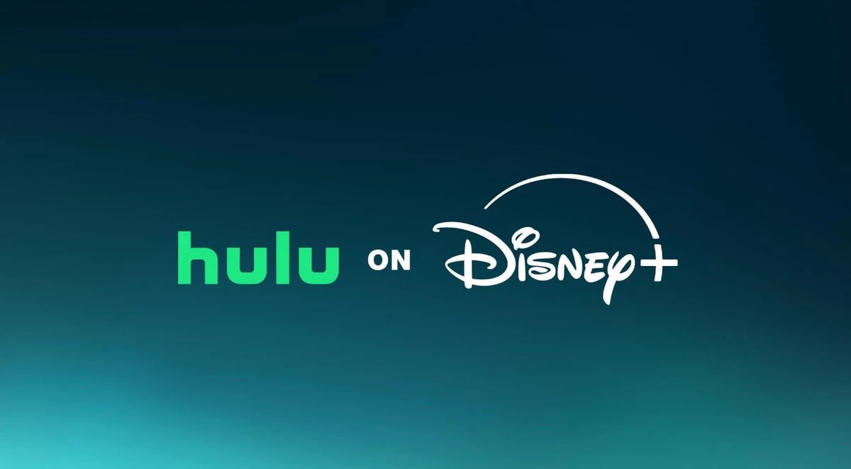
Disney has officially changed the logo design of Disney+, integrating elements from Hulu in celebration of its integration with the streaming platform.
In the new look, the entertainment giant has opted for a teal-based gradient background that combines Disney and Hulu's brand colors, replacing the deep royal blue the company had used in its logo since 2019.
The new color is dubbed "Aurora" — resembling the Northern Lights, as well as making a direct reference to Sleeping Beauty's Disney Princess, Aurora.
Apart from the colors, the iconic swoosh that sits atop the typography has been slightly modified.
Before, the curved line featured a color gradient akin to the trail of Peter Pan's Tinkerbell. Now, the iconic swoosh has been updated into a solid white line.
The new logo was released shortly before the two media giants announced the official launch of their merged streaming service.
Users can now enjoy Hulu's offerings within the Disney+ platform, including hit series "The Bear" and period drama "Shogun."
‘Lilo & Stitch’ and ‘Family Guy’ crossover billboard for Hulu coming to Disney+
— DiscussingFilm (@DiscussingFilm) March 27, 2024
(Source: @quepaso_daniel) pic.twitter.com/vX1m5HjB8m
To promote the merger, the Mickey Mouse creator also launched several out-of-home (OOH) efforts, including a witty billboard announcing that the cartoon Family Guy is now available on the joint streaming service.
Netizens React Negatively to New Logo
Several users have taken to social media to air out their thoughts on Disney+'s rebrand, with many against the subtle changes.
"Lifeless color. Got rid of the pretty fade in the curve. Graphic design is dead," one user wrote in response to a post by @DiscussingFilm on X.
Included pic.twitter.com/Qk4v8igmA6
— RR🧠 (@Asoegwu_) March 27, 2024
Another user even parodied the new logo, mocking the changes by rewriting "Disney" as "Delulu," which is slang for "delusional."
While the logo design has generally received negative feedback, no other changes have been announced by Disney or Hulu regarding their overall visual branding.
Conceptualizing or rebranding a logo needs to be on point to effectively communicate a brand's identity.
Businesses need to consider hiring a top design agency to ensure that their logo perfectly captures what they stand for.
Editing by Katherine 'Makkie' Maclang