
Design remains one of the strongest tools a brand has to explain who it is.
DesignRush recognizes standout creative work each month through its Design Awards program.
August's winners come from six categories: website, logo, print, app, packaging, and video.
The projects simplify complicated experiences, sharpen what each brand stands for, and give people a reason to remember the work.
Motion and physical formats do much of the lifting this month, with video case studies and a pop-up book series among the winners.
Best Website Design: ANML
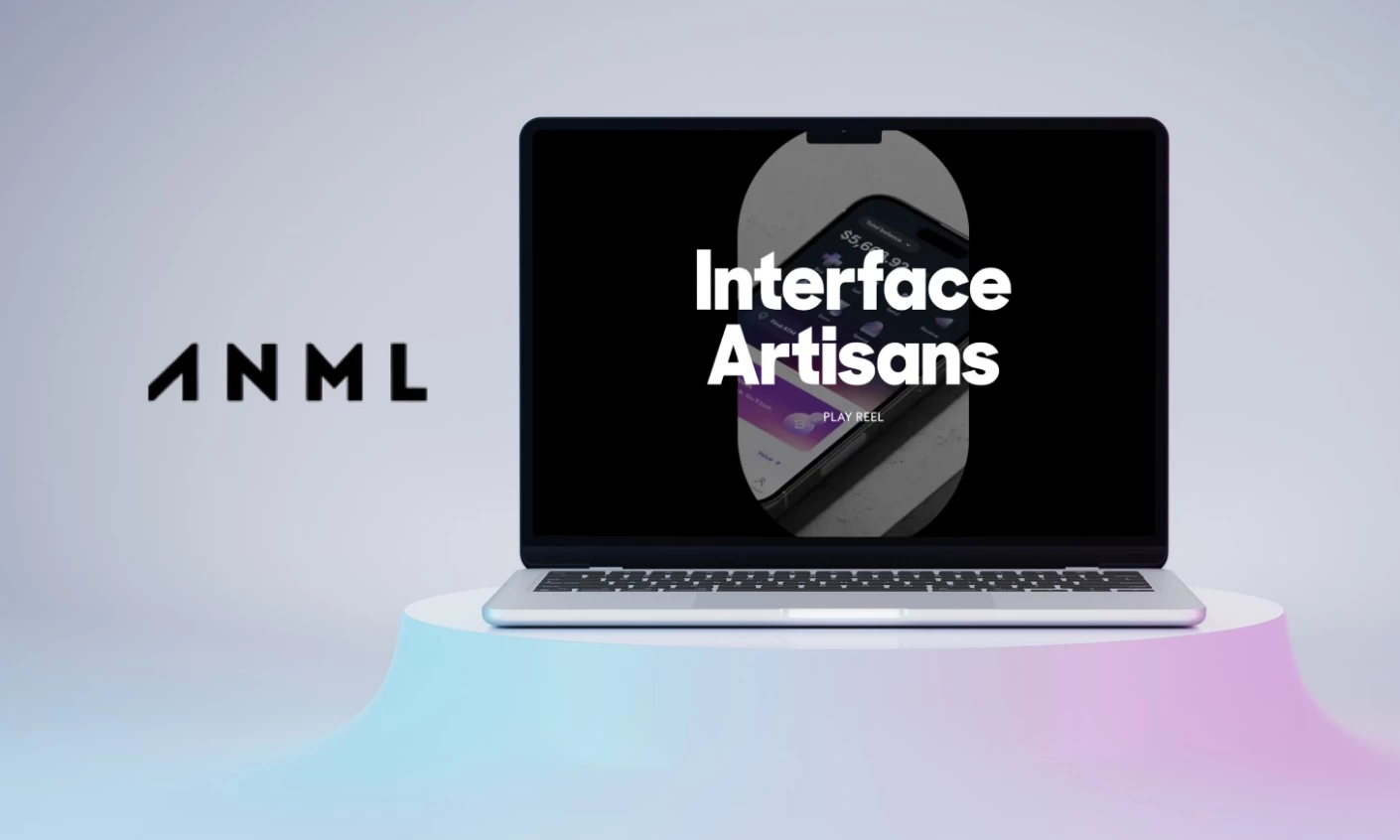
ANML won the website category for its own studio site, a showcase for the agency's "Functional Branding Method."
The layout moves from headline to project work with little clutter, treating websites, brands, and products as one connected body of work.
Case studies for BILT, Firestone Walker, and Olliv run as short video features, with a five-item menu keeping the site uncluttered.
Juror Sharon Braude noted how the video-heavy build held together, calling the work "polished, interactive, and clearly presented."
Page speed got the same attention as the visuals, which matters for an agency selling web design as a service.
Best Logo Design: Sato Mateus
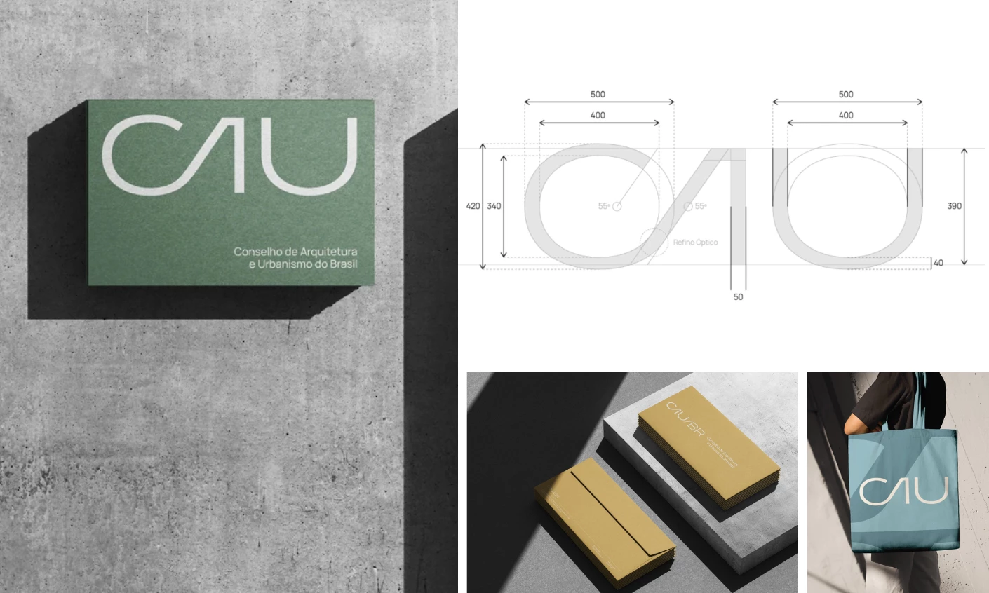
Sato Mateus took the logo award for a new identity for the Council of Architecture and Urbanism of Brazil (CAU/BR).
The wordmark pulls its letterforms from Oscar Niemeyer's curved architectural lines, drawn as one continuous stroke.
The "A" drops its crossbar into a smooth arc, and the "U" opens into an unbroken loop, giving the mark a hand-drawn quality that still reads clearly at any size.
Earth ochre, vegetation green, and a muted sky blue point to Brazil's landscape.
The thin line survives both a business card emboss and a street poster blowup, which CAU/BR needs for a mark used on signage and documents.
Best Print Design: Toby Ng Design
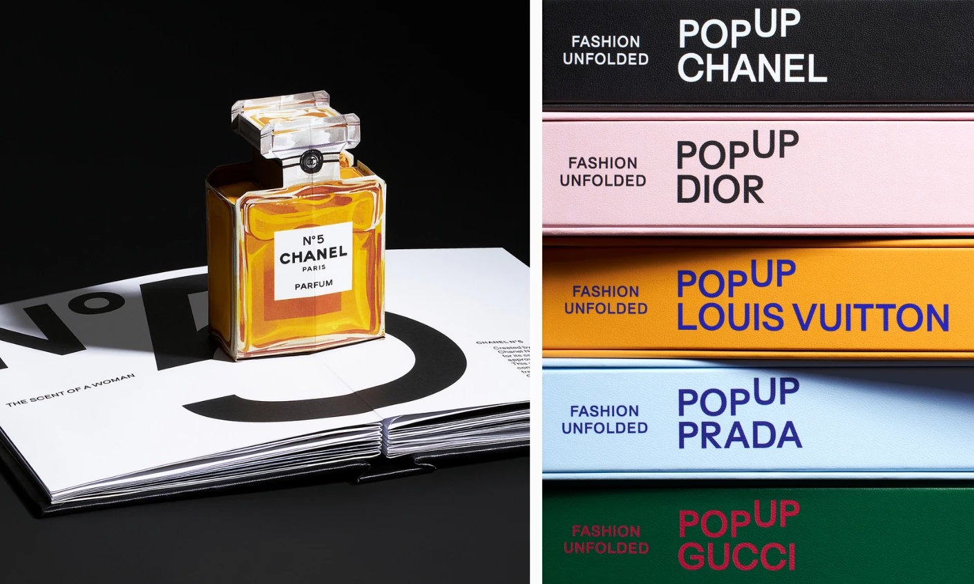
Toby Ng Design won the print category for "Pop Up Signatures: Fashion Unfolded," a book series that renders fashion houses as paper engineering.
Each volume carries its house's signature color, and a raised "UP" on every cover signals the pop-up format while tying the series together.
A Chanel No. 5 bottle, a Lady Dior bag, and a full Louis Vuitton runway unfold as sculptural spreads, complete with typography and short editorial text.
"Love at first sight, amazing how the engineering that created this looks so effortless," Juror Andrea Owsinek-Brucker shared.
Fashion is a three-dimensional craft, and a book that opens into volume speaks the same language as the houses it documents.
Best App Design: Chop Dawg
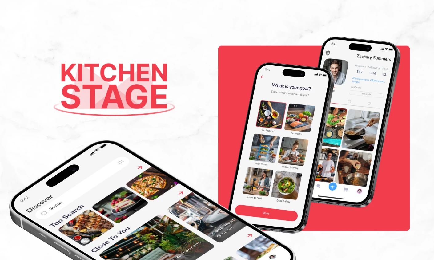
Chop Dawg earned the best app award for Kitchen Stage, which combines recipe discovery, grocery delivery, restaurant picks, and cooking videos.
Onboarding asks users whether they want inspiration, healthier meals, or cooking lessons, then sorts the feed to match.
Every recipe lists its ingredients with an add-to-cart button, so a missing item becomes a delivery order.
Users can also film, speed up, and voice over their own cooking clips, then post them to a social-style discovery feed.
Chop Dawg reports more than 500,000 uploaded recipes and videos in the app's first 90 days, plus a 35% lift in grocery delivery conversions.
Best Packaging Design: Leyma Design
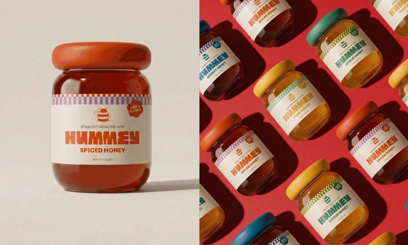
Leyma Design won the packaging award for Hummey Honey, giving the jars a rounded shape that echoes the brand's bumblebee mascot.
The logo pairs a soft, fuzzy bee outline with a honeycomb's clean geometry.
Four flavors (Pure, Citrus, Smoky, and Spiced) each get their own look while staying part of the same family on the shelf.
Juror Lucia Barbaresso praised the bottle cap, calling it "particularly original" and "a very brilliant idea."
The packaging design pairs a warm honey gold with a muted green, separating the line from the amber-and-brown palette most honey brands use.
Best Video Design: Biscuit Filmworks
Biscuit Filmworks took the video award for Roku's "TV Is Better Here," a short film set inside a neon art-deco theater in Roku City.
Roku City began as the screensaver on idle Roku TVs, so the film gives a live-action home to a piece of brand property viewers already know.
Pirates, mobsters, and doctors move through the space while a bellhop hands out remotes, keeping the product a prop inside the story.
Owsinek-Brucker credited the comedy for doing the sales work, calling the spot "engaging, entertaining" and saying it "endorses Roku nicely."
Fast cuts run the film through genre after genre, and the conversational script makes a joke out of dull steps like TV setup.
Design still decides how fast people understand a company and whether they remember it later.
Every August winner had one problem to solve, from a jar that needs to be read on the shelf to a film that has to sell a remote.
The judging rewarded work that held up at every size, on a phone screen and on a street poster.
Check back in September for the next set of winners. Submit your work now before the panel meets.