
Tinder just gave itself a personality it hasn't had in years.
The dating app brought on design studio Porto Rocha for its first rebrand in nearly 10 years, centering the new identity on a fictional persona named "T."
The character will serve as a dating columnist meant to carry Tinder's tone across the app.
In an interview with It's Nice That, strategy and copy director Natalee Ranii-Dropcho said the team looked to real advice columnists for inspiration.
"We imagined our voice as a kind of trusted dating columnist," she added, pointing to references including a 1990s UK dating column and Carrie Bradshaw.
Tinder wanted "T" to sound like the friend you go to for dating advice.
"This voice has made her mistakes, she’s learned with you, and she’s also having the time of her life doing it," she added.
Senior designer Yedo Han shared that the design system had to hold several (sometimes conflicting) ideas about modern dating at once.
This meant mixing anime screenshots, oil paintings, and meme-style photos into the app's core imagery alongside the usual staged couple shots.
"This kind of imagery is just all part of the Gen Z experience in daily life," Han explained.
Ranii-Dropcho also described the thinking behind that approach as designing for contradiction.
She described Gen Z daters as burnt out but hopeful, nostalgic yet inventing new norms, and caught between reality and fantasy.
Tinder's rebrand leads with voice, treating brand personality as the thing that pulls users back to a tired category.
A Flame Learns to Flirt
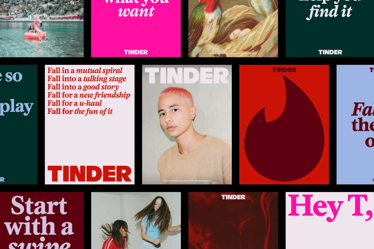
The redesign touches nearly every part of Tinder's visual identity.
The wordmark trades its lowercase sans serif for an all-caps treatment, paired with a new typeface meant to add confidence without losing warmth.
It's a branding decision that Porto Rocha says had to balance confidence with approachability.
The flame icon now looks sleeker and sharper, a cleaner take on the mark everyone already knows.
The palette widens its familiar red-and-pink gradient with blue and green tones for a fuller emotional range.
Swiping also became a design element. Porto Rocha used the gesture to reveal typography, logos, and imagery underneath.
This made a familiar motion feel like a small hit of anticipation, part of an identity built to feel new while keeping Tinder recognizable.
Tinder got a rebrand pic.twitter.com/Br5YOlFzl5
— Andreas Storm (@avstorm) July 14, 2026
The copy changes, too. Tinder's new language reworks "happily ever after" into "happily TBD."
And while it's a small change, it's meant to open the story past a single ending.
Burnout Is the Real Competitor
Tinder is rebranding under real pressure.
A 2024 survey data puts dating app burnout at 78%, and it hits Gen Z hardest.
The dating app feels it directly, with paying subscribers down from 11.1 million in 2022 to 8.77 million in 2025.
Tinder's year-end report found that 48% of Gen Z singles deleted every dating app in 2024.
Against this backdrop, a voice-first rebrand serves the purpose of both a style refresh and a retention strategy.
- Give the product a personality users can argue with: A fictional columnist gives Tinder a stance, which matters more when users are opting out of dating apps entirely.
- Design for the messy middle: Gen Z feels ambivalent about dating apps, so the identity is built on contradiction and shows it honestly.
- Let familiar gestures do new work: Reinterpreting swipe as a reveal mechanic gets more mileage out of behavior users already know.
The real value of a rebrand like this is a second look, a reason for lapsed users to reopen an app they had already written off.
Our Take: Can a Fake Columnist Save a Swipe?
A mascot or a tagline sits still, but a columnist has to keep showing up with something to say.
We think this is Tinder's smartest move here, a voice that can be wrong, take positions, and grow alongside its users.
It's risky for a brand carrying this much scar tissue, but it may be the only real answer to dating fatigue.
"T" gives Tinder a voice that can name the mess and skip the preachy success stories.
The real question is whether the columnist is still worth interacting with years from now.
A logo is finished the day you launch it, but a persona is something you have to keep building, in every post, reply, and campaign.
Brands need agencies that understand how to align visual changes with operational ones so the rebrand holds up over time.
Explore the top branding agencies in our directory.