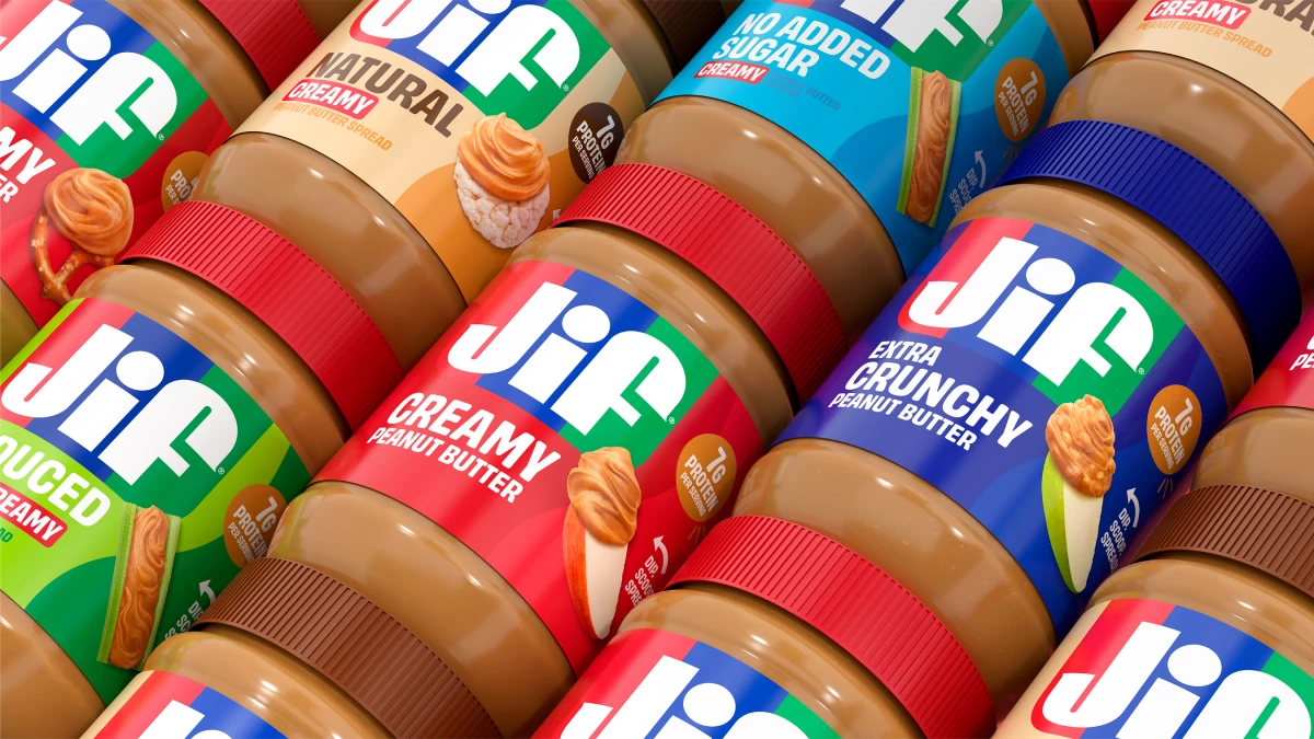

Jif just handed its most recognizable asset a second job.
Eighty-five percent of consumers can pick out Jif peanut butter's red, blue, and green stripes at a glance, says the brand.
However, this recognition has limits, as shoppers saw the logo and thought only of peanut butter and jelly.
Jif currently accounts for just 4% of total snacking occasions, despite owning one of the most identifiable packages on the shelf.
Its new platform, "Every Jif'ing Thing," rewrites the white lettering inside these stripes into a rotating set of prompts: DIP, SIP, MIX, and more.
Each one points to snacking ideas most people never associate with the brand, like creamy peanut ramen noodles, apple nachos, oatmeal, and ice cream.
Jif is also rolling out its first major brand refresh in more than 30 years.
The redesign revives the tri-color banner and strips the dated drop shadow from the letters.
New packaging starts shipping in October 2026, before reaching shelves in waves through the fall and early winter.
Treating the logo as a rotating message board marks a real change in how Jif thinks about its packaging.
"We wanted to honor the iconic elements people know and love while bringing new energy to the shelf," The J.M. Smucker Co. Marketing Director Shelly Kowal said in a press release.
"Jif has evolved from being one of the key ingredients in a PB&J to also serving as a delicious complement to so many snacking occasions, and this new branding celebrates that."
PSOne, the bespoke Publicis agency for The J.M. Smucker Co., developed the platform, with BBH USA leading creative.
The campaign runs across broadcast, streaming, TV, online video, Meta, TikTok, and Pinterest.
The Opera Treatment
The spots put an unexpected spin on "O Fortuna," one of classical music's most familiar pieces.
BBH USA re-recorded the booming Latin vocals with a full live choir and new lyrics about peanut butter's versatility.
Mechanical camera arms, extensive VFX, and detailed food cinematography track the typography as it rearranges itself across each stripe.
Packaging copy becomes the punch line of every scene.
Jif has spent the last few years finding new occasions for a decades-old product, and this latest push continues the idea.
In 2024, the Super Bowl-timed "Save the Celery" campaign asked football fans to pair leftover wing celery with peanut butter.
The Sandwich Ceiling
Jif is redesigning because the category has a limit.
The U.S. peanut butter market was valued at $1.7 billion in 2025.
On top of that, USDA data show peanut butter consumption running 6% above its 10-year average.
Other peanut snacks, including bars and trail mixes, ran below that same benchmark over the same period.
Buyers are pushing peanut butter into smoothies, desserts, and savory dishes, occasions well outside the PB&J sandwich.
A logo rewritten as verbs answers this demand head-on.
Jif's approach offers three lessons for brands sitting on recognition they have not fully spent:
- Transform a fixed asset into one that rotates: Making the logo's lettering editable gives Jif a reason to keep showing up in new contexts without a full redesign each time.
- Attack the occasion gap directly: With Jif appearing in only a sliver of snacking moments, naming specific combinations like ramen or apple nachos gives shoppers literal ideas to act on.
- Borrow scale from an unexpected source: Reworking a piece like "O Fortuna" gives a grocery aisle staple a moment usually reserved for premium categories.
Brand recognition earns attention, but only specific instructions tell shoppers what to do with it.
Our Take: Can a Logo Talk Us Into a New Snack?
A logo usually just sits there, guarding the shelf, doing its one job forever.
Jif cracked this open, and yes, we think the stripes reading "DIP and MIX" can talk a shopper into peanut butter on oatmeal.
It's a stranger move than it sounds for a brand this old, but one that makes sense considering modern snacking habits.
We keep coming back to the choir, of all things, going full opera about peanut butter with the same intensity usually reserved for war movies and perfume ads.
That's the real gamble here, borrowing scale from somewhere peanut butter has no business being, hoping shoppers find it fun instead of ridiculous.
A jar of peanut butter picking a fight this big is the kind of thing we want more brands willing to try, whatever the scoreboard says in six months.
The alternative is another quiet logo update that nobody talks about, and we have seen plenty of those.
Brands need agencies that understand how to align visual changes with operational ones so the rebrand holds up over time.
Explore the top branding agencies in our directory.