
Good design says what a brand stands for the second you see it.
It works quietly, guiding people through a website, a package, or an app without you noticing the effort.
Each month, DesignRush honors work that does exactly this through its Design Awards program.
July's winners span six categories, and every one of them naturally makes an idea, a place, or a product stick in your memory.
Best Website Design: Digital Silk
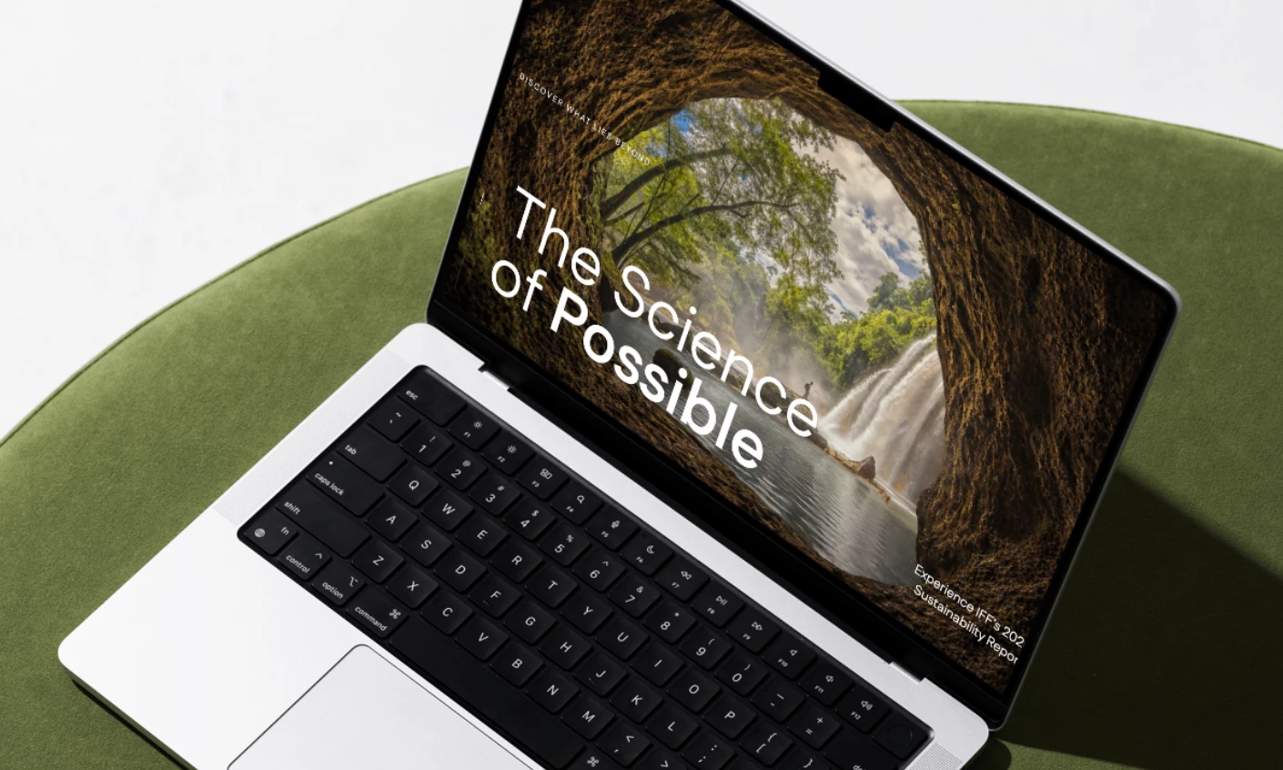
Digital Silk won the website category for its work on the IFF 2025 Sustainability Report landing page.
The team designed a scrollytelling experience for International Flavors & Fragrances Inc. (IFF), so each section reveals itself like an unfolding narrative.
A persistent top bar tracks scroll position against named sections, so readers always know where they are on a long page.
The data visualizations anchor the web design, with a radial supply chain wheel and bento-box layouts that make dense ESG figures easier to read.
The Download Report button sits right below the CEO's closing quote, the exact point where a click feels like the obvious next step.
Best Logo Design: Graphéine
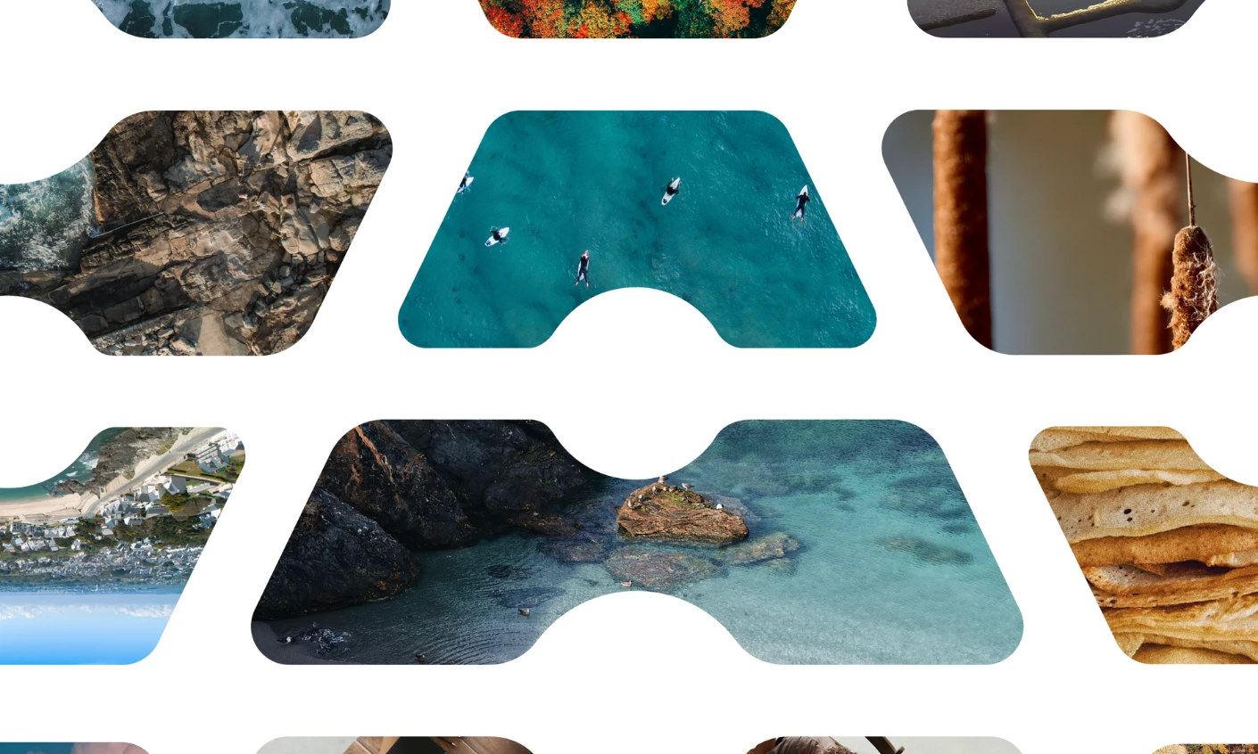
Graphéine took home the logo award for CapAtlantique La Baule-Guérande Agglo.
The mark builds an "A" out of two salt pans shown in perspective, meeting at a mound of salt at the center where the letter peaks.
The initial stands for both the Atlantic Ocean and the Agglomeration that serves the region.
A condensed custom typography keeps the wordmark legible even at small sizes.
Dark blue anchors the palette as a nod to the Atlantic, with brighter tones added so the mark holds up on totes, shirts, and aerial imagery.
Best Print Design: Brainlabs
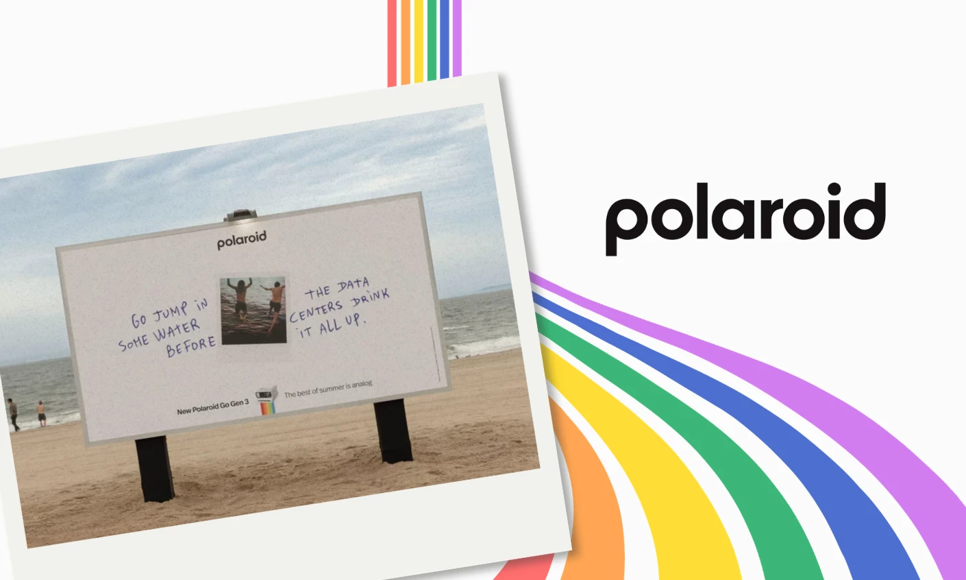
The print award went to Brainlabs for its creative work on Polaroid's "The Best of Summer Is Analog" campaign.
The Coney Island billboard makes its point in one line: "Go jump in some water before the data centers drink it all up."
Setting it on a beach was a logical move, since people typically put their phones away for the afternoon to unwind and enjoy the breeze.
The same brand tone shows up across London and New York, with witty lines like "You can't bask in blue light" easily catching attention.
Creative Director Patricia Varella calls Polaroid "deeply pro-human."
And this stance, coupled with the brand's analog nature, earns the provocative copy its credibility.
Best App Design: Rondesignlab
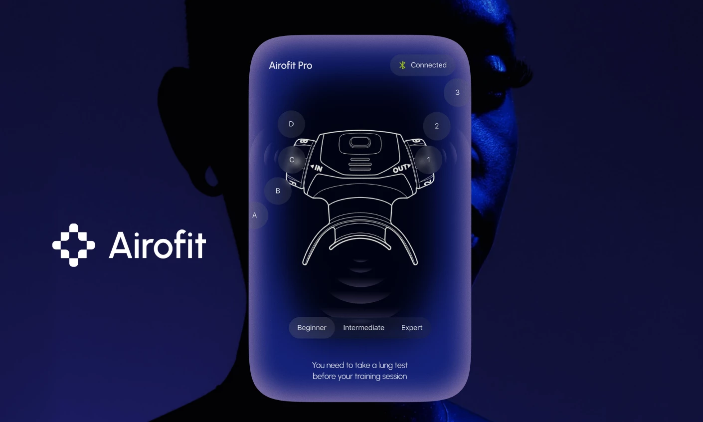
Rondesignlab earned the app award for its work on Airofit, a smart breathing device that delivers personalized training data.
Each screen gives one metric its own space instead of crowding the display.
The app design runs dark, with neon-tipped graphics that make the numbers feel alive while the device reads your breath in real time.
The pairing screen shows a labeled drawing of the device next to a Beginner, Intermediate, and Expert selector, so the setup feels like a cockpit.
Lastly, a dotted numeral style shows up across the lung capacity, breath volume, and streak counter screens, giving the whole app one clear signature.
Best Packaging Design: Happycentro
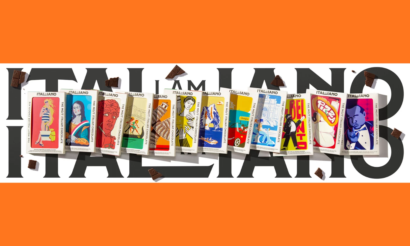
Happycentro bagged the award for its I AM ITALIANO packaging design, with every Italian cliché becoming the brand's actual visual language.
Each chocolate bar has its own illustrated icon, from the Mona Lisa and Michelangelo's David to Botticelli's Venus.
Pizza neon signs, an Italian Job sports car, and a tuxedoed man pinching his fingers round out the set.
The wordmark hides "I AM" inside ITALIANO, with the inserted letters forming the "L" in the middle.
A custom ITALIANO typeface holds the whole design system together, with each packaging creatively doubling as a collectible postcard.
Best Video Design: Dentsu Creative
Dentsu Creative won best video for IKEA Canada's "Assemble the World" spot for the World Cup.
The film rebuilds flags from everyday IKEA products, like a green DRÖNA box and yellow tray for Brazil, and a grid of KALLAX cubes for England.
Overhead framing and clean white space make small household items feel monumental, and playful cuts let them "assemble" like a flat-pack build.
The copy works just as hard, with "Brilliant match" reading as a football result and a product pairing at the same time.
The concept holds because the product mechanic is the message, flat-pack assembly standing in for a nation made of many cultures.
Design keeps influencing how brands talk to the people they're trying to reach.
July's winners show what that looks like when it's executed well: real systems, solid storytelling, and results people can use.
DesignRush continues to spotlight the teams pushing this work forward.