FOX Weather's Rebrand: Key Findings
- New identity rollout includes updated red-white-blue logo, tagline, and beach house event series.
- Viewership is up across FAST platforms, with sustained gains in minutes watched and total video starts.
- FOX Square activation runs through Labor Day, placing the brand refresh in front of one of Midtown’s busiest walk-by audiences.
Quick listen: FOX Weather’s fourth anniversary refresh proves rebrands work best when they’re lived.
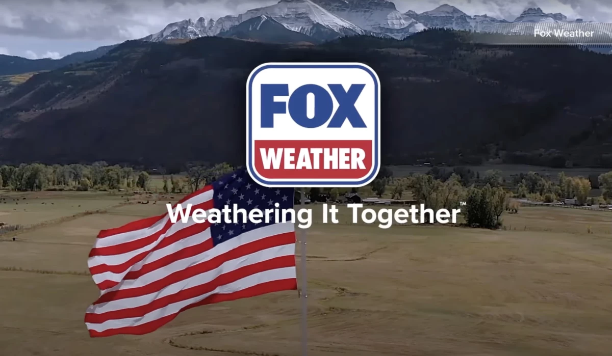
FOX Weather is entering its fourth year with a sharper look, a new slogan, and a full-on activation outside its New York headquarters.
The rebrand includes a red, white, and blue color scheme, updated logo, and tagline:
“For All Seasons. For All America.FOX Weather: Weathering It Together.”
It’s airing live segments from a pop-up beach house, complete with sand sculptures and a giant Adirondack chair.
The on-site broadcast, hosted by meteorologist Bob Van Dillen, marks the close of its summer programming push.
It is also the start of a more unified look across FOX News Media brands.
And to cap off the rollout, FOX Weather is taking over FOX Square in Midtown through Labor Day.
Since its 2021 debut, the network has steadily climbed the ranks across FAST platforms, and this added visibility has paid off.
FOX Weather is now logging double-digit gains across key metrics, from total watch time to monthly users, page views, and video starts.
Coverage of major weather events across FOX News Media has also amplified its reach.
Aligning with the FOX Family
The refreshed logo trades its softer blue-and-orange palette for one that now matches FOX News and FOX Nation.
It’s a small change that signals a deeper brand alignment, particularly ahead of the upcoming “FOX One” streaming service, which is expected to feature select feeds from across its media properties.
While the font and layout remain mostly unchanged, the move to red, white, and blue brings consistency to how FOX presents its expanding network across platforms.
View this post on Instagram
The new tagline, featured in recent promos, threads together themes of reliability and reach.
And while the phrase “Weathering It Together” remains trademarked by the network, the “For All America” line has raised eyebrows for echoing NewsNation’s long-standing slogan.
Still, the logo redesign lands at a moment of strong momentum.
FOX Weather has carved out space during national coverage of hurricanes, wildfires, and extreme heat.
It’s also found ways to localize its appeal, as seen in the current Times Square activation, which gives New Yorkers and passing tourists a way to see the brand up close.
Our Take: Can visual consistency drive real connection?
I think what really stands out here is the effort to meet audiences both digitally and physically.
FOX Weather could have quietly updated its graphics.
Instead, it used the moment to connect with viewers through live events, daily broadcasts, and brand storytelling that feels grounded in its mission.
It's not too flashy, but it captures attention.
For brands weighing a rebrand or realignment, a few things are worth pulling from this play:
- Don’t let the update live in a vacuum. Viewers need to see it, yes, but they also need to experience it.
- Anchor your change in a real-world moment. Whether it’s a campaign launch or a physical activation, context matters.
- Make the familiar feel new without breaking trust. Fox realigned its palette and messaging.
- Use your physical space as a canvas. Especially for media brands, headquarters are more than offices. They’re stages.
And lastly, keep the rollout tight and visible. Every touchpoint should carry the same language and tone.
Good branding doesn’t just announce itself; it earns attention by showing up consistently in places your audience already is.
Another great example of a great logo redesign is Bentley.
The luxury car brand recently launched its fifth logo, refining and modernizing its iconic "Winged B" emblem rather than completely changing it and alienating its audience.
Strategic refreshes drive relevance without losing equity. Work with experts who understand how to evolve brands without diluting their impact:


