-details-webp.webp)
Data and Insight Democratization: Key Findings
- U.S. enterprises are leading efforts to democratize data, using low-code tools and embedded analytics to support non-technical users.
- No-code tools accelerate decisions, letting non-technical teams explore data without analysts.
- Shared definitions prevent misalignment, ensuring teams act on the same metrics and goals.
U.S. companies are making data more accessible across teams, not just to analysts, according to the 2024 ISG Provider Lens report.
Yet, there’s a growing disconnect that’s frustrating employees and slowing down business growth.
While teams are told to “use the data,” many hit the same walls:
- Data is still locked away, accessible only to analysts
- Dashboards are too complex, and support is limited
Employees are not wrong to be frustrated.
While 92% of business leaders say data literacy is important, just 17% say their organization actually supports employees in building that skill, according to Qlik.
This common company problem can be expensive. Why? Opportunities are missed, decisions stall, and teams default to gut instinct over evidence.
-content-large-webp.webp)
Achieving data democratization isn’t about checking a box or saying you’ve “tried.”
It’s about putting in the kind of effort that actually drives impact in the form of faster decision-making, higher productivity, and measurable revenue gains.
Real democratization gives every team the clarity, context, and confidence to act. When data becomes part of how people work, not just how they report, momentum follows.
Platforms like Adverity support this shift by helping teams bring together data from across the business, making it easier to explore, interpret, and act on.
But tools are just part of the story.
To truly democratize data, organizations need to rethink how they design, deliver, and discuss insights across every team:
- Give teams tools they can use, not just access.
- Design dashboards that focus attention, not just show data.
- Turn charts into stories people can act on.
- Align on definitions before building dashboards.
- Make reports a trigger for action, not just updates.
- Build a culture that rewards curiosity, not just cleanup.
Each of these moves is simple, but strategic. Here’s how to put them into practice.
How to Make Data Actually Work Across Your Business
These six steps break down what democratization looks like in practice — and how to do it in a way that actually drives action.
1. Equip Teams with Tools They Can Use from Day One
True data democratization doesn’t just mean giving people access. It also means giving them tools they can actually use without needing a crash course in SQL.
Look for platforms with intuitive interfaces, visual builders, and low/no-code capabilities.
View this post on Instagram
The goal is to reduce friction so teams can pull and explore their own insights without waiting on analysts.
“If only experts can use the tools, don’t be surprised when only experts engage with the data. Usability is the difference between a company that talks about being data-driven and one that actually is data-driven,” said a representative from Adverity.
When tools are approachable from day one, teams stop waiting in line for reports — and start discovering answers independently.
That shift not only reduces bottlenecks, but also creates a stronger sense of ownership around data-driven work.
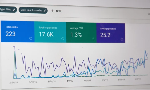
2. Design Dashboards That Surface the Right Data at the Right Time
Dashboards often fail not because the data is wrong, but because the design assumes too much.
If dashboards are hard to navigate, overly technical, or buried in niche tools, teams won’t use them, even if they have access.
View this post on Instagram
Likewise, if users have to squint, click endlessly, or guess at what metrics mean, they’ll disengage — or worse, misinterpret the data they see.
The goal here is to design dashboards that are intuitive enough for non-specialists to use, allowing users to easily draw strong insights from data.
That means surfacing core metrics in clear language, minimizing jargon, and ensuring performance data is easy to find and act on.
When insights are easy to access and understand, more people can contribute to better, holistic decisions and solutions.
3. Use Storytelling to Bring Data to Life
Not everyone speaks “data,” and that’s okay. This is where data storytelling comes in.
To do this, include short summaries, insights, and “what this means” sections alongside visuals that reflect the data.
Data visualization and storytelling help non-technical users connect the dots. This way, they see not just the chart, but also understand the key takeaways.
By framing insights in a way that’s human, relevant, and digestible, you help more people see not just what’s happening, but why it matters.
And when people better understand the story behind the numbers, they’re more likely to act on it.
4. Create a Shared Language for Metrics and Visuals
It’s almost impossible to scale insight without first establishing shared meaning. Yet many organizations jump straight into dashboard builds without first aligning on the fundamentals.
Visual consistency only goes so far when semantic inconsistency is still at play. And that ambiguity makes collaboration harder than it needs to be.
Without clear agreement on key terms and metrics, teams may optimize for conflicting goals, duplicate efforts, or misinterpret success altogether.
Ask your team questions like these and come to a consensus on what these should mean:
- What counts as a conversion?
- Which numbers matter most?
- Why is one team’s “win” another team’s “wash”?
5. Make Automated Reports Instantly Actionable
Automated reports are often framed as a time-saver. But it’s only valuable if you’re saving time by delivering something worth receiving.
Flooding inboxes with unfiltered dashboards or unreadable spreadsheets doesn’t democratize data; it desensitizes people to it.
Reports should do more than inform. They should prompt clear and instant action.
That means stripping out noise, surfacing what’s changed, and offering just enough context to guide next steps.
Add a short summary, flag key movements, and format it so the most important details are impossible to miss.
Whether reports are automated or manually built, the goal is the same: make it easy for someone to glance, grasp, and go do something with it.
6. Build a Culture of Data Curiosity and Reward It
Curiosity is often the missing piece in effective data strategies — not because people lack interest, but because the work culture discourages exploration unless there's a “right” answer.
-content-large-webp.webp)
The shift happens when you reward the question, not just the result, and when imperfect insights are treated as stepping stones, not liabilities.
“A big part of making decisions with data is trial and error - and that means allowing room for your marketers to make mistakes. But, if your company sees marketing as a cost center, then that’s not going to happen,” said Harriet Durnford Smith, chief marketing officer at Adverity.
Start by creating low-stakes opportunities to explore ideas such as:
- Open Q&A sessions with analysts
- Team-wide data dives
- Slack channels where early ideas are welcomed
Insight Without Access Is Just Expense
Bigger budgets won’t fix a broken data culture.
If insights are locked away, misinterpreted, or too complicated to use, then all the tools and dashboards in the world won’t help.
Democratizing data means making it part of how the business actually runs — not just how it reports.
Make it easy to access, easy to understand, and easy to act on. Then, step back and watch teams move faster, smarter, and with more confidence.