Utah Mammoth Launch Spot: Key Findings
- More than 850,000 fans selected “Mammoth” through a yearlong, multi-round naming vote.
- The cinematic launch film was produced in just eight days, shot across caves, museums, and snowy mountain roads.
- The campaign replaces typical sports tropes with atmospheric, myth-driven storytelling to build a deeper brand identity.
Quick listen: How Utah Mammoth’s mythic launch is redefining sports branding — in under 2 minutes.
A creature from Utah’s past just became the face of its newest NHL team.
To introduce the Utah Mammoth name in May, the team rolled out a cinematic launch instead of typical sports marketing.
The campaign centered on a 90-second piece led by director Zeppelin Zeerip and produced by Field Work Creative in Salt Lake City.
Shot in a museum, a real cave system, and snow-covered mountain roads, the film introduces the Mammoth not just as a name but as something ancient stirring back to life.
The narrative follows two young museum-goers and a hiker who uncovers a tusk deep underground.
These stories converge as a mammoth stirs beneath the ice, ending with a tusk breaking through and the rallying cry, “Tusks Up.”
Zeerip recalled the pace and pressure behind the scenes, noting the intense logistics of working across challenging locations.
“We had eight days to pull this off, from permits to mountain roads.
That cave sequence wasn’t just technically hard — it was the heart of the whole piece.”
View this post on Instagram
Zeerip said filming the tusk discovery in a cave, using lowered lights and rigged setups, gave the spot its strongest cinematic and emotional weight.
Forged Through Fan Power
The team’s launch wasn’t just visually ambitious.
During its inaugural season, Utah averaged over 11,000 fans per home game, while youth hockey participation in the state has climbed since 2020.
The Utah Mammoth name came from a year-long public process involving four rounds of surveys and more than 850,000 votes.
The team deliberately chose a singular form, “Mammoth,” to reflect unity and strength.
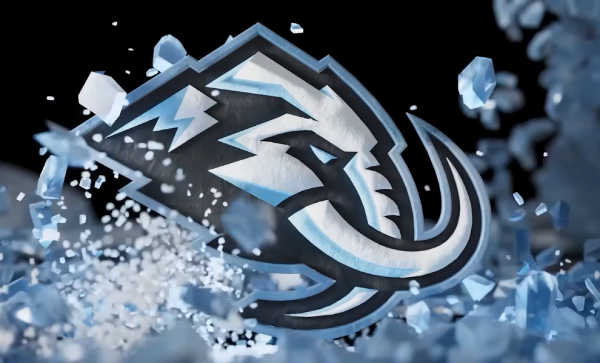
The final identity draws on Utah’s Ice Age history, with mammoth fossils found throughout the state, some still preserving DNA.
View this post on Instagram
The logo features the Wasatch Mountains, the outline of Utah, and curved tusks forming a U.
Jerseys retain the club’s original color palette of Rock Black, Mountain Blue, and Salt White while introducing a custom typeface called Mammoth Sans, angled to reflect the state's mountainous landscape.
Rather than outsourcing to a creative agency, the team developed the concept in-house and brought on Field Work Creative to execute it with scale and speed.
View this post on Instagram
According to Zeerip, the intent wasn’t just to promote a team but to create a myth rooted in the region’s geography and history.
The result is a campaign that gives the Mammoth identity emotional weight and a sense of permanence, designed to resonate long after the puck drops.
Our Take: Is This Just a One-Off or a New Standard?
I don't think this was built to be a one-time stunt.
It shows that even in sports, audiences expect more than a logo reveal and a slogan.
They want meaning and story.
The Utah Mammoth instantly becomes one of the best looking logos in all of professional sports. Ryan Smith and company listened to fans and absolutely nailed this. pic.twitter.com/PLutAlVT7C
— Art Cummings (@ArtTakesNote) May 7, 2025
The Mammoth launch proves that strong creative backed by local insight can build real emotional investment.
As budgets tighten and attention spans shrink, teams that put in this kind of work will stand out longer, connect deeper, and sell more on and off the ice.
For another campaign turning sports into storytelling, see how Adam Devine’s MLB spot brings comedy and purpose to the plate.