
Typography as a Trust Signal: Key Findings
- Typography shapes how audiences perceive your brand by conveying emotion, tone, and meaning before a single word is read.
- Most brands misuse type by defaulting to safe fonts, skipping scalability, or failing to build complete systems.
- Treat typography like a strategic asset, not decoration. When chosen intentionally, it can unify messaging, elevate perception, and future-proof brand identity.
What is the quickest way a brand can communicate its trustworthiness to potential customers?
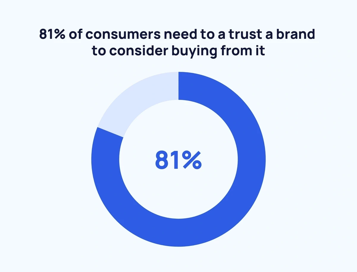
Through design and visual communication.
A website’s design can influence a company’s perceived business credibility by up to 75%, according to the Stanford Web Credibility Project.
However, most brand leaders still think of visual identity in terms of logos, color palettes, and product shots. Typography — if it’s mentioned at all — is often relegated to the margins, treated as decorative or secondary.
That can be a costly mistake.
Font and typography have the power to communicate brand personality and influence how consumers perceive traits like trustworthiness or sophistication, based on a study from the Journal of Brand Management.
To understand just how much is riding on those curves and counters, I spoke to Terrance Weinzierl, executive creative type director at Monotype, who shares why choice of typography is a strategic asset and how brands can do better.
Who Is Terrance Weinzierl?
As an Executive Creative Type Director in the Monotype Studio, Terrance Weinzierl has been creating and modifying typefaces for the Monotype Library and a wide range of brands since 2008. In addition to working on custom projects for PBS, Microsoft, Google, Barnes & Noble, Domino’s and SAP, he’s designed type for video games, professional sports teams, and auto manufacturers. As part of Monotype, he’s been involved in an array of client projects, designing bespoke type for well-known brands as well as contributing type releases, such as Kairos Sans and Monarda, to the library. Terrance designed Joanna Sans Nova, which is part of the Eric Gill Series superfamily, and maintains a keen interest in hand-lettering and calligraphy.
Typography as the Unsung Hero of Branding
Few people pause to notice a typeface. But when typography is done well, it feels right.
Terrance captures this succinctly:
“Typefaces carry emotion and add meaning along with the message from the copywriting. It’s logic and emotion all at once, which is why typography is so powerful.
Typefaces are doing the heavy-lifting in conveying mood and meaning in all of the content that a brand produces.”
Most marketing teams focus on what’s being said like strong taglines, clever CTAs, and punchy headlines. But typography quietly shapes how that message lands.
View this post on Instagram
Typography isn’t neutral. The shape of a single letterform can suggest warmth or coldness, elegance or utility.
That is what makes it such a potent tool for building trust between brands and customers.
“Type is memorable and recognizable, and building trust through experiences is the most important connection to the audience,” Terrance adds.
All of this is compounded by the fact that people will interact with your chosen typography at every point of their journey with your brand, from your logo and your website, to your brochures and packaging.
What Most Companies Get Wrong About Fonts
Typography mistakes don’t usually show up in a brand autopsy. But they’re often part of the slow bleed that many brands don’t notice until it’s too late.
When type fails, it rarely does so loudly.
And like many creative errors, it usually begins with a good-enough decision that no one revisits until something breaks.
Obviously, few teams set out to get typography wrong. But intention doesn’t immunize you from the outcome.
Some missteps are technical. Others are due to a lack of strategic clarity. Yet, all of these are avoidable if you know the common pitfalls.
Here are four of the most common ones, according to Terrance:
1. Relying on default fonts that dilute brand personality
System fonts are like off-the-rack suits: clean, functional, forgettable. Choosing one of these doesn’t make you look neutral. It makes you look like you didn’t choose at all.
“Ask yourself if Arial or Aptos is the best choice, or just the easiest choice,” Terrance advises. “You wouldn’t use any color for your specific brand, right? So why would you use just any typeface?”
Fonts help set the tone for how a brand speaks, moves, and feels.
And in a world where every scroll brings another DTC brand with millennial pink and minimalist packaging, a typeface is often your first shot at saying, “we’re not like the rest.”
2. Leaving the style guide of your brand bible unfinished
Most teams make decisions about headlines. Fewer take the time to consider how typography should behave in the subheads, body copy, disclaimers, legal text, or across different screen sizes.
Terrance points out that strong typography systems should plan for the whole experience, not just the hero moment.
“I often see style guides that have one headline typeface specified, but that can lack the depth that an organization needs. Try to think ahead to how type might need to be used across your brand’s storytelling, and this will help prevent rogue solutions popping up.”
To do this, try asking yourself the following questions and more:
- Do I need to specify a text and display style?
- What do the H2 and H3 levels of type look like?
- How can I exaggerate the mood I’m after by pairing typefaces?
- Does my brand have a specific product or service that requires a specialized type, like in an app or embedded in a device?
3. Choosing fonts that don’t scale across use cases
A typeface might look beautiful on packaging or signage, but fall apart at small sizes or on screens.
That’s not just an aesthetic concern. It’s a usability issue.
Legibility, optical sizing, variable font performance, and digital rendering all affect how typography holds up in the real world.
“For example, a serif or script typeface that has very high stroke contrast (the difference between thick and thin bits) that gets washed out when used very small,” Terrance explains.
View this post on Instagram
Although some typeface families have optical sizes to compensate for different sizes or viewing distances, brands should definitely make it a point to choose the right tool for the job.
Ideally, how a typeface works and how it looks should both be considered and leveraged.
4. Overlooking licensing and long-term usage rights
Every typeface comes with licensing terms that determine where and how it can be used. Unfortunately, many teams misunderstand, or even ignore, licensing.
That’s when problems begin.
A font chosen for a brochure ends up in digital ads, pitch decks, or product interfaces. No one checks whether those uses are actually allowed.
Sometimes the license covers it. Sometimes it doesn’t.
Relying on unvetted assets creates bottlenecks, last-minute workarounds, and potential legal costs.
Getting it right at the start — selecting the appropriate license, thinking through every use case — avoids disruption later. And it ensures the brand can grow without doubling back.
Build a System That Can Flex
The most expressive brands don’t cling to a single typeface. They build coordinated families of fonts designed to shift tone without losing identity.
It starts with a reliable sans. Then comes the range. Pair it with a serif for formal settings, or a script for something more personal.
“You don’t need to reinvent the system. Use what’s familiar to your audience when introducing a fresh element,” Terrance says.
Even within a single family, subtle adjustments carry weight.
View this post on Instagram
A bold, condensed style can command attention in a product brochure. A lighter, rounded version softens the tone in a welcome email.
Same brand. Same message. Different emotional register.
Of course, the goal isn’t variety for its own sake. It’s control.
A well-structured system gives brands the ability to shape perception — to move between confident and warm, formal and informal, without ever breaking character.
Bringing It ‘All Together’ for M&M’s
When M&M’s reached out to Monotype to refresh its brand, the goal wasn’t to change everything.
It was to evolve a familiar identity into one that felt more inclusive, more expressive, more current.
Terrance and the Monotype team partnered with Mars and JKR to create that evolution through type.
“Building on familiar elements from the logo mark, we developed ‘All Together’ — a custom sans and serif family designed to embody M&Ms refreshed purpose of inclusivity and belonging.
The All Together typeface features playful slab serifs with joyful details inspired by the candy itself, creating a bold and approachable voice,” he says.
With variable font technology built in, All Together could shift shape without losing character.
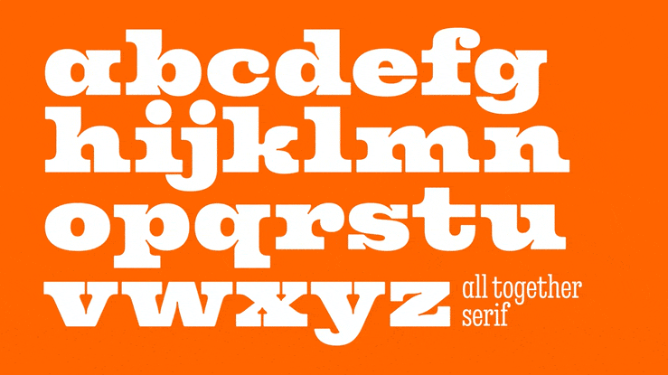
Every weight, every style, still feels unmistakably M&M’s — and that’s the point.
The system doesn’t just support a message of inclusivity. It embodies a type family with the idea of no two pieces looking the same, but all fitting together.
Navigating AI’s Role in Typography
AI isn’t coming for type. In fact, Terrance frames AI not as a threat, but as an accelerant:
“The power of AI tools is startling, but technology usually moves faster than our comfort level with it.
I think the near future will bring the ability to use specific typefaces with precision and clarity within an image prompt, ensuring brands stay visually consistent even as technology evolves.”
That’s where things get interesting for brand typography. Through Monotype’s integration with Pencil, teams can now embed licensed fonts directly into AI-driven creative workflows.
This means even AI-generated content can stay visually consistent, legally sound, and emotionally coherent in every use case.
What happens when AI comes for our fonts?
— Monotype. (@Monotype) June 23, 2025
We get new tools, new questions, and a whole lot of new creative possibilities.
As Charles Nix says: “You don’t get many chances to see a radical shift like this.”
And through it all, it’s still people — designers — driving the change. https://t.co/bfkNlG3Wmp
Terrance also sees another opportunity emerging, one that’s less about automation and more about navigation.
Tools like What The Font are quietly reshaping how designers discover and pair type.
“These tools make it much more efficient to find what you’re looking for in a massive library of fonts,” Terrance explains, “much like how music streaming services help us quickly and accurately navigate vast song catalogs.”
Anchor Your Brand by Choosing with Intent
Most people won’t notice a well-chosen typeface. But they’ll feel it.
“Typefaces are an essential element to any visual identity, and the choice and use matter as much as the logo, colors, photography, illustration, or any other visual asset,” Terrance concludes.
The right typography doesn’t just carry the words — it carries the brand.
And when it works, it becomes invisible in the best possible way: by letting your brand’s message take center stage.
But get it wrong, and the damage accumulates quietly.


