Patrón's Redesign: Key Findings
- Patrón unveils its first major packaging redesign since 1989, emphasizing heritage while introducing modern, premium visual cues.
- New bottle features embossed agave-inspired glass, golden bee emblem, and sustainable lightweighting to reduce carbon footprint.
- The gift box refresh designed by Butterfly Cannon adds premium details and cocktail QR codes to elevate the consumer experience.
Quick listen: Patrón’s tequila bottle redesign blends heritage and sustainability — in under 2 minutes.
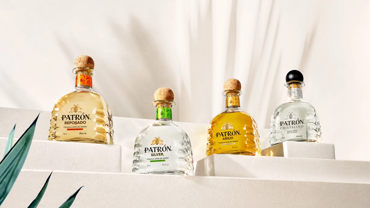
Patrón Tequila is giving its bottle a new look for the first time in more than three decades.
The tequila maker has revealed a refreshed bottle and packaging design across its core portfolio, including Silver, Reposado, Añejo, and Extra Añejo, while keeping its signature bell-shaped silhouette intact.
“This moment represents more than a redesign — it's a statement of brand leadership and everything that defines Patrón today,” said Roberto Ramirez, Global Senior VP for Patrón and Agaves.
He added that every element was carefully considered to help the bottle stand out on shelves the same way the tequila itself does inside the glass.
Created by global creative agency Servaire & Co., the redesign highlights details tied to craftsmanship and heritage.
Embossed glass patterns inspired by the agave piña emphasize the natural ingredient at the heart of the spirit, while the iconic Patrón bee has been given a gold upgrade on the three-dimensional logo.
To display the brand’s sustainability efforts, the bottle weight has been reduced by 8% across formats, cutting its overall carbon footprint.
Samantha Newby, Global VP for Patrón, Innovation & Sustainability, said that the change was about balancing innovation and tradition.
“Every aspect of this bold design evolution is an homage to our handcrafted Mexican heritage and the details that go into making our exceptional artisanal tequila,” she noted.
A Modern Touch on the Shelf
Beyond the bottle itself, Patrón has also refreshed its premium gift packaging, designed by London-based Butterfly Cannon.
The box retains its vibrant colors while introducing debossed white detailing and a scannable QR code that leads customers to cocktail recipes.
Other updates include a neck collar with filigree motifs inspired by the brand’s Jalisco distillery and Master Distiller David Rodriguez’s signature.
This is paired with the phrase “Handcrafted with Agave, Water and Time” printed on the bottle’s side.
The brand emphasized that while the look has evolved, the liquid inside remains unchanged.
Putting together nods to its heritage with forward-looking packaging choices allowed Patrón to strengthen its role as a leader in premium tequila.
The rollout is now underway in the U.S. and will expand to international markets this fall.
Our Take: Can Packaging Truly Shape Premium Identity?
To me, Patrón treated the redesign as both a visual makeover and a business move.
It kept its iconic silhouette but enhanced details like the agave embossing and golden bee, reminding consumers that brands can stay true to their roots while boosting relevance.
I find it interesting that sustainability was integrated through bottle lightweighting, which turned its packaging into part of the company’s comprehensive brand marketing strategy.
Overall, it shows how packaging can do more than protect a product: it can deepen storytelling, reinforce heritage, and even become a touchpoint for digital engagement with QR-linked recipes.
In other news, Grey Goose recently launched a U.S. Open activation that connects the brand to lifestyle moments.


