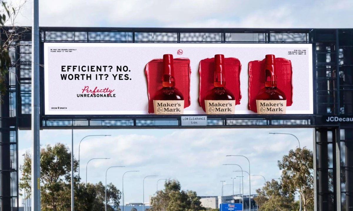

Maker's Mark is giving its signature red wax a new role in its global brand identity.
The brand extends a creative relationship with Turner Duckworth into a second master-brand redesign.
The Kentucky bourbon brand unveiled the identity Nov. 17, with Turner Duckworth London leading the work.
Matt Fox, creative director at Turner Duckworth, told DesignRush that the brief started with an asset that the studio didn't have to invent.
"We're always looking for the unmistakable and with Maker's Mark there was already one of the most recognizable assets in the world, the red wax," he said.
The system draws on the materials and production methods at Star Hill Farm.
It also extends Maker's Mark's "Perfectly Unreasonable" campaign into a visual language for global markets.
Full-service agency Carmichael Lynch created that campaign in February 2025, its first work for the brand.
This second redesign follows Turner Duckworth's 2021 brand refresh and its 2025 identity for Star Hill Farm Whisky.
"My grandparents weren't thinking about 'branding' when they created Maker's Mark," Rob Samuels, eighth-generation whisky maker and managing director, said in a press release.
"They cared about a hand-made process in service to flavor and design that honors that vision."
The new identity rolls out through the brand's website, advertising, retail, social media, and brand experiences, continuing through 2027.
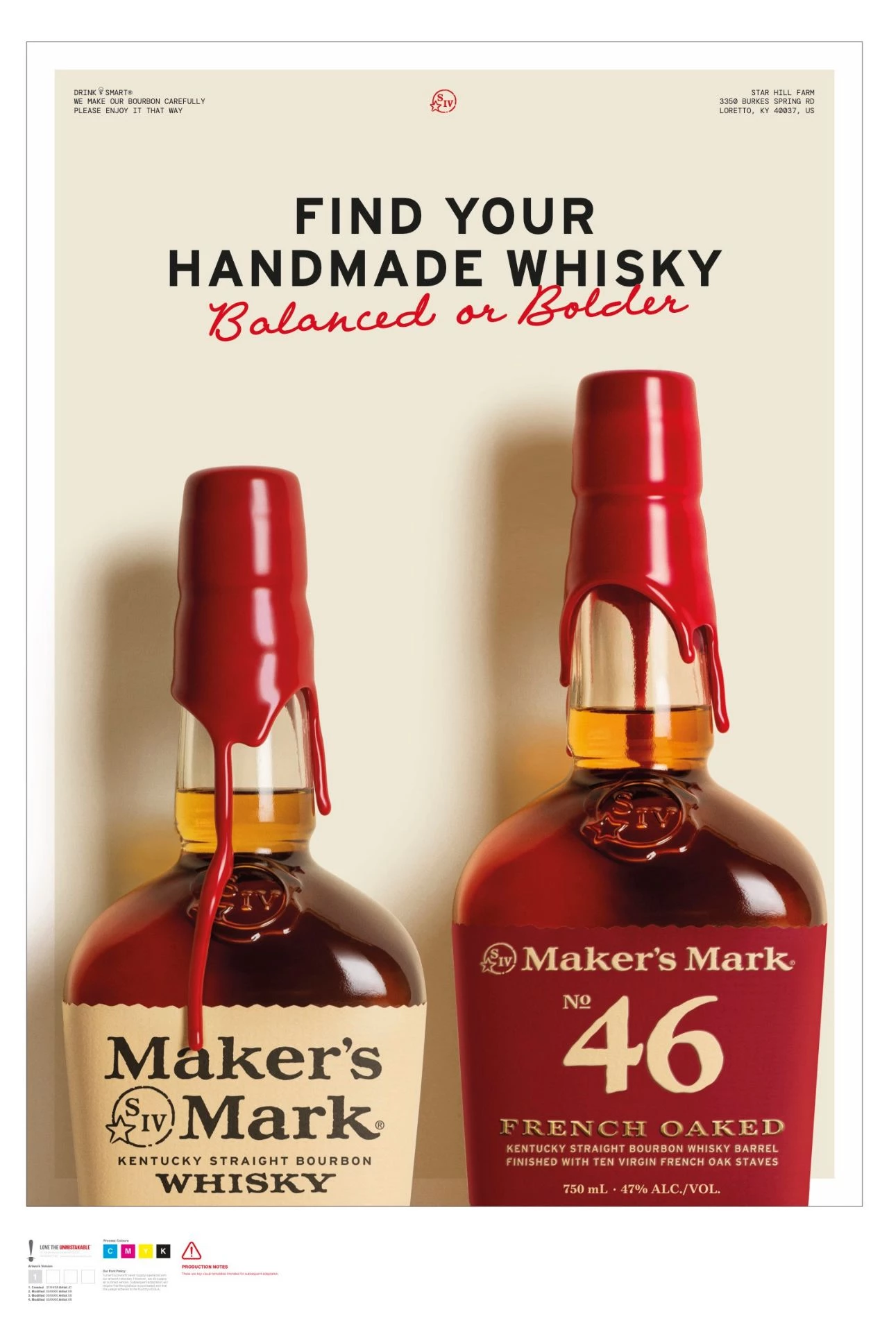
Three Maker's Mark briefs since 2021 give Turner Duckworth a retention record that heritage brands look for when they put an identity refresh up for review.
The agency has also refreshed Kleenex and Newman's Own, so each repeat brief here doubles as a case study for its next heritage pitch.
London Studio Picks Up Its Third Brief From the Distillery
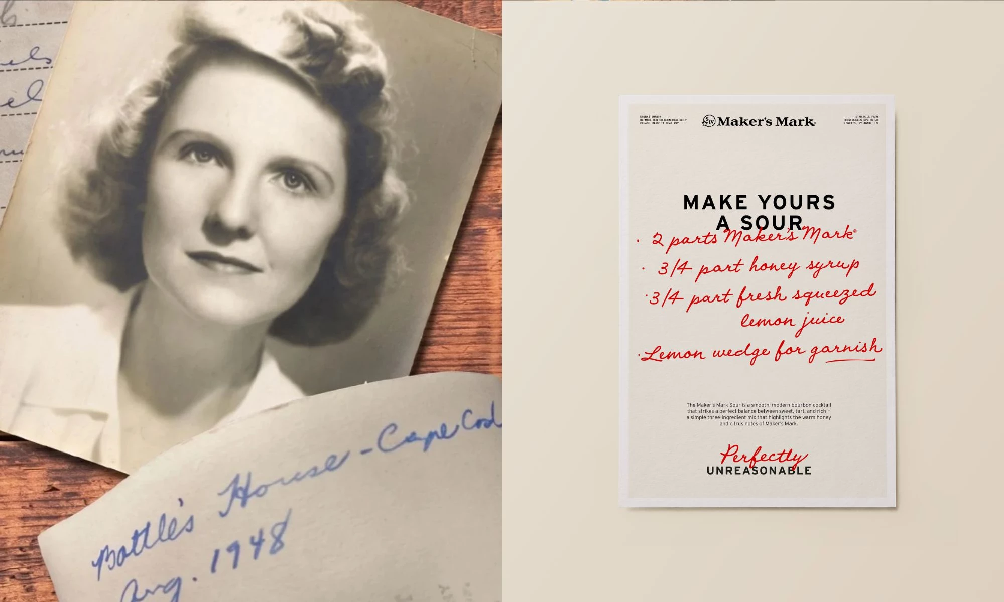
The London team developed custom typography inspired by co-founder Margie Samuels' handwriting.
It also created tactile wax marks using natural materials found at Star Hill Farm.
These include wheat stalks, oak rings, and native flora.
Fox also shared with us that the studio used the wax to point people toward the place where Maker's Mark is made.
"But great design is also about opening doors into worlds, real places," he explained.
"By taking the wax beyond the bottle, we've created a mark-making language that brings the ingredients, land and human craft behind Maker's Mark into the identity, giving the brand a richer way to tell its story while remaining unmistakably itself."
Turner Duckworth's 2021 master-brand refresh also used the red wax as its central asset.
Creative director Jared Britton led the earlier work, which introduced custom fonts, wood-etched graphics, and a more extensive red-and-cream visual language.
Turner Duckworth also designed the identity for Star Hill Farm Whisky in 2025.
The product's visual system used agricultural imagery, wheat textures, and recycled packaging to communicate its connection to the land.
The latest identity folds these creative territories into Maker's Mark's main design system.
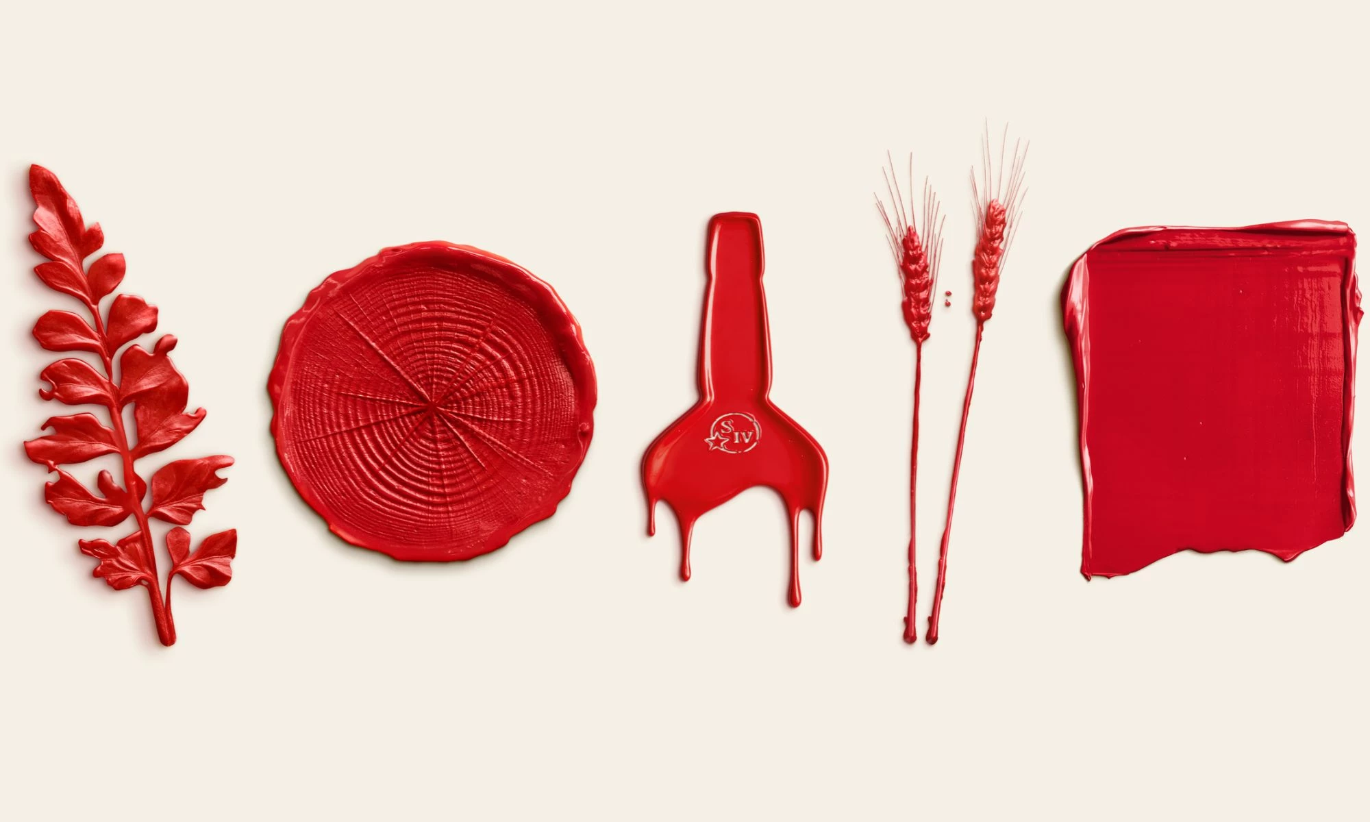
Chloe Lloyd-Jones, VP of global brand marketing at Maker's Mark, told DesignRush that the identity gives the brand's mantra a visual form.
"Maker's Mark has always been a brand that does things differently, and our 'Perfectly Unreasonable' philosophy is rooted in the belief that the extra effort we put into making our bourbon is what makes it exceptional.
With this new visual identity, we're bringing that story to life in a fresh, contemporary way," she said.
"Our ambition is to build on the strength of our heritage to elevate how we show up in the world, communicate the quality of our bourbon and create a distinctive, premium and consistent brand experience that connects with consumers across markets."
In the brand's press release, Lloyd-Jones connected the handmade process to a world that keeps speeding up.
"In a world increasingly driven by speed and automation, we still believe some things are worth making slowly, by hand," she added.
Elements of the new identity already appeared in brand experiences in the U.S. and China. Outdoor ads also launched in Australia and the U.K.
Maker's Mark's in-house global brand team handles the market-by-market experiences, while Turner Duckworth supplies the system they all draw from.
The rollout tests the global branding strategy that Turner Duckworth set out in 2021, when it framed that refresh as a foundation for a global icon.
68 Years of Hand-Dipped Wax Anchor the System
Maker's Mark has hand-dipped its bottles in signature red wax since 1958, which gives Turner Duckworth an asset with decades of brand recognition.
Star Hill Farm Whisky broke that run in 2025 as the first bottle from the distillery without the red wax.
The 2026 identity puts the wax back at the center of the master brand.
Heritage brands vetting a design agency should look for one that has already worked both with and without their signature asset.
Turner Duckworth has done both at Maker's Mark, so it knows which assets must stay fixed and which ones can flex.
Agencies and brands developing a heritage brand strategy can take three lessons from Maker's Mark:
Give Signature Assets Room to Grow
Brands should identify the visual features consumers already associate with them and find new applications that preserve their recognition.
Maker's Mark released a red, white, and blue wax dip in June 2026 for America's 250th anniversary, with a portion of proceeds going to the Farmer Veteran Coalition.
Make Production Part of the Design Brief
Agencies should explore the materials, people, and processes behind a product when developing visual identities.
Turner Duckworth's Star Hill Farm Whisky packaging used wheat-fiber labels and a ceramic-finish cork that nods to Kentucky limestone.
Keep Agency Relationships Strategically Connected
Brands should give agency partners enough continuity to understand existing design systems and develop new work without losing brand recognition.
Turner Duckworth's London studio led the 2021 Maker's Mark identity and returned to lead the 2026 system.
Lloyd-Jones' team went back to Star Hill Farm for the materials, so the in-house brand team helped design the new identity alongside the agency.
Our Take: Can One Agency Keep a Heritage Identity Current?
Turner Duckworth knows Maker's Mark's visual history better than any shop the brand could hire today.
We'd back one agency to keep a heritage identity current, as long as each refresh finds new raw material to work on.
Familiar design cues can turn repetitive if every refresh leans on the same red-wax treatment.
Carmichael Lynch also adds a second voice, since it writes the "Perfectly Unreasonable" ads that the identity has to support.
Suntory used the same split on Jim Beam in 2023, when Turner Duckworth designed the identity and Leo Burnett made the "People Are Good For You" ads.
Maker's Mark should hand both shops the same wax marks for the 2027 rollout so the ads and the identity look like one brand.
In a DesignRush interview, Turner Duckworth discussed how iconic brands can preserve recognition while keeping their identities relevant.
Explore these top branding agencies on DesignRush to find a partner for your next brand identity project.