Lufthansa Group's Rebrand: Key Findings
- The new brand identity strengthens cohesion through an evolved crane, new typeface, and expanded palette.
- Clearer visual cues improve navigation across booking paths, signage, and aircraft markings, making multi-airline journeys easier to follow.
- Rollout through 2026 brings the new identity to aircraft, lounges, and digital platforms, creating a more consistent experience across the network.
Lufthansa Group has unveiled a new brand identity that reinforces its evolution into an integrated airline network.
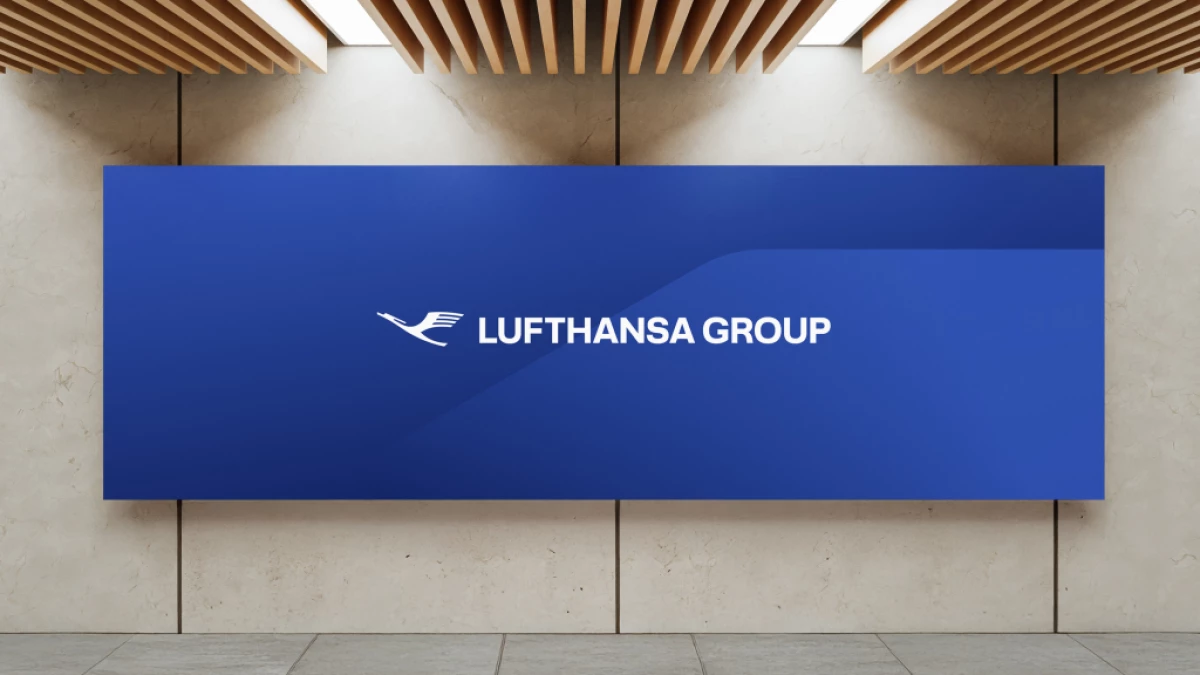
The redesign centers on an evolved crane logo, now presented without its long-standing circular frame.
Along with a new typeface and a color palette expanded by six altitude-inspired tones, the redesign reflects the scale and diversity of the Group.
Executives frame the update as a strategic milestone.
Chief Commercial Officer Dieter Vranckx said the new identity acts as "a visual anchor of trust" and supports a unified brand experience across all Group services.
"It will reflect our strategic brand values and a promise we want to make to our passengers across all our brands," Vranckx added.
The system is already live on digital boarding passes, websites, and more than 160 aircraft, with wider rollout planned into 2026.
A Visual System Built for Consistency
The new visual identity introduces a top-layer structure that sits above each airline’s individual brand.
It's designed to create a smoother experience for travelers who may book on one carrier, connect on another, and use lounges operated by a third.
The vertical color spectrum is also appearing in wayfinding, onboard materials, and airport environments to reduce fragmentation.
Refreshed digital touchpoints and updated aircraft now feature the “Member of Lufthansa Group” endorsement, signaling affiliation across the network.
As lounges and signage are updated globally, these cues will help travelers recognize Group services more easily, particularly in shared hubs.
The goal is cohesion across the Group while preserving each airline’s unique brand identity.
Industry Shifts Give the Redesign Added Weight
Airline groups increasingly depend on strong brand architecture as multi-carrier itineraries become more common.
IATA expects global passenger traffic to reach 4.8 billion in 2024 and approach 5 billion in 2025.
This underscores the need for clearer guidance throughout the travel journey.
Within this backdrop, Lufthansa Group’s redesign functions as an operational upgrade.
It clarifies how the Group operates as a connected network and gives passengers intuitive visual signals across platforms, aircraft, and airports.
View this post on Instagram
To sum it up, the new brand identity creates structural advantages:
- Simplified journeys across multi-airline itineraries
- Efficiencies in signage, interfaces, and aircraft liveries
- Stronger recognition in competitive hub markets
It also gives the Group a clearer platform for future service updates, since a unified identity makes changes easier to communicate.
Our Take: What Does This Rebrand Really Change for Travelers?
I see this redesign as a rather practical improvement.
Travelers rarely think about airline groups, but they notice when the experience feels disjointed.
A clearer system helps remove that friction, especially in hubs where multiple carriers share space, and passengers switch between brands without realizing it.
What stands out is how the Group is using design to support behavior that already happens at scale rather than trying to teach something new.
The new identity gives Lufthansa Group a way to signal connection across its airlines without overwhelming the individuality of each one.
In practice, this means fewer moments of hesitation for passengers and a smoother sense of continuity across the journey.
In other news, American Airlines is boosting its global reach through a new FIFA World Cup partnership.
Need help with your brand? Explore DesignRush Top Branding Agencies to elevate your next identity project.


