Key Takeaways
- Korean Air’s first major rebrand in 40 years modernizes its identity while maintaining its heritage.
- The new visuals align with its premium service offerings and international expansion strategy.
- The rebrand follows its merger with Asiana Airlines, reinforcing Korean Air’s status as a global aviation leader.
Korean Air is soaring into a new era with a bold brand transformation led by global brand consultancy Lippincott.
The rebrand, the airline’s first since 1984, reaffirms its position as a premium global carrier while reinforcing Seoul’s status as a major international aviation hub.
This redesign only marks the second refresh in the airline’s 55-year history.
Beyond a new look and being the most loved airline, we continue to connect people, cultures, and experiences.
— Korean Air (@KoreanAir_KE) March 11, 2025
Discover the next chapter of Korean Air at the link below.https://t.co/CGxd4xxiWFpic.twitter.com/nNnl1Jsrms
Inspired by its “Excellence in Flight” ethos, Korean Air’s new identity enhances its business and first-class offerings, elevating the passenger experience with a hospitality-driven approach.
At the heart of the rebrand is a modernized Taeguk, the iconic symbol from the South Korean flag.
Lippincott’s reinterpretation blends the original emblem’s strength with the flowing elegance of Sangmo Nori, a traditional Korean prosperity dance known for its ribbon movements.
The refined Taeguk now stands independently, increasing its visibility throughout the airline’s newly crafted cabin environments by design company PriestmanGoode.
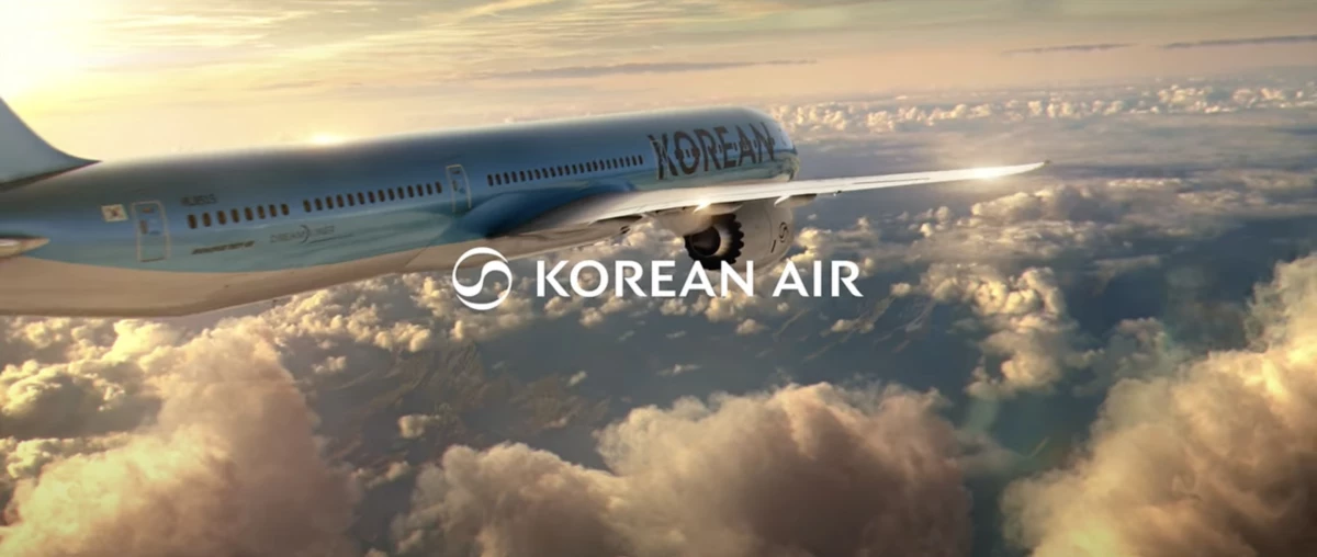
The updated logotype, inspired by luxury hospitality, features refined, tapered terminals that echo the Taeguk’s fluidity while evoking traditional calligraphic brush strokes.
Notably, the word “Air” has been removed from the fuselage logotype, allowing “Korean” to take center stage.
It is a move that reinforces its flag carrier status and ensures greater brand visibility at global airports.
In an exclusive statement to DesignRush, Dan Vasconcelos, creative director at Lippincott, shared insights on the strategic vision behind the rebrand and how it aligns with the airline’s ambitions for global growth.
"The rebrand is part of a wider strategy shift by Korean Air, with the aim to take the business from a national carrier to an international airline.
This focus on unlocking global audiences — and therefore global growth — was a key consideration throughout the process, and informed key design decisions.
Alongside a redesigned business class cabin, menu, and all-round premium passenger experience, the rebrand shines a spotlight on Korean Air as a new, modern, confident, and more global brand.
Ultimately, it signals a new era for Korean Air, bringing a host of new growth potential."
The rebrand, revealed at the airline’s headquarters in Seoul, blends tradition with contemporary aesthetics to reinforce its position as South Korea’s flagship carrier.

The rebrand also extends to inflight experiences. New premium-class dining, developed in collaboration with renowned chefs, features gourmet dishes and expanded menu options.
Enhanced tableware, luxury bedding, and exclusive amenity kits elevate comfort for first-class and Prestige passengers.
The upgraded brand identity and inflight experience will begin rolling out today, with a phased introduction across Korean Air’s global network.
With Korean Air, Anywhere is Possible
The new look was launched with a cinematic brand film titled "Anywhere Is Possible."
The film opens with a young woman sitting at an airport, imagining her next adventure as she poses the question, "What's your anywhere?" to the unseen audience.
The scene then transitions through breathtaking destinations — from lush forests and vast deserts to vibrant cities around the world.
"That's why we fly daily to first interviews, second chances, third dates, to grand entrances, and mic drops," the narrator continues.
The two-minute video ends with the message: "At Korean Air, we don't just fly to hundreds of destinations. Our routes streak across the sky to millions of extraordinary anywheres."
View this post on Instagram
Korean Air’s rebrand is a strategic move to strengthen its global presence and attract more premium travelers.
The airline is focusing on luxury and a high-end experience, making it more competitive in the international market.
Removing “Air” from the logo helps “Korean” stand out, reinforcing national pride and increasing brand recognition.
Likewise, Nockta previously made its own bold transformation, rebranding to showcase its evolution into a global, innovation-driven agency.


