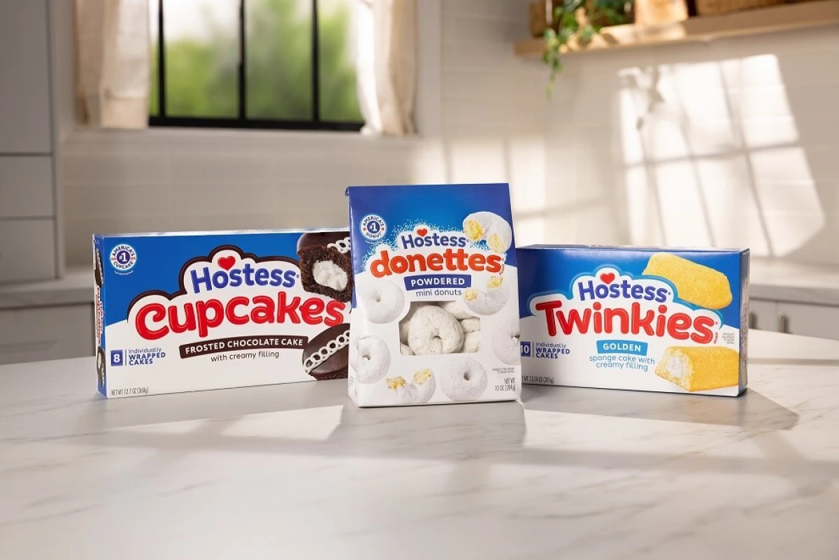
Hostess, America's favorite sweet snack, has just revealed a rebrand that shakes up the iconic Twinkies logo and packaging design, which also includes fan-favorites Cupcakes, Donettes, and Ding Dongs.
The J.M. Smucker Co.-owned snack company's new modernized look was created in an effort to refresh the brand for a new generation while still appealing to its loyal fans.
Featuring a streamlined typeface and a more vibrant color palette, the new logo keeps the brand's trademark heart design, showing that its core values remain the same.
Hostess also celebrates the light and airy texture its snacks are known for with a new cloud-shaped border.

In a press release, The J.M. Smucker Co. VP Christopher Balach positioned the new logo and packaging design as the next chapter of the iconic brand:
"When we talk to consumers about the brand, the thing we hear again and again is about the joy it brings, and we were eager to celebrate the special feeling of enjoying a favorite Hostess treat through this work."
Meanwhile, Marketing Director Aundrea Graver pointed out the subtleties of the easter eggs embedded within the product packaging and presentation and how they celebrate the uniqueness of each snack produced.
Refreshing a packaging design should retain the core aspects of what makes a brand unique and recognizable while creating relevance to a new audience, just like how Hostess did it.
Business rebranding is an essential part of increasing a brand's longevity, ensuring it remains attractive to both old and new generations.
New Look, Same Taste
Hostess tapped a dedicated team to develop the brand's new look, employing multiple phases of consumer testing to achieve a satisfactory final result.
According to the brand, consumers preferred the updated designs 2:1 to the older presentation, citing a more appetizing and modern feel.

The rebrand also unifies the brand's identity across its different offerings, utilizing fonts that look quite similar to each other.
This is most evident in Hostess' new design for Ding Dongs.
While rebranding is something that helps businesses stay relevant, especially with new trends coming up every decade or so, not everyone can be considered a success.
Last month, Jaguar made headlines when it launched a radical rebrand that shocked critics and fans alike, drawing immense backlash online.


