Hello's Whipped Toothpaste Campaign: Key Findings
- The brand has launched its new whipped toothpaste with a campaign developed by Walrus, centered on the product's foamy texture.
- "The hello Whipped Effect" targets sensory appeal in a category where most advertising leads with clinical claims.
- The product retails for $5.99 at Walmart, Target, and Amazon, a premium-positioned launch with immediate mass retail distribution.
Oral care brand hello has launched its new whipped toothpaste with a campaign built around translating a sensory product experience into advertising.
The campaign, titled "The hello Whipped Effect," was developed by creative agency Walrus and centers on a visual metaphor for the toothpaste's foamy, velvety texture.
The product, a swirl-shaped fluoride formula, comes in two flavors: mellow mint dream and peppermint stick.
View this post on Instagram
It's also vegan with no artificial sweeteners, dyes, SLS, parabens, or titanium dioxide.
Hello is owned by Colgate-Palmolive, which acquired the brand in 2020 and has continued expanding it across mass retail.
This campaign is as much about reinforcing the brand's identity as it is about launching a product.
A format this visually distinct needs creative that earns the same attention on screen as the packaging does on the shelf.
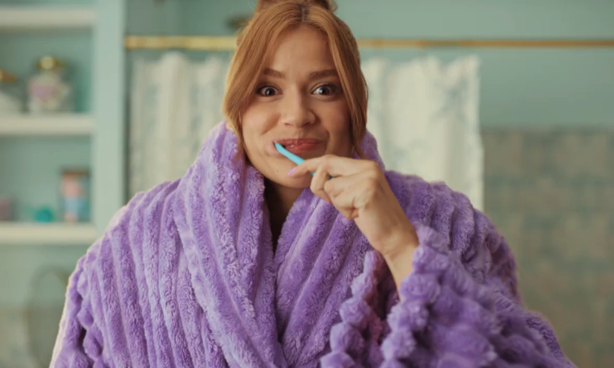
The Puffing Robe as a Creative Device
The campaign's central image is a puffing robe, used as a stand-in for the sensation of using the toothpaste.
The creative logic is that the texture of hello, which is whipped, foamy, and airy, needed a physical equivalent that could communicate the feeling visually.
View this post on Instagram
Paula Beer Levine, managing director at Walrus, told DesignRush the brief started with the product's visual identity and worked outward from there:
"The poppy pastel packaging, playful nurdle shape, and unique brushing experience make it an incredibly visual, sensorial product — and that became our inspiration," she explained.
"The puffing robe became our metaphor for that moment: plush, airy, and unexpectedly delightful, bringing the feeling of using hello whipped to life in a way that breaks from traditional industry advertising and leans into hello's signature sense of joy."
The campaign moves away from the clinical visual language that defines most oral care advertising.
Texture, mood, and the bathroom counter as a stage are doing the work here.
Hello's Brand Positioning
The brand has built its identity around ingredient transparency and aesthetic design since it launched in 2013.
It has maintained this brand positioning while expanding into wider retail distribution.
Colgate-Palmolive reported net sales of $20.1 billion in 2024, up from $16.47 billion in 2020.
Hello operates as a premium sub-brand within this portfolio, targeting shoppers who are willing to pay slightly more for distinctive packaging and cleaner formulations.
Rebecca Keszkowski, director of social, influencer, and communications at Colgate-Palmolive, told DesignRush the campaign reflects how the brand approaches product development:
"Everything we do — from how we develop our products to how we show up creatively — starts with a simple question: 'How can we bring more delight, magic, and 'yay' to the everyday?' That idea is at the heart of whipped and what inspired our newest creative," she said.
"In 'The hello Whipped Effect,' we bring the dreamy, foamy texture of our whipped toothpaste to life in a way that shows how something as routine as brushing can feel extra special."
The $5.99 price point also keeps the toothpaste accessible, which is crucial for a brand whose growth depends on its shelf performance at stores like Walmart and Target.
Hello's latest campaign offers a few takeaways for brands launching sensory or format-driven items:
- Find a physical metaphor for intangible experiences: A stand-in image helps audiences visualize the feeling of using the product.
- Let the product's aesthetic lead: A campaign that matches the packaging's tone reinforces shelf impression.
- Mood-led advertising earns attention in functional categories: Sensation and aesthetic give a brand a distinct register.
Toothpaste is a category where every brand promises the same things, and the ad format can be what actually prompts people to pick it up.
Our Take: Does the Metaphor Land?
We think the puffing robe is a clever way to convey the brand's message.
Toothpaste texture is hard to show, but Walrus still found a way to make it tangible and believable.
View this post on Instagram
Hello also has a consistent enough visual identity that the campaign reads as an extension of the brand, which is a harder thing to achieve than it looks.
At $5.99 and on shelves at major retailers, we think it will be easier for consumers to try the product out.
Holding on to customers will be more difficult to execute.
CPG brands launching sensory or format-driven products need agencies that understand how to translate product experience into compelling creative.
Explore the top creative agencies in our directory.