Heinz Fry Box Campaign: Key Points
- Heinz and Rethink’s "Looks Familiar" campaign focuses on how fry boxes resemble the brand’s iconic Keystone logo.
- Its Canadian rollout partners with Uber Eats, offering half-off Heinz bottles with fry orders to boost delivery presence.
- Paid media and social support extend globally, establishing Heinz as the go-to condiment in restaurants and takeout.
Heinz is reminding people that fries without its ketchup just don’t feel complete.
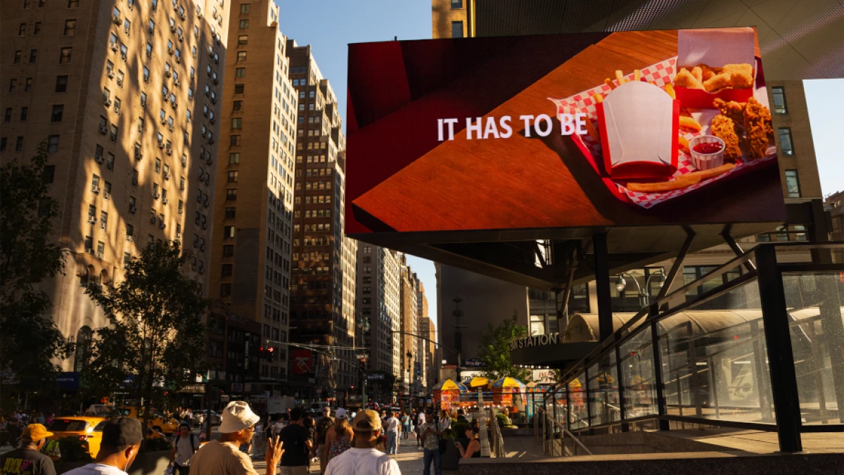
Together with agency Rethink, the company has launched "Looks Familiar," a global campaign that highlights a simple truth: fry boxes around the world resemble the Heinz Keystone logo.
It’s a cheeky way to prove the brand’s claim that not just any ketchup pairs with fries. It has to be Heinz.
View this post on Instagram
“While the insight behind this global idea is a simple one, the Heinz brand's connection to fries is iconic and universal,” said Nina Patel, VP of Global Heinz brand at the Kraft Heinz Company.
“No matter where you are in the world, ‘Looks Familiar’ spotlights the truth that famous fry boxes everywhere are shaped just like our distinctive signature Keystone.”
Patel continued, saying the campaign is an affirmation of the love that generations of fans have for the condiment.
"While we don’t know who designed the first French fry box, it’s certain they must have been a big Heinz fan," she added.
Notably, the campaign builds on "It Has To Be Heinz," the global creative platform first launched in 2023, which united all regions under one brand message for the first time in the company’s history.
The teams worked with The Kitchen, Zeno Group, and Carat to develop a multi-channel rollout including paid media, PR, and social activations.
Fry Boxes Hiding in Plain Sight
The Canadian leg of the campaign comes with a promotional tie-in on Uber Eats, where customers can get half off bottles of Heinz ketchup with their fry orders.
The move strengthens the brand’s delivery partnerships and ensures that more Canadians connect fries with Heinz, both at home and on the go.
“Fry boxes could come in any shape - but without exception, we see boxes around the world all in the shape of the Heinz Keystone," Jacquelyn Parent, creative director at Rethink, added.
"It’s one thing to say 'It has to be Heinz,' it’s another thing to prove it.”
The spots running across YouTube and Meta, in both English and French, show fry boxes cleverly aligned with the Keystone shape.
View this post on Instagram
It's a move to reinforce how Heinz, over the decades, has embedded itself in food culture and built a visual identity recognizable even outside its product label.
Globally, the campaign frames Heinz as the default fries partner in restaurants and takeout orders.
French fries are the most ordered item on Uber Eats worldwide and appear on more than half of all restaurant menus.
With that reach, Heinz wants to close the gap between recognition and consumption.
Our Take: Is One Iconic Look All It Takes?
What I find clever about this campaign is how it reframes something we’ve always seen but never thought about.
In turning fry boxes into an unspoken ad, Heinz was able to tap into a brand truth without needing flashy slogans or overexplanation.
To me, this works because it makes people realize that the fry containers they've held at some point in their life have resembled the brand’s shape all along.
That subtle storytelling is harder to replicate than a discount or a seasonal push.
It’s proof that a simple packaging connection, once pointed out, can feel like it was always part of the customer experience.
In other news, Starbucks brought back its Pumpkin Spice Latte with a fresh campaign.