
Receive our NewsletterJoin over 70,000 B2B decision-makers growing their brands
Branding News
Rebrands, the latest trends, and the strategic reasons behind the way brands change how they look, covered daily for brand leads, strategists, and agencies doing the work, as interpreted by experts in the industry.
Latest Brands News & Trends
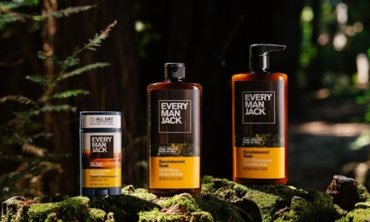
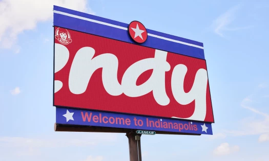
Every Man Jack Refreshes Its Shelf Look With Recyclable Bottles
| 6 hours ago | 2 min read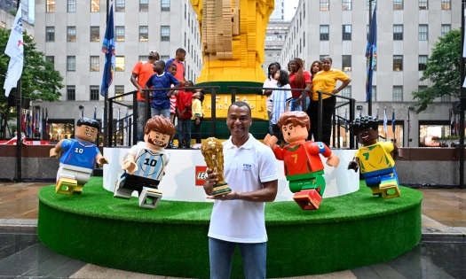
Lego Builds a 27-Foot World Cup Trophy Made of 1.36 Million Bricks
| 23 hours ago | 3 min read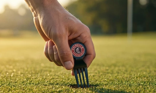

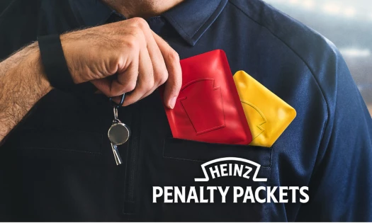
Heinz's 'Penalty Packets' Give Soccer Fans More Ketchup to Play With
| 1 day ago | 3 min read
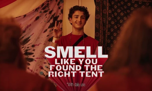
Old Spice Wants Men in the U.K. to Believe Confidence Has a Smell
| 1 day ago | 2 min read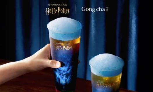
Gong cha Pours an Elder Wand Tea for Harry Potter's 25th Year
| 2 days ago | 3 min read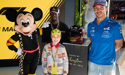
Disney Auctions Mickey Mouse-Branded F1 Helmet for Make-A-Wish
| 2 days ago | 2 min read
Receive our NewsletterJoin over 70,000 B2B decision-makers growing their brands