Etsy's 2026 Rebrand: Key Findings
- The platform partnered with SYLVAIN to reposition its brand around discovery and connection instead of purely transactions.
- The refreshed visual identity centers on a square motif and flexible system applied across product, marketing, and platform experiences.
- The rollout includes tools and guidelines to ensure consistency while allowing variation that reflects Etsy’s diverse seller community.
Etsy wants to feel human again.
After riding a pandemic-driven surge, the marketplace found itself surrounded by competitors that all looked and behaved the same.
This urged Etsy to rethink its design strategy and reinforce that it’s more than a place to check out a cart. It’s where people actually discover something personal.
To get there, Etsy worked with strategy and design agency SYLVAIN to redefine how the brand shows up across platforms.
The goal of the rebrand was to position Etsy as the entry point for discovery, where buyers connect with the people behind each item.
This idea carries through the system itself, with “A starting point for special” used as the line that anchors the visual identity and the tone across touchpoints.
It reframes Etsy as a place where the right object meets the right person at the right moment, straying from transactions and focusing on building relationships.
A New Human-Centered Design
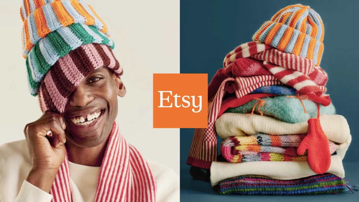
The new design system centers on a square, described as both a container and a gateway into Etsy’s world.
It presents the platform as a way into unique items and the people who make them.

Inside this frame sits a redesigned wordmark, with softer curves and slightly uneven proportions that feel less mechanical and more human.
It's subtle, but it's a move meant to reflect the individuality of Etsy’s sellers instead of imposing a rigid corporate look.
“Etsy is iconic. A huge part of SYLVAIN’s brief was reconnecting a brand to what makes it special — which is always a point of pride,” said Michael Ian Kaye, chief creative officer of SYLVAIN.
“Reflecting the uniqueness of its buyers and sellers, the goal was to keep it simple but confident, so that Etsy could focus on being more Etsy.”
Apart from the logo, the team built out a full visual system.

It includes custom glyphs, silhouettes, expanded colors, and motion behaviors that mirror the textures and variety of the seller community.
SYLVAIN worked alongside Upstatement to integrate the system directly into Etsy’s digital experience.
This means the same design language carries through listings, search, and seller tools, not just campaigns.
The rollout is happening gradually, with new assets appearing across ads, product pages, and communications.
The company has also provided detailed guidelines and toolkits to ensure consistent use of the system as it expands.
The Shift to Discovery-Led Branding
Etsy's refresh shows how design can reposition a platform without changing its core product:
- Strong branding systems should move into the product experience, ensuring consistency across every customer interaction.
- A flexible visual identity allows brands to scale globally. Doing so will also reflect individuality and diverse creator communities.
- Changing focus from transactions to relationships can help platforms like online marketplaces feel more personal.
The real question now is whether this more human approach can hold attention in a space still driven by convenience, pricing, and speed.
Our Take: Can Design Make a Marketplace Feel Personal?
Etsy is not trying to outdo Amazon. It's just trying to remind you why it exists in the first place.
The square, the softer wordmark, and the system behind it all are quiet but deliberate signals that tell you there is a person on the other side of the product.
View this post on Instagram
If the design can slow you down just enough to notice the story behind an item, then it works.
Because in a marketplace like this, attention is currency. And right now, Etsy is trying to earn it back in a more human way.
Similarly, Sprite recently updated its visual identity with a global rebrand.
The strongest refreshes usually start with something people already feel when they use the product. Explore these top branding agencies in our directory.


