
A client came to us with an app idea in the fuel delivery space. Real problem, real solution, and an ambitious plan to expand across ten major states right out of the gate.
Once the prototype was ready to show, they needed something to bring in front of investors and partners.
Not just a deck. The deck. The one that either gets you the next meeting or doesn't.
They came to us at Doodle N Dash for the branding, the design, the structure, all of it. And the first thing we had to get past wasn't the visuals. It was the instinct to put everything in.
The Instinct That Sinks Most Pitch Decks
Most people building a pitch deck are still designing it like it's 2005.
Dense slides, full paragraphs, every stat and every detail laid out because it feels safer to include it than to leave it out.
That instinct makes sense on paper. It's also exactly what kills a pitch in the room.
An investor doesn't want to read your deck. They want to hear you walk them through it.
Presented Live vs. Read Cold
There's a real difference between a document meant to be read cold and one meant to be presented live, and a pitch deck is almost always the second thing.
If someone in the room is squinting at a paragraph on slide six instead of listening to what you're saying, you've already lost part of the pitch, no matter how good the actual idea is.
So we stripped it down. An investor in a room like that wants three things, in order:
- What's the problem,
- How are you solving it,
- What's the ask.
That's it. Everything else is either supporting detail that lives in an appendix or supporting detail that lives in your mouth, not the slide.
We landed on somewhere between eight and 12 slides, which sounds thin until you realize that's the range where a deck actually works as a guide instead of a script.
Enough structure to keep the presenter on track through every important beat, but not so much that the audience starts reading instead of listening.
Designing a Deck Like an Experience
Pitch deck design has genuinely changed over the last decade, and most people building one still don't know it.
It used to be about cramming information onto a slide and calling it thorough. Now it's closer to designing an experience.
Typography, Visuals, and the Numbers That Land
Typography carries an emotional weight now, not just a font choice.
It's the difference between a deck that feels like a spreadsheet and one that feels like a company someone wants to bet on.
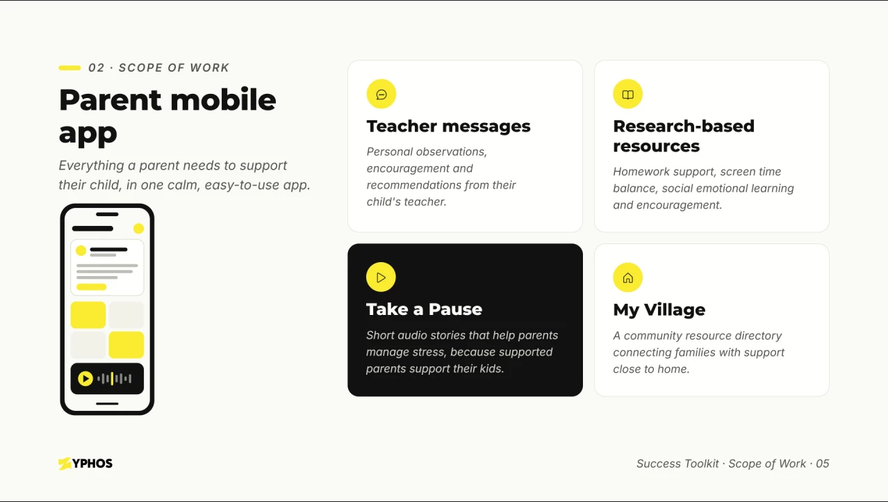
Visuals work the same way. Minimal doesn't mean empty.
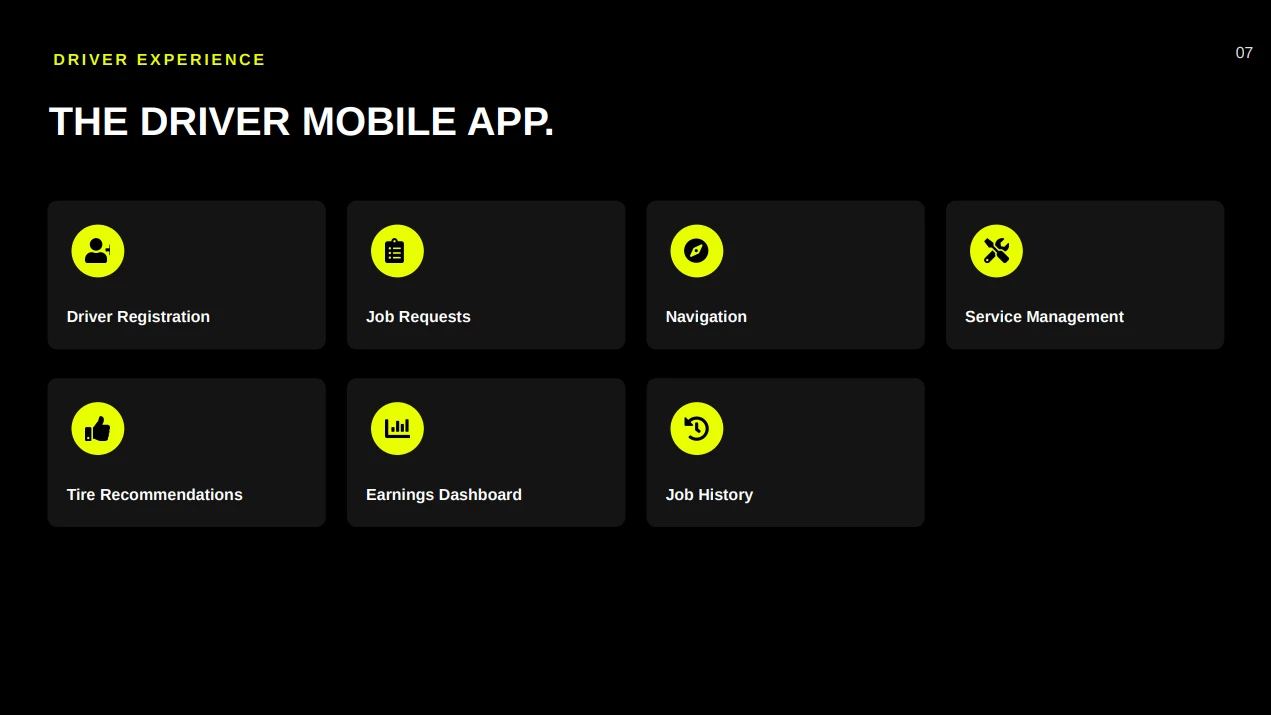
It means every visual left on the slide is there on purpose, doing one job, instead of competing with four other things for the same three seconds of attention.
And numbers still matter, arguably more than ever. But the numbers that convert aren't the ones buried in a table.
They're the one or two that get pulled out, sized up, and given room to actually land.
The Arc That Builds a Case
Structure carries the same weight. The problem. The solution as we designed it. The bigger picture if it works. The ask. What happens right after the meeting if the answer is yes.
Get that order wrong, and the deck presents facts instead of building a case.
Getting the Client to Let Go
All of that would've fallen apart if the client wouldn't actually agree to it. That was the hardest part of the whole project, honestly. Not the design, the convincing.
Clients almost always want to keep more in than they should, because every slide feels important when you're the one who lived through building the thing.
We at Doodle N Dash had to walk them through why a slide should be a snapshot of what's being said out loud, not a stand-in for it.
Each one exists to support a beat in the pitch, not to carry the whole argument on its own.
It worked. After a handful of pitches using the deck, the client landed meetings with the right investors and partners.
That kind of meeting doesn't happen off a mediocre deck, no matter how strong the underlying idea is.
And none of that had much to do with making the slides look nice, even though they did.
It had to do with treating the deck as a framework for a conversation instead of a document trying to make the case all on its own.
That distinction is easy to miss until you've sat in the room and watched it play out both ways.