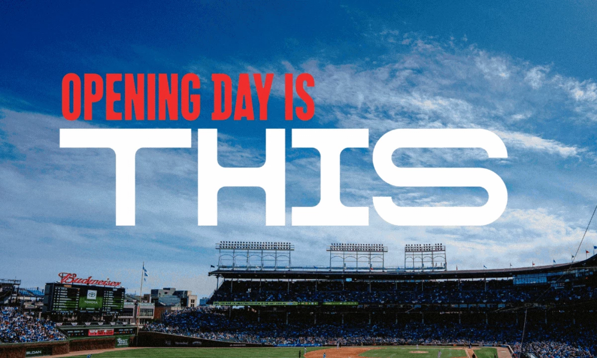
When the Chicago Cubs released their 2026 season campaign, fans had plenty to say.
"THIS was not a good choice at all," one fan commented on X. "I could have come up with this slogan in my sleep," wrote another.
The reaction was immediate, divided, and loud. The campaign’s ambiguity immediately fueled debate among fans.
THIS. pic.twitter.com/SDzDLlwsIo
— Chicago Cubs (@Cubs) February 16, 2026
Created by Christopher A. Ritter with co-creative directors Kent Carmichael, Peter Carnevale, and Scott Serilla, the campaign is the Cubs' annual ticketing push.
It is built to drive seat sales across citywide media, digital channels, and in-stadium touchpoints.
The brief was simple. Put people in the seats at Wrigley Field. The answer was a single bracketed word that refuses to define itself.
What [THIS] Does
Baseball is the backdrop, and the campaign sells everything wrapped around it.
"Walking through the tunnel. The first glimpse of the field. The wind, the ivy, strangers becoming friends," as Ritter's campaign notes describe it.
The slogan becomes a blank declaration that fans complete with their own memories, transforming a ticket promotion into an invitation to belong.
View this post on Instagram
By refusing to fix a meaning, the campaign stays personal for every fan who encounters it, from a lifelong bleacher regular to someone attending their first game.
Visually, the system earns the emotional weight the slogan implies. Handcrafted paint gestures transform photography into something tactile, and custom typography gives the work character.
Bold color blocks and cinematic imagery create a sense of scale without losing warmth.
The result is a sports branding platform built to carry a franchise across a full season.
Why Ambiguity Works Here
The criticism that the campaign could mean anything is structurally the same as the compliment.
Successful brand platforms today are less declarative and more invitational.
View this post on Instagram
Nike's "Just Do It" works because you get to decide what it is. Apple's "Think Different" campaign worked because "different" is personal.
L’Oréal Paris recently used a similar strategy with its "Mother & ___’ campaign," leaving the audience to complete the message themselves.
For the Cubs specifically, ambiguity has cultural permission.
Their fans have built their identity around living through this kind of moment, the heartbreak, the irrational hope, the ritual of return.
The campaign design does not have to explain that history. It just has to name it.
What Brands Can Take From This
The Cubs did not try to out-message their competition.
They created space for the audience to do the work, and that distinction matters for any brand in a crowded category where differentiation through claims is increasingly difficult.
![Chicago Cubs [THIS] campaign manifesto overlaid on a packed Wrigley Field, declaring that no two experiences are the same and [THIS] is everything.](https://media.designrush.com/tinymce_images/1034053/conversions/chicago-cubs-this-manifesto-content-large-webp.webp "Chicago Cubs [THIS] Campaign Manifesto at Wrigley Field")
Here is what the campaign signals for brand strategists.
Embrace ambiguity when the audience already understands the meaning. Brands with devoted followings can afford to speak less and let fans fill in the rest.
Lead with invitation over declaration in high-loyalty categories. Marketers should give fans language for what they already feel, without pushing them to something new.
Let visuals carry the emotional weight that copy leaves open. Teams should invest in tactile, handcrafted design that does the work the words deliberately withhold.
Provocative branding generates earned media that paid placements cannot buy.
The campaign quickly became a topic of discussion across fan and design circles.
Our Take: Is [THIS] Smart Branding or Just Controversy?
Deliberate ambiguity is one of the harder things to sell to a client, and the Cubs approved it anyway. We think the fan backlash validated the strategy rather than undermined it.
A campaign that earns debate in sports media and design circles without buying placement in either is a rare outcome for a ticketing brief.
The platform also has durability. It can absorb whatever the Cubs become across seasons without requiring a rebrand.
Brands that age well rarely over-explain. They leave enough room for the audience to finish the sentence.
Sports brands building campaigns that last need agencies that understand both identity and audience. Find the top branding agencies in the USA in our directory that work at this level.